Designed with Mark Bearak and Yuval Borochov
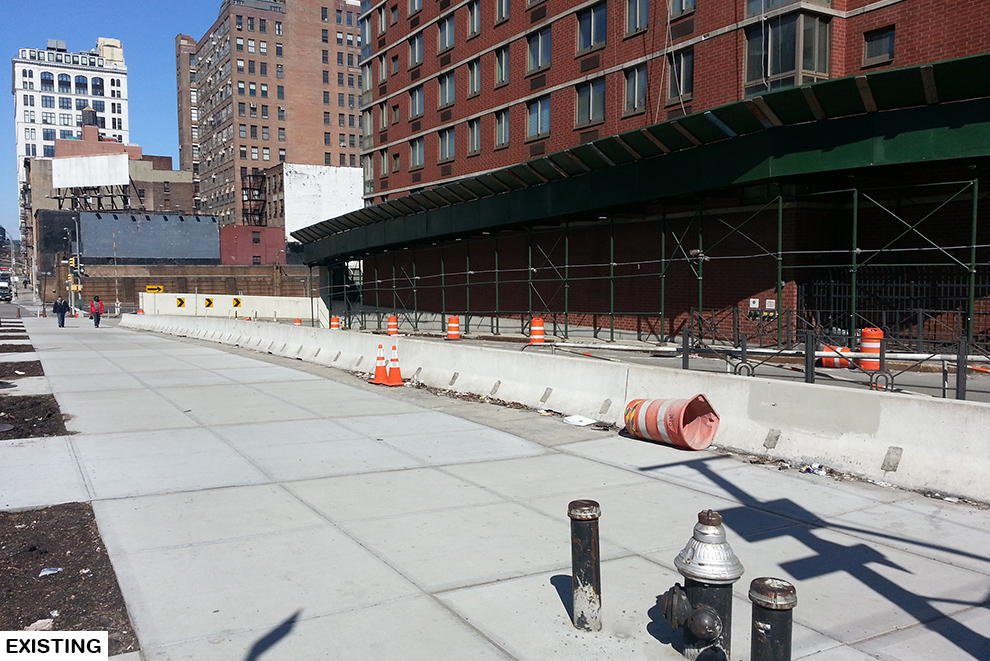
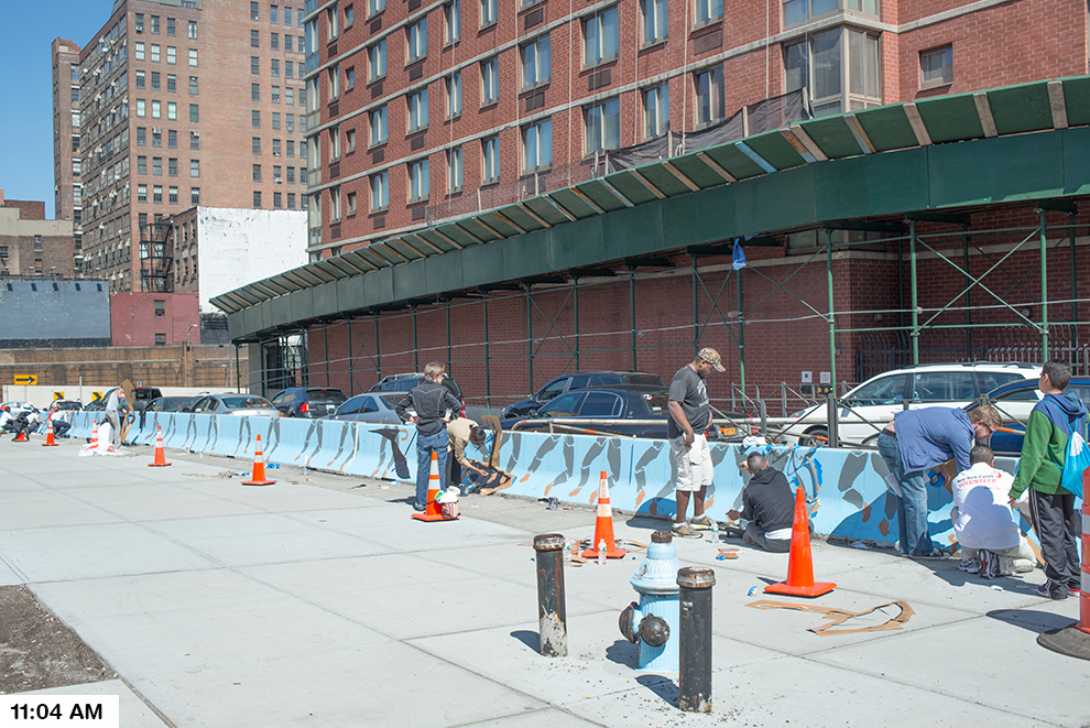
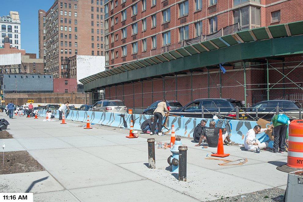
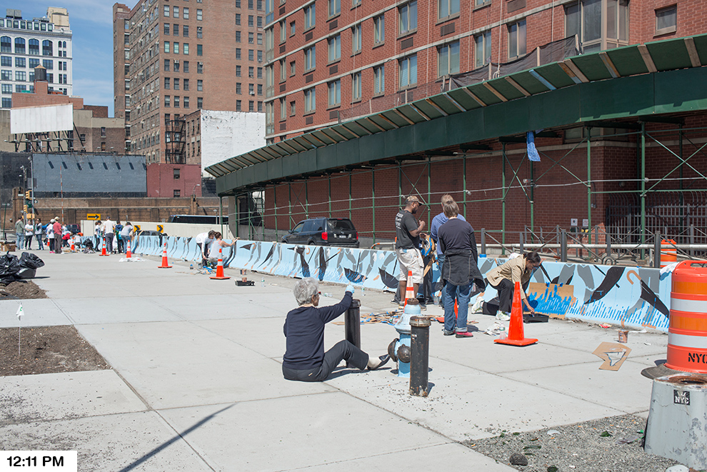
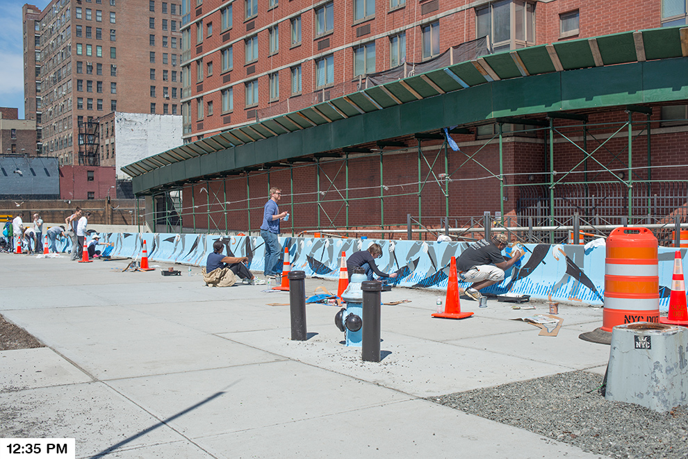
What began as a competition for a temporary rehabilitation of an existing chain link fence along two blocks – adjacent to a pair of parking lots – quickly became a more encompassing proposal as we realized the latent potential of the two narrow, un-programmed plazas bordering the modest chain link fence. Located at the Delancey Street connection to the Williamsburg Bridge, the site acts as the symbolic gateway to the Lower East Side for those leaving and entering Manhattan, and as such, displays a great wealth of untapped design opportunity. As a temporary proposal of less than 5 years duration, we identified a variation of possible plug-in nodes that could be used to test ideas for the site and generate community engagement by bringing the scattered, diverse collection of LES attractions together at the fence, displaying the street-level density and multiple, overlapping functions that have historically characterized the LES. Budget and business plans were also developed to illustrate the feasibility of a more ambitious program at the site through a variety of funding and sponsorship options.
PROJECT DESCRIPTION:
The possibilities of programming a BLOQ are endless, ranging from a bike repair station, to a satellite location of a Lower East Side business, to a concert venue stage. Each block will have its’ own identity, but share geometric cues from its neighbors. In our proposal we will aggregate 16 BLOQS that will serve as a gateway to the LES while also providing an oasis of attractions within the neighborhood.
The site will consist of two city blocks and each section will have its own identity. We call the Eastern section the PIT-STOP based on its adjacency to the Williamsburg Bridge and its planned programmatic functions. The BLOQS located in this section will serve as a way station for pedestrians heading to Brooklyn or entering the LES. This section will have BLOQS with services such as bike repair, coffee and skate gear.
We call the Western section the CHILL space and we will treat it as more of a destination. The width of the site allows for larger gatherings of people who can congregate into the farmers market or catch a drink at the pop-up bar. Our proposal represents a handful of potential BLOQS; over the life of the project there are endless possibilities for temporary and permanent installations.
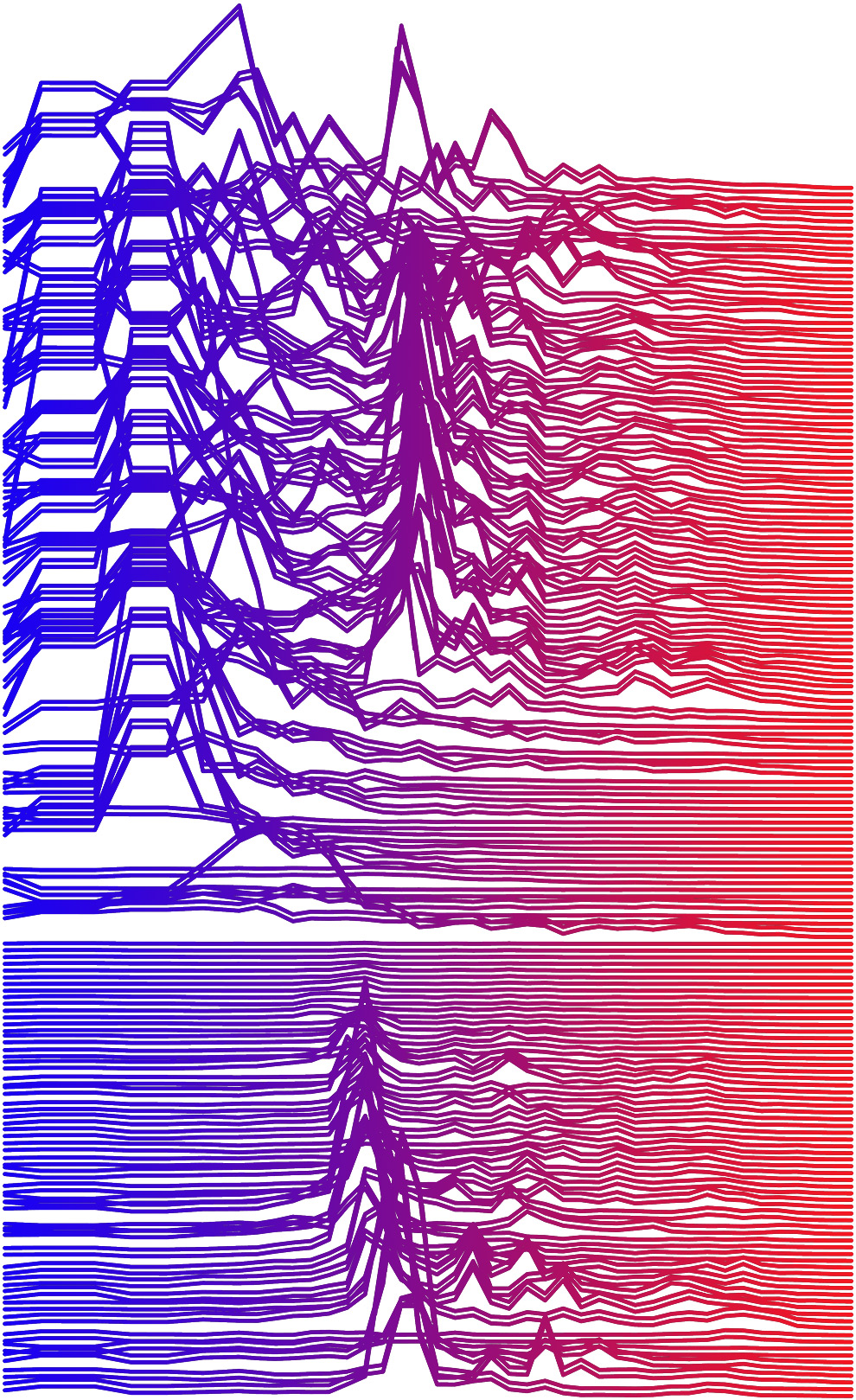
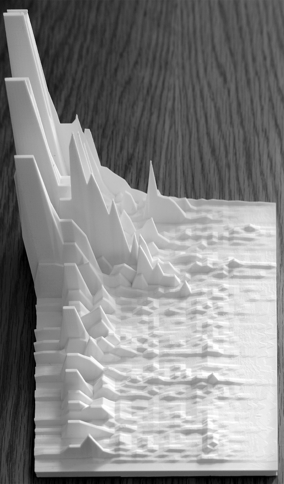
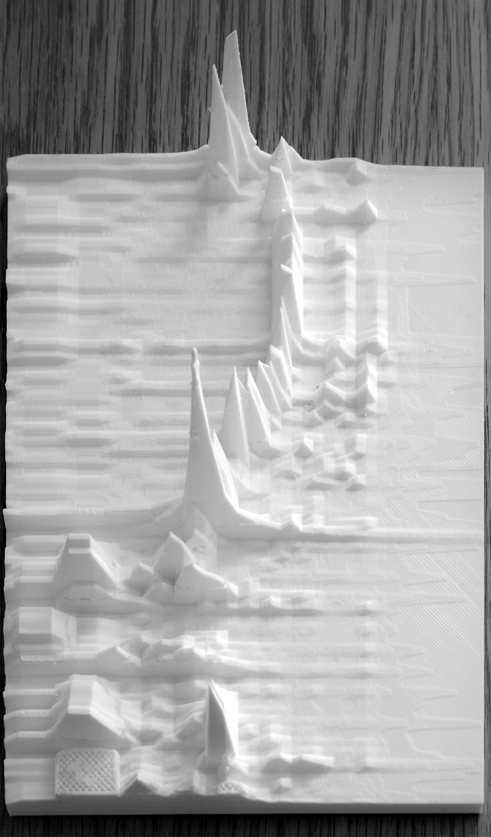
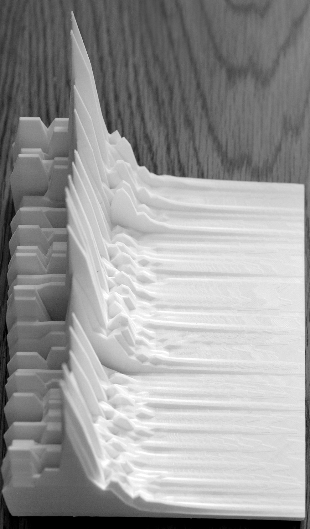
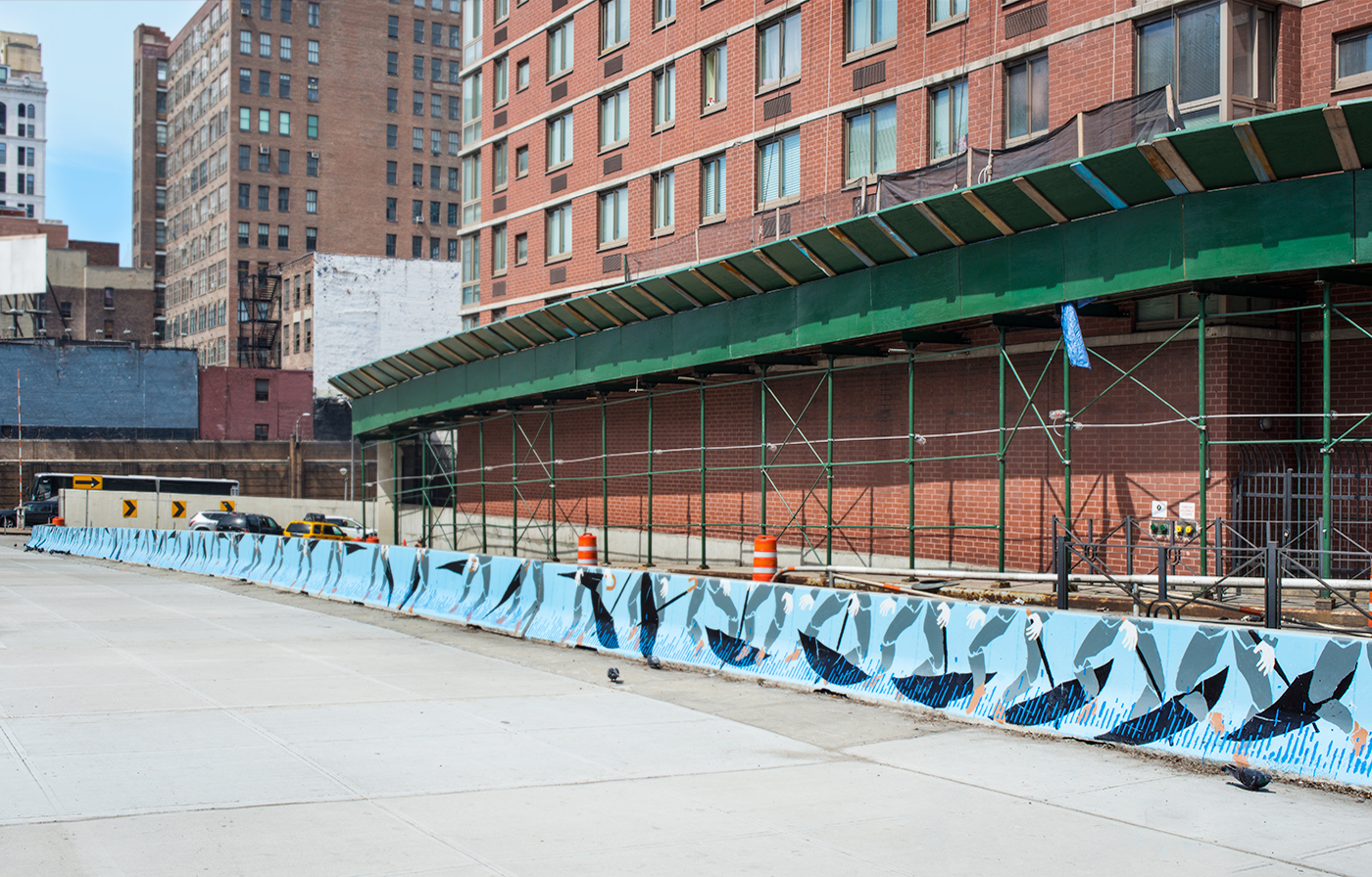
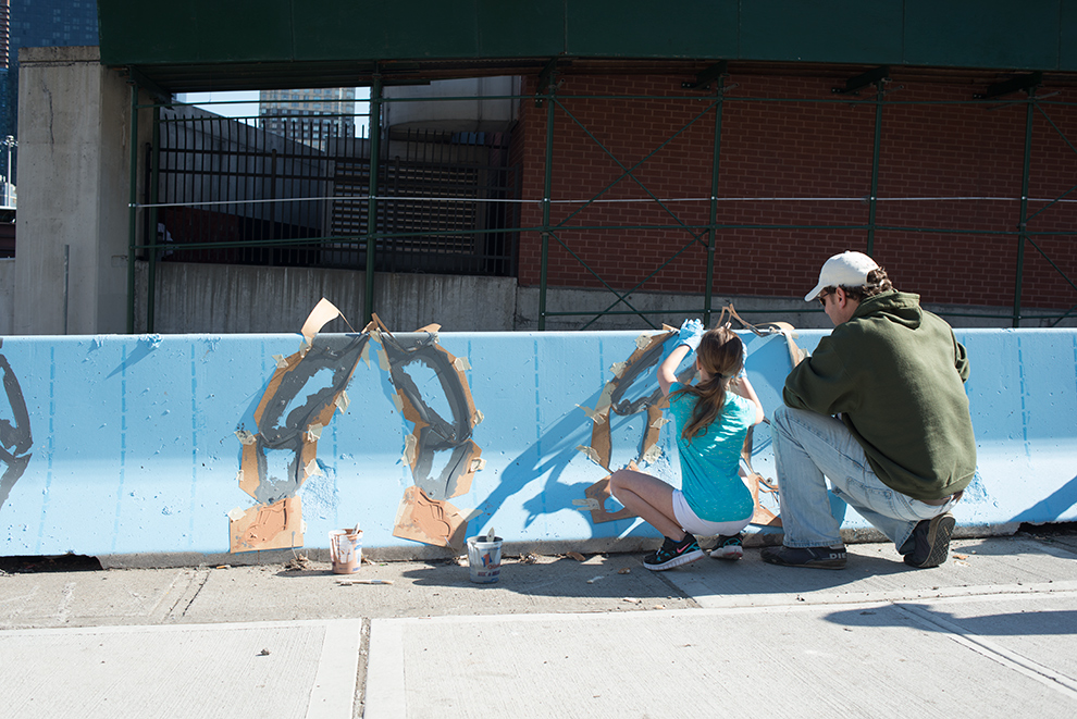
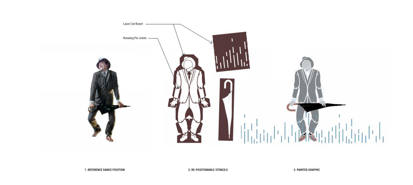
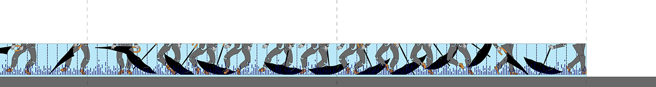
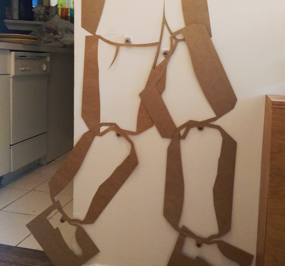
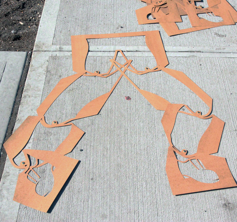
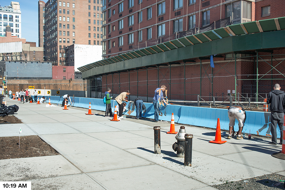
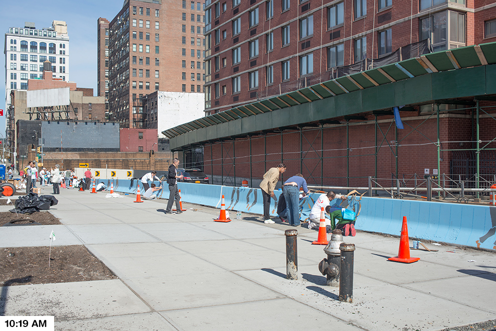
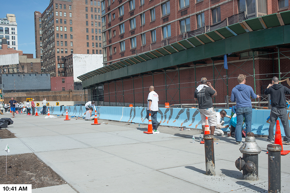
Further exploring the actual BLOQS, each zone will be defined by a fence which will act as a billboard for the community and patterns placed along the ground. Each section of fence will be a billboard representing an actual block of the LES. The design of each section of the fence will be a series of parallelograms that advertise local businesses within the represented blocks of the LES. The parallelograms will be colored based on following four categories: Shop, Eat, Explore & Nightlife. The adjacent ground will be a continuation of this theme containing patterns unique to each BLOQ.
The most liberating feature of the BLOQS will be created when the fence is used as a jumping off point to an architectural installation. We will bend, fold, cut, extend and warp the fence to accommodate the unique functions of each BLOQ. In some cases the drama of the gesture will be relatively modest; in the case of the market the fence will simply be extended horizontally to create a canopy to protect the produce. In more complex situations, structure and furniture will be built off of the fence to create a space suitable to host large groups of visitors. One of the largest BLOQS will be composed of a bar, stage and viewing area built within the distinct vocabulary of the installation.
The main purpose of the BLOQ installation is to activate the space. The BLOQ will not only serve as a gateway to the LES, it will serve as a destination for all New Yorkers. The project will never be static and its potential can be tested over time as the project evolves to suit the changing needs of the community. Eventually the project will not only be a representation of the vitality of the neighborhood, it will also serve as a benchmark for the evolution of the Lower East Side.
http://newyorkcity.arthere.org/art/bloq-party-2/
http://lesbloqparty.com

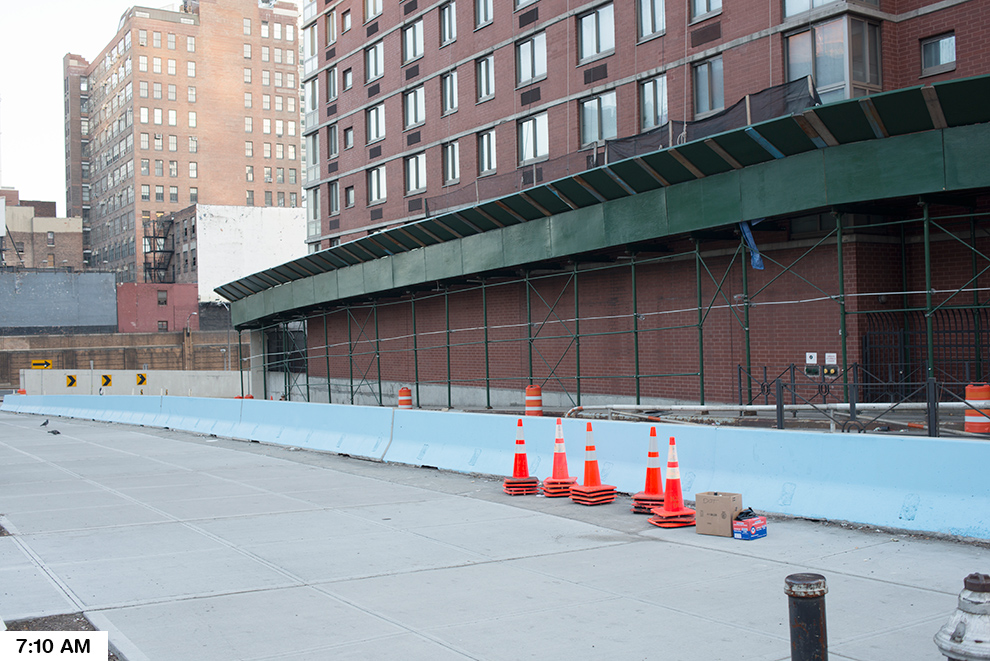
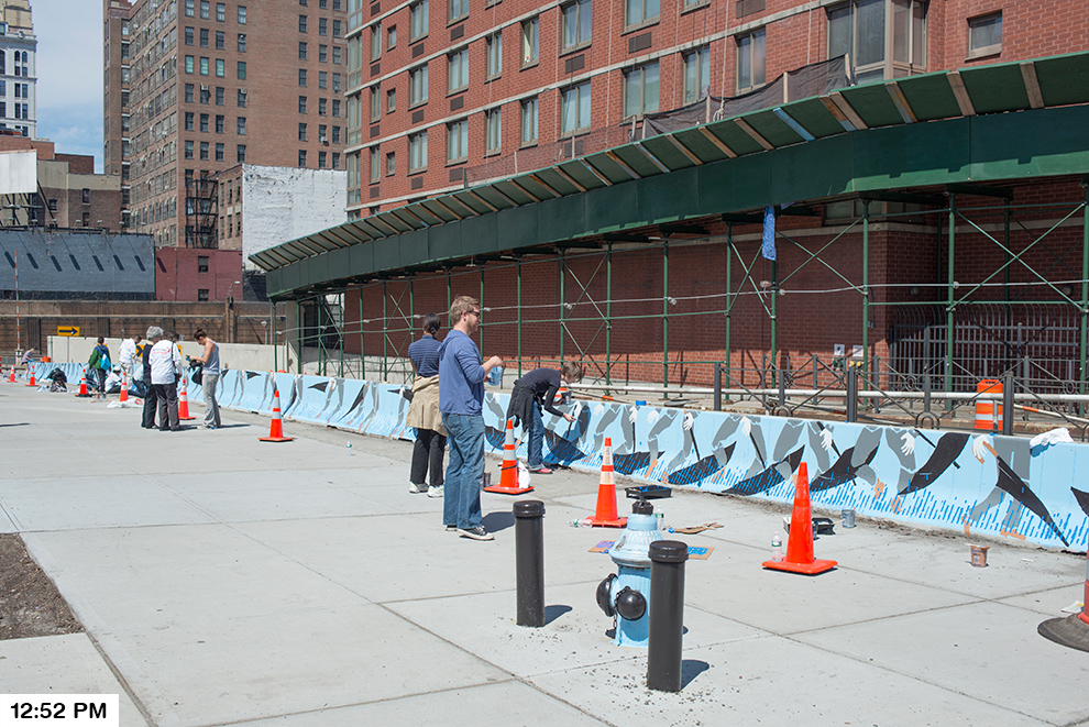
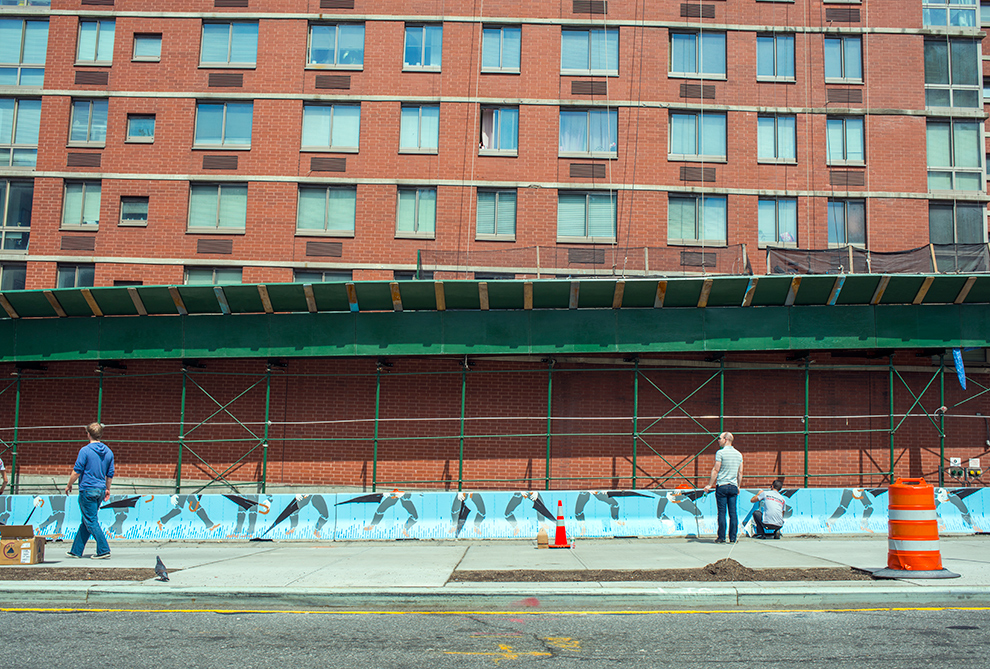
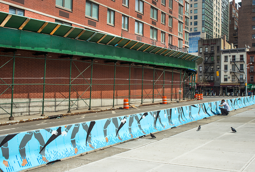
Existing Site