JOHN LOCKE, ARCHITECT

  • Featured Work
  • Design Blog           
  • Photography
  • Graphic Design
  • Dept of Urban Betterment

About

Hello. I live in New York and work at The Living. I hold a graduate degree from Columbia University's GSAPP and an undergraduate architecture degree from the University of Texas at Austin. I have more than seven years of professional experience at noted architecture firms, including New York-based Rogers Marvel Architects and SOM. I also tackle freelance graphic and photography work with my partner in crime, the multi-talented Jackie Caradonio at Lion in Oil. In addition, I teach a course, Hacking the Urban Experience, at Columbia. View my CV here: CV(html). Thanks and have a nice day.

Contact

john.h.locke{at}gmail.com
310.735.3333

Architecture Portfolios

Portfolio 2002-2007 (issuu)
Portfolio 2008-2009 (issuu)

HOME / BLOG

graphic design

2018062 Tags: 3DPrinting, museum, photography, research | No Comments »

APHRODITE IN MARBLE

Saturday morning, creating a digital copy of the Aphrodite in Marble from the Met. A form that has perpetually adapted – originally cast in bronze 2000 years ago, later destroyed, reproduced (two times, different artists) in marble, limbs were lost, limbs were added, parts recreated, etc.


20160427 Tags: graphic design, sound, tattoo | No Comments »

Sound and Ink

tatoo-web-2

I was asked to design a soundwave tattoo that references a specific part of a single song. It turned out pretty cool. Buildings are often designed for a 50-year lifespan. Female life expectancy in New York is pegged at 83 years, so as a design problem the time scale on this exceeds architecture.


20150529 Tags: 3DPrinting, graphic design, processing, sound | 1 Comment »

3DP – SOUNDWAVE


Building off of previous work that looked at real-time sound visualization, the intention of this exercise was to create a series of physical objects that legibly conveyed the transformation of sound into a landscape. Four specific indicative moments of recorded sound were rendered as a topographic form in Processing, then 3d printed. Any piece of real-time or recorded sound would work, however, these prototypes were chosen because they highlight special snippets or short moments during signature songs that could warrant further observation of the ordered or chaotic underlying sound structure. Once printed, each piece creates a striking object that allows for ease of visual comparison.


The four selections shown here include:


1) “Young Americans” – David Bowie. The brief pause at 4:19. (youtube link) Also, per Jennifer Egan in A Visit to the Goon Squad: “This is a lost opportunity. Hell, it would’ve been so easy to draw out the pause after ‘…break down and cry…’ to a full second, or 2, or 3, but Bowie must’ve chickened out for some reason.”


2) “Ride of the Valkyries” – Richard Wagner. The introduction of the main theme including the arrival of the brass instruments. (youtube link)


3) “Mood Indigo” – Duke Ellington. Jimmy Hamilton’s introduction on the clarinet. (youtube link)


4) “Sonified Starlight” – NASA. Translation of light waves emanating from star KIC 7671081B into an audible pattern via NASA’s Kepler Input Catalog. (soundcloud link)


Lastly, drop me a line if you’d be interested in your own 3D printed soundwave.


3D-PRINTS-01b

3D-PRINTS-KEPLER

“Sonified Starlight” – NASA. Translation of light waves emanating from star KIC 7671081B into an audible pattern via NASA’s Kepler Input Catalog. (soundcloud link)


3D-PRINTS-BOWIE

“Young Americans” – David Bowie. The brief pause at 4:19. (youtube link)


3D-PRINTS-VALKRIE

“Ride of the Valkyries” – Richard Wagner. The introduction of the main theme including the arrival of the brass instruments. (youtube link)


3D-PRINTS-MOOD-INDIGO-C

“Mood Indigo” – Duke Ellington. Jimmy Hamilton’s introduction on the clarinet. (youtube link)


WAVE01-FINAL-WEBMOODINDIGO01-FINAL-WEBKEPLER-FINAL-WEBBOWIE-FINAL-WEB

3D-PRINTS-VALKRIES-AXO-BW3D-PRINTS-MOOD-INDIGO-AXO-BW3D-PRINTS-KEPLER-AXO-BW3D-PRINTS-BOWIE-AXO

20141231 Tags: architecture, fabrication, new york, research, school, teaching, urban | No Comments »

HACKING THE URBAN EXPERIENCE – STUDENT WORK FALL 2014

web-01web-02

web-03web-04

web-05web-06

web-07web-08


A small selection of the amazing work the group produced in class this semester. Click on the images above for more information.

20140428 Tags: competition, fabrication, graphic design, interaction, new york, urban | No Comments »

Muybridge + Kelly

overall
Final painted barrier
final01
NYCares Volunteers paint the barrier
install

stencil-design
Stencils with movable joints
stencil-design-03

Barrier made of (10) 20′ long modules
SECTION-01-rev

SECTION-02-rev

SECTION-03-rev

SECTION-04-rev

Stencils laser cut out of oil board with rotating brass pin joints
stencil01stencil02
200′ of barrier painted in 4 hours
corner-01corner-01corner-01corner-01

corner-01corner-01corner-01corner-01

corner-01corner-01corner-01corner-01

NYCares volunteers painted barrier number 10
install02
Final painted barrier images
final_01final_02

final_03final_04


My design for “Singing in the Rain” was commissioned by the NYC DOT as part of the Urban Art program to Beautify Barriers throughout the city. The site is located just South of the theater district and Times Square at 36th St and 9th Ave in Manhattan, and references musicals – especially one in particular – as well as motion, animation and street rhythm. The piece will be up for 1 year and made use of a series of movable stencils of figures with articulated joints to allow for variation in the 200′ barrier length. 20 awesome volunteers of all ages participating in the NYC Cares program (many who had never picked up a paintbrush before) were able to arrange the stencils and finish painting the design in 4 hours based off of a series of detailed instruction sheets.

20130511 Tags: architecture, competitions, fabrication, graphic design, urban | No Comments »

This space could be…


To generate interest and excitement for our BLOQ PARTY proposal, we wanted to start a conversation by showing how the program elements we produced could potentially activate the competition site. Competitions, design proposals and urban space planning oftentimes fall under the radar of the actual users of the site who are both unaware that a competition is taking place and then have no voice in the process or outcome. The plastic signs are intended to link the digital proposal to an actual physical space – less obscure websites and more public posters. It also helped to see how our space division laid out on the actual site, we had treated the eastern, narrower plaza area as space for movement and dynamic interaction – biking, running, skating. The western, more generous plaza was designed for slower, more spontaneous meeting areas. We hope the signs can begin to create a diaglogue for the best use of the space including potentially new and different program ideas that can eventually bring the space to life in a vibrant manner for all.

2013053 Tags: architecture, competitions, graphic design, urban | No Comments »

BLOQ PARTY


Designed with Mark Bearak and Yuval Borochov


What began as a competition for a temporary rehabilitation of an existing chain link fence along two blocks – adjacent to a pair of parking lots – quickly became a more encompassing proposal as we realized the latent potential of the two narrow, un-programmed plazas bordering the modest chain link fence. Located at the Delancey Street connection to the Williamsburg Bridge, the site acts as the symbolic gateway to the Lower East Side for those leaving and entering Manhattan, and as such, displays a great wealth of untapped design opportunity. As a temporary proposal of less than 5 years duration, we identified a variation of possible plug-in nodes that could be used to test ideas for the site and generate community engagement by bringing the scattered, diverse collection of LES attractions together at the fence, displaying the street-level density and multiple, overlapping functions that have historically characterized the LES. Budget and business plans were also developed to illustrate the feasibility of a more ambitious program at the site through a variety of funding and sponsorship options.


PROJECT DESCRIPTION:
The possibilities of programming a BLOQ are endless, ranging from a bike repair station, to a satellite location of a Lower East Side business, to a concert venue stage. Each block will have its’ own identity, but share geometric cues from its neighbors. In our proposal we will aggregate 16 BLOQS that will serve as a gateway to the LES while also providing an oasis of attractions within the neighborhood.
The site will consist of two city blocks and each section will have its own identity. We call the Eastern section the PIT-STOP based on its adjacency to the Williamsburg Bridge and its planned programmatic functions. The BLOQS located in this section will serve as a way station for pedestrians heading to Brooklyn or entering the LES. This section will have BLOQS with services such as bike repair, coffee and skate gear.


We call the Western section the CHILL space and we will treat it as more of a destination. The width of the site allows for larger gatherings of people who can congregate into the farmers market or catch a drink at the pop-up bar. Our proposal represents a handful of potential BLOQS; over the life of the project there are endless possibilities for temporary and permanent installations.


Further exploring the actual BLOQS, each zone will be defined by a fence which will act as a billboard for the community and patterns placed along the ground. Each section of fence will be a billboard representing an actual block of the LES. The design of each section of the fence will be a series of parallelograms that advertise local businesses within the represented blocks of the LES. The parallelograms will be colored based on following four categories: Shop, Eat, Explore & Nightlife. The adjacent ground will be a continuation of this theme containing patterns unique to each BLOQ.


The most liberating feature of the BLOQS will be created when the fence is used as a jumping off point to an architectural installation. We will bend, fold, cut, extend and warp the fence to accommodate the unique functions of each BLOQ. In some cases the drama of the gesture will be relatively modest; in the case of the market the fence will simply be extended horizontally to create a canopy to protect the produce. In more complex situations, structure and furniture will be built off of the fence to create a space suitable to host large groups of visitors. One of the largest BLOQS will be composed of a bar, stage and viewing area built within the distinct vocabulary of the installation.


The main purpose of the BLOQ installation is to activate the space. The BLOQ will not only serve as a gateway to the LES, it will serve as a destination for all New Yorkers. The project will never be static and its potential can be tested over time as the project evolves to suit the changing needs of the community. Eventually the project will not only be a representation of the vitality of the neighborhood, it will also serve as a benchmark for the evolution of the Lower East Side.


http://newyorkcity.arthere.org/art/bloq-party-2/
http://lesbloqparty.com


Existing Site

20130329 Tags: graphic design, grasshopper, parametric | No Comments »

=)


Parametric facade apertures on swooping surfaces are out, parametric emoticons are in. A quick experiment using the image sampler node in Grasshopper to parametrically control the relative ecstatic to furious expression of an emoticon. A sampled pure white pixel on the original background image produces full-mouthed, googly-eyed happiness, while a sampled black pixel will unleash furrowed-brow, pursed-mouth rage. Grayscale pixels produce the range of conflicted emotions in between. Grasshopper definition can be downloaded here, works with any image, but simpler images with fewer colors tend to produce more legible results.

2012072 Tags: camouflage, competition, graphic design | 1 Comment »

crystal camouflage


Continuing my love of camouflage and painting jersey barriers in a way that is probably too heavy on the new aesthetic vibe, but sill enjoyable nonetheless.


Related: Satellite map images with missing or unclear data

20111231 Tags: graphic design, grasshopper, typography | No Comments »

devilish hairpieces

 
2011091 Tags: camouflage, competition, graphic design | No Comments »

razzle dazzle

razzle02


Inspired by both razzle dazzle camouflage and my middle school trapper keeper, this barrier entry presents a strong graphic face to the street. While the concept of camouflage may certainly seem like a contradictory tact for a protective barrier whose sole purpose is to remain unhidden, by using bold, angular geometric forms to blur the barrier’s edges, this in fact increases its perceived range. The illusory effect of the forms induce nearby traffic to slow down, producing a safer, more bike and pedestrian friendly thruway.


razzle01

2011057 Tags: competition, graphic design | No Comments »

high five, or: no brushes needed

conccanvas
A mural designed for a competition as part of a public art/farm space in the Bronx. The design started simply enough, with a walk through the Bronx and seeing the message “being great is the best revenge” scrawled across an abandoned mattress. The sentiment seemed to aptly sum up the spirit of possibility and potential inherent in every one us that has ever been underestimated or ignored. This led to the method of application of the message – not with paint on brush, but rather by paint applied directly via the volunteer’s hand, slapped down with conviction on the concrete canvas. Each unique creator becomes part of the final composition, through an emphatic gesture that is sometimes messy, with colorful fingerprints and palmprints merging together and breaking out of the geometrical lines of the fonts. The mural and painting technique will unite all those that volunteer and create a lasting memory of community togetherness.


I finished as a finalist, congrats to Oscar Lopez for a great winning entry.

20110225 Tags: competition, graphic design | No Comments »

a city of private eyes

barrier011

barrier02c


For a jersey barrier competition submission, we started with an iconic New York quote from Agatha Christie as indicative of the city: “It is ridiculous to set a detective story in New York City. New York City is itself a detective story,” and played off the recurring themes of mystery and dual meanings inherent to the make-up of our city. New Yorkers strive to challenge themselves, whether by running through the park during the marathon or following their career dreams, and we wanted to elevate something that is typically a solitary challenging act pursued underground in the subway – solving sudoku puzzles – to the street level, making it a communal, shared act. The design then works simply on two levels, as both a reflection of the city, and at the smaller scale, of the acts that makes New Yorkers such apt problem solvers.


The design will be quick to apply. Using only a limited color palette and a repeating stencil system, we will be able to economically create a bold, colorful graphic statement that will encourage all those that walk, bike, and run by the barrier to think about and interact with their great city.

20110211 Tags: work | 3 Comments »

house designed for a guy on craigslist who doesn’t want to pay architects

thepoophouse


After perusing a recent discussion post on archinect aptly titled: architects getting f’d on Craigslist (or: truth, bitterness and self-pity together at last), I was reminded of my own unfortunate craigslist encounter. It pains me to say it, but true story, last year, my final grad semester, I was cruising craigslist looking for some freelance architecture work. Now, granted, jobs on craigslist are typically posted by the most bottom-feeding, scum-suckingest of elements that greedily prey on the desperate, naive or unemployed, (at the time I equaled all three) at a frequency that beggars belief. So I knew I was wading into an unregulated seller’s market, but we’ve all been in tough positions before and compromises are made and pride may or may not survive intact. I had managed to wade through the obvious red flags which typically fall into one of two categories: including the clearly insane (“This is your first impression and demonstrates your ability as a designer. Use care in selecting the paper, the font, and the organization of text on the page.”) or the unnecesarily pretentious (“hip and prestigious award-winning design firm now accepting interns…”). So it was not without a healthy dose of skepticism that I reached out to one seemingly innocuous post, “Long Island Resident Looking for Architecture Services.”


Unfortunately it didn’t take many email exchanges before it quickly became obvious that “Long Island Resident” – a dentist – held a depressingly all-too-common view on what the role of an architect should be during difficult economic times and where on the scale of respectability he held the design services sector of the construction process. Basically LIR had a plot of land and wanted someone to design him the house that would sit on it for free. Or rather that familiar old standby, work for free in exchange for “something to put in your portfolio.” This wasn’t one of those situations where you’re just trying help out a friend or family member with a garage, or doing some pro-bono volunteering for those in need, or just being an adjunct. No, not at all, this guy had the means and was looking to browbeat someone into submission. In all fairness LIR thought a full set of documents, about four months of work, shouldn’t be free, but rather could be had for the princely sum of $350. I had no idea where the $350 number came from, possibly it was the number that allowed an apparently well-off dentist to salve his own conscience at demanding such massive concessions from a poor, young architect all in the name of The Greatest Recession Since the Great Depression. But I don’t know. Look, obviously life isn’t fair. People aren’t infallible and when given the opportunity will take advantage of those that can’t or won’t defend themselves. Opportunism is a leach on any creative profession, especially architecture, where self-doubt and masochism run rampant.


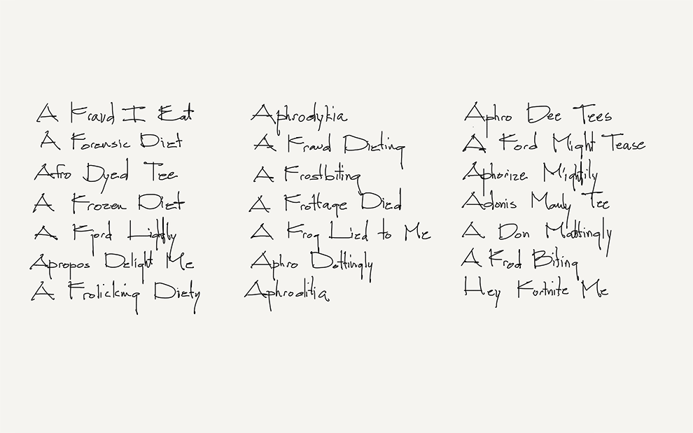
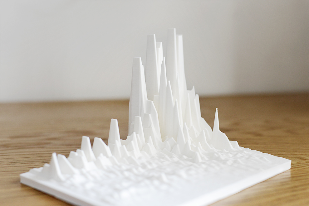
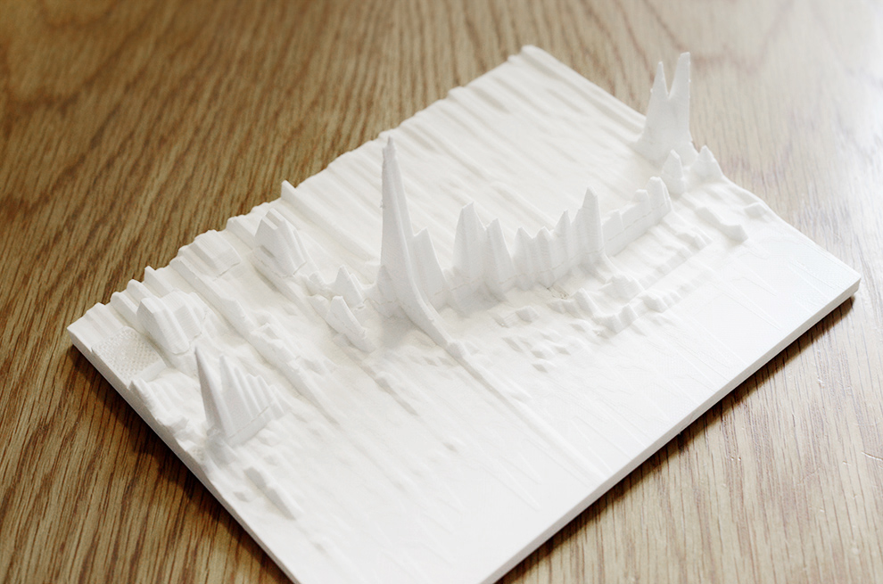
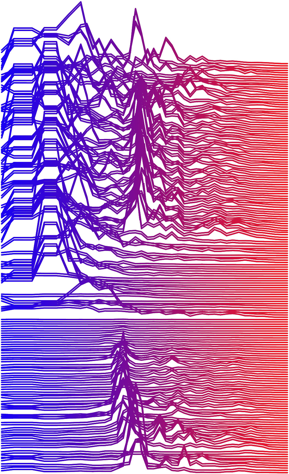
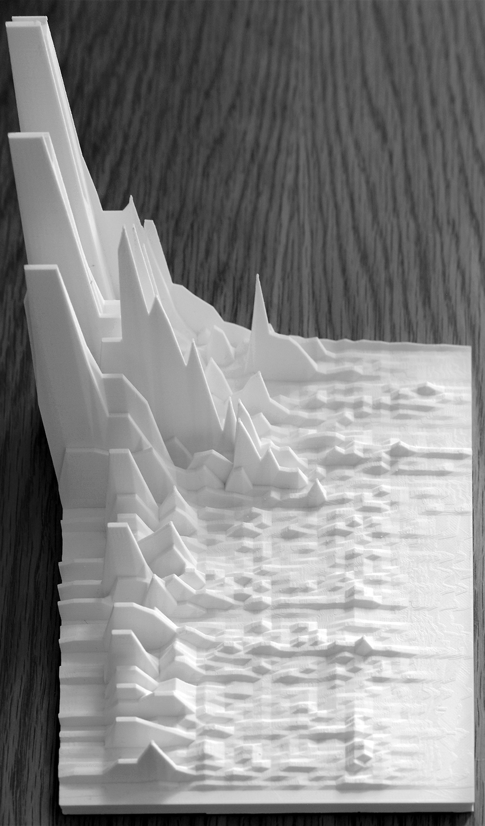
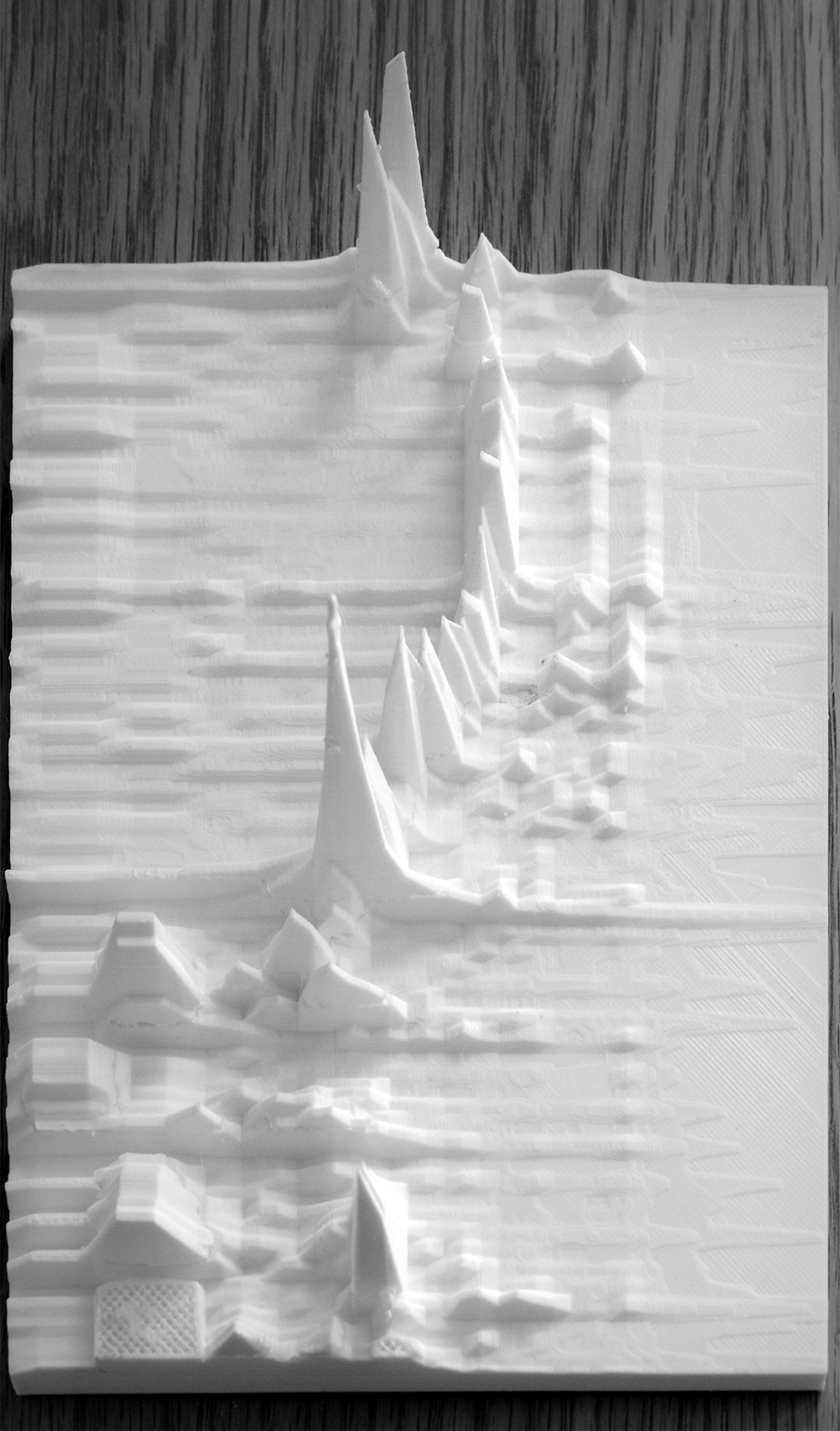
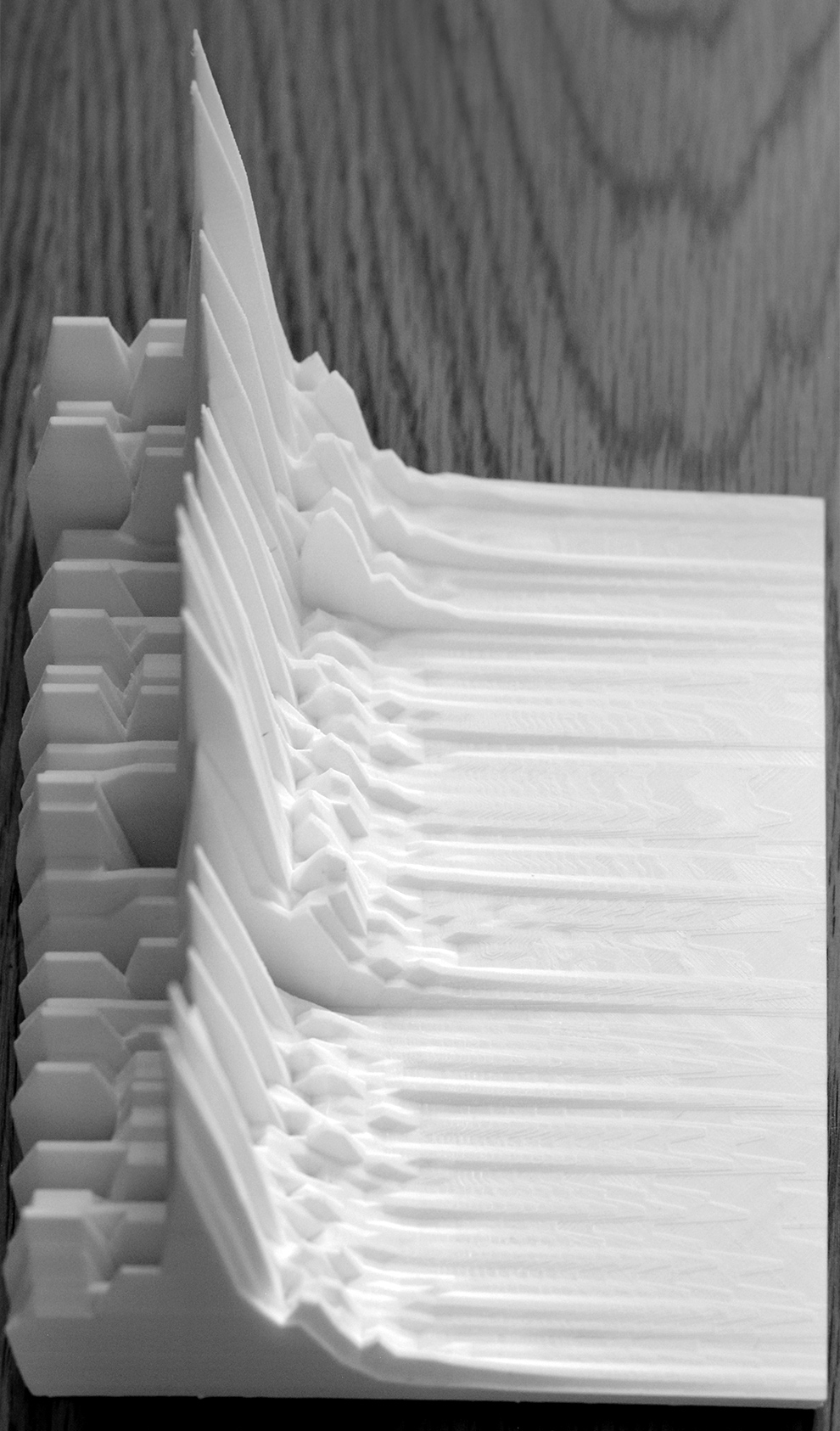
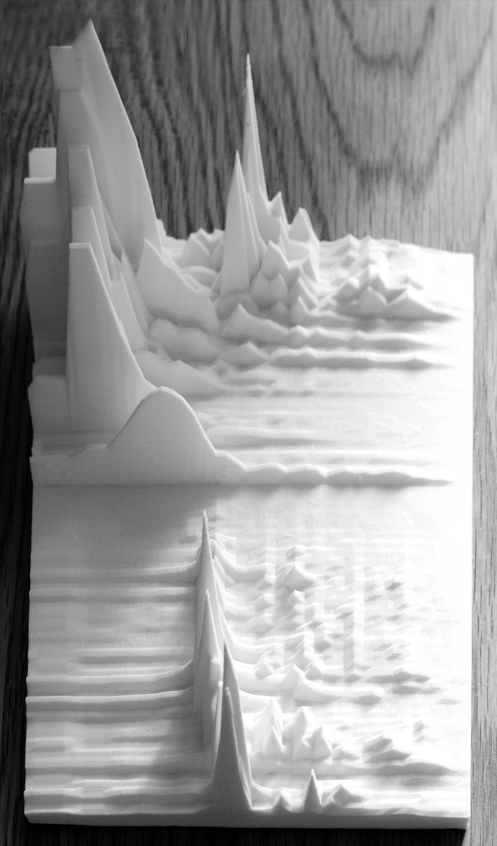
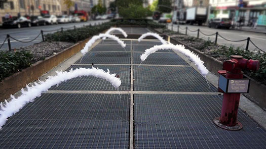
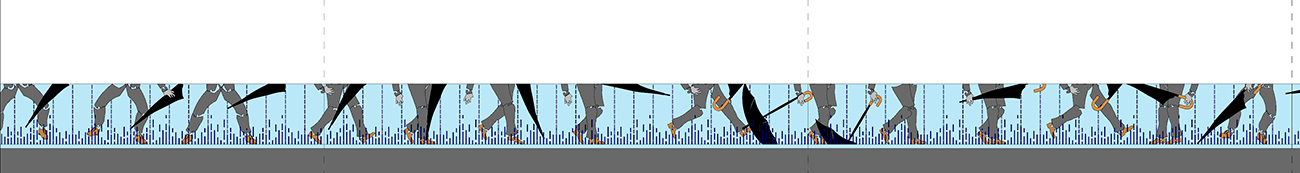
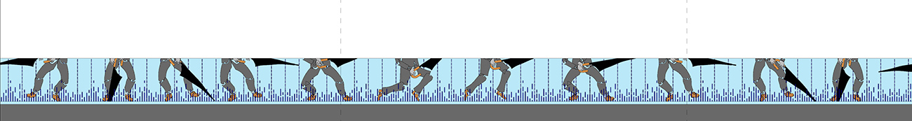
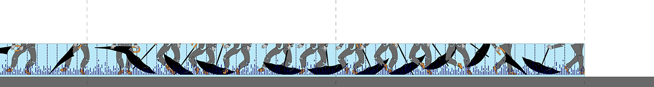
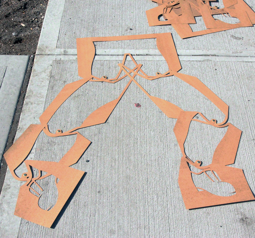
As a firm believer in the you-get-what-you-pay-for principle, I took a few hours off from my finals, and sent off the above image to LIR. My counter-offer was that I would design and document a house for free, everything, on the one condition that he in no way interfers with my creative vision (see img above). I argued passionately and apparently in vain that the house I designed for him would be a sustainable marvel, 100% post-consumer recycled materials, it would utilize a unique geothermal process for harnessing energy from deep within the bowels of the earth that would create a custom steam-exhausting microclimate around his residence, and at the very least would be widely published. All for free. I thought he’d bite at it, but here I am some 21 months later, sitting and waiting. But in the meantime, the offer still stands and is extended to any other random, affluent craigslist poster out there looking for a house and doesn’t want the burden of having to pay a designer.


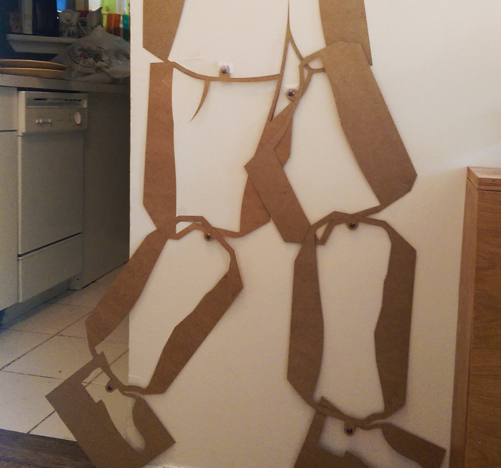
So in parting, keep your eyes open, and if you start to see a number of Massapequa Park Steamers dropping all over a residential neighborhood near you, you can be assured of two things: a) there are some very satisfied architects out there and b) their fee was $0.00.

20101211 Tags: camouflage, graphic design | 1 Comment »

Bomb The Drone

drone_bomb_01
The New Flesh


drone_bomb_02
The Destroyed Buddha of Bamyan


Some drone bombing interventions made for DEMILIT as part of their “minor (open-source) act of insurgent citizenship and imaginative transgressions” against the pilotless drones that we increasingly rely on to fight the the good fight (and sometimes not so good) in Afghanistan.
#demilit #bombthedrone

« Older Entries

COPYRIGHT © 2011 \ JOHN LOCKE \ ALL RIGHTS RESERVED (RSS)

TOP OF PAGE

last update: 201102:1627