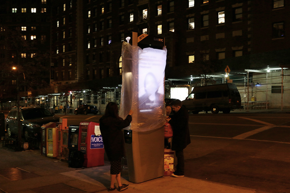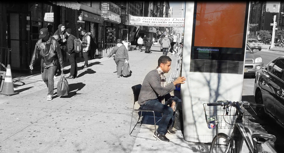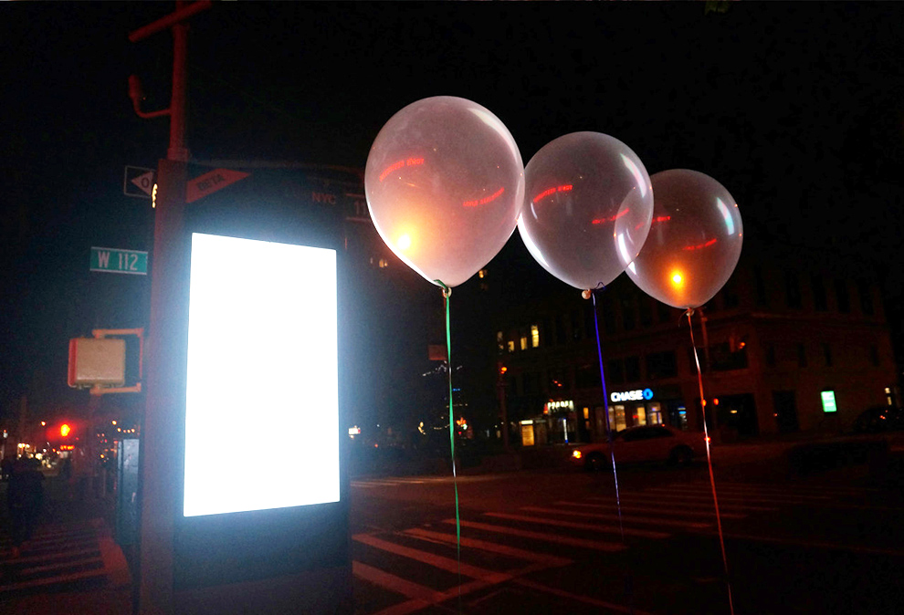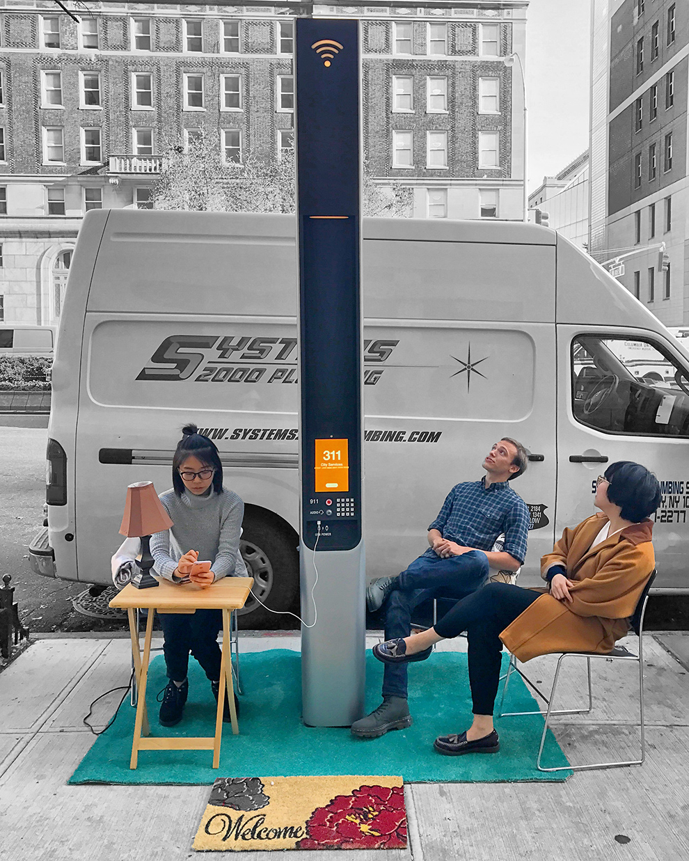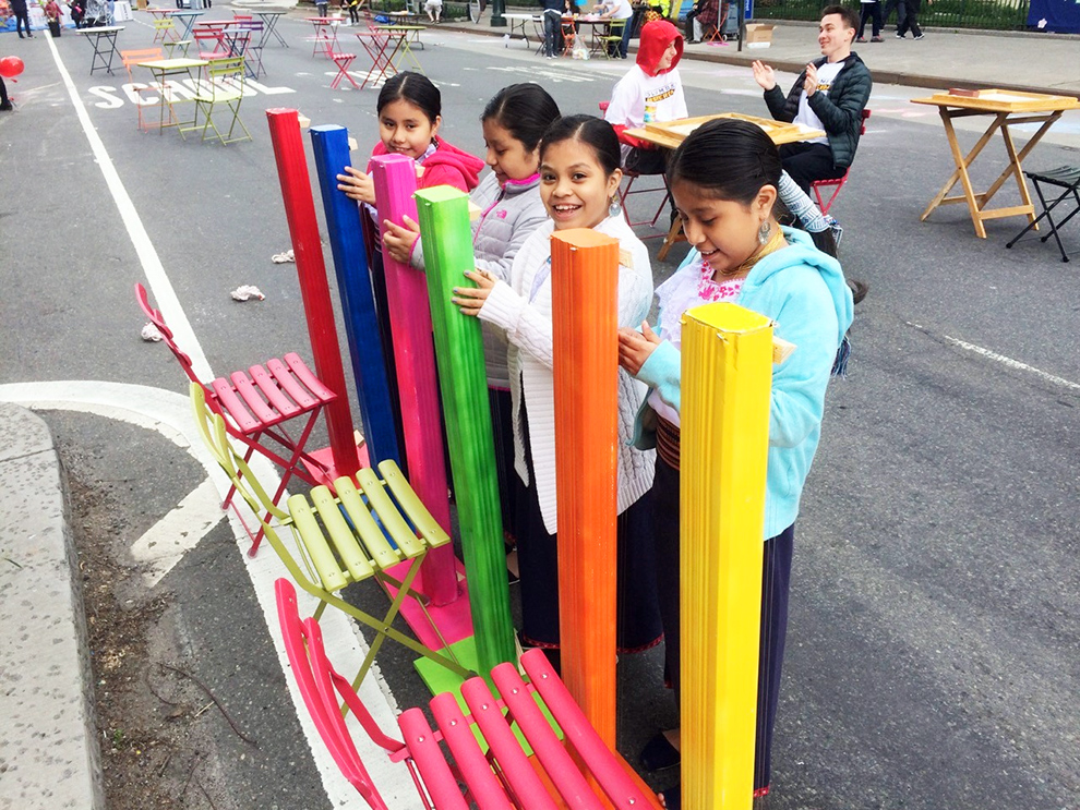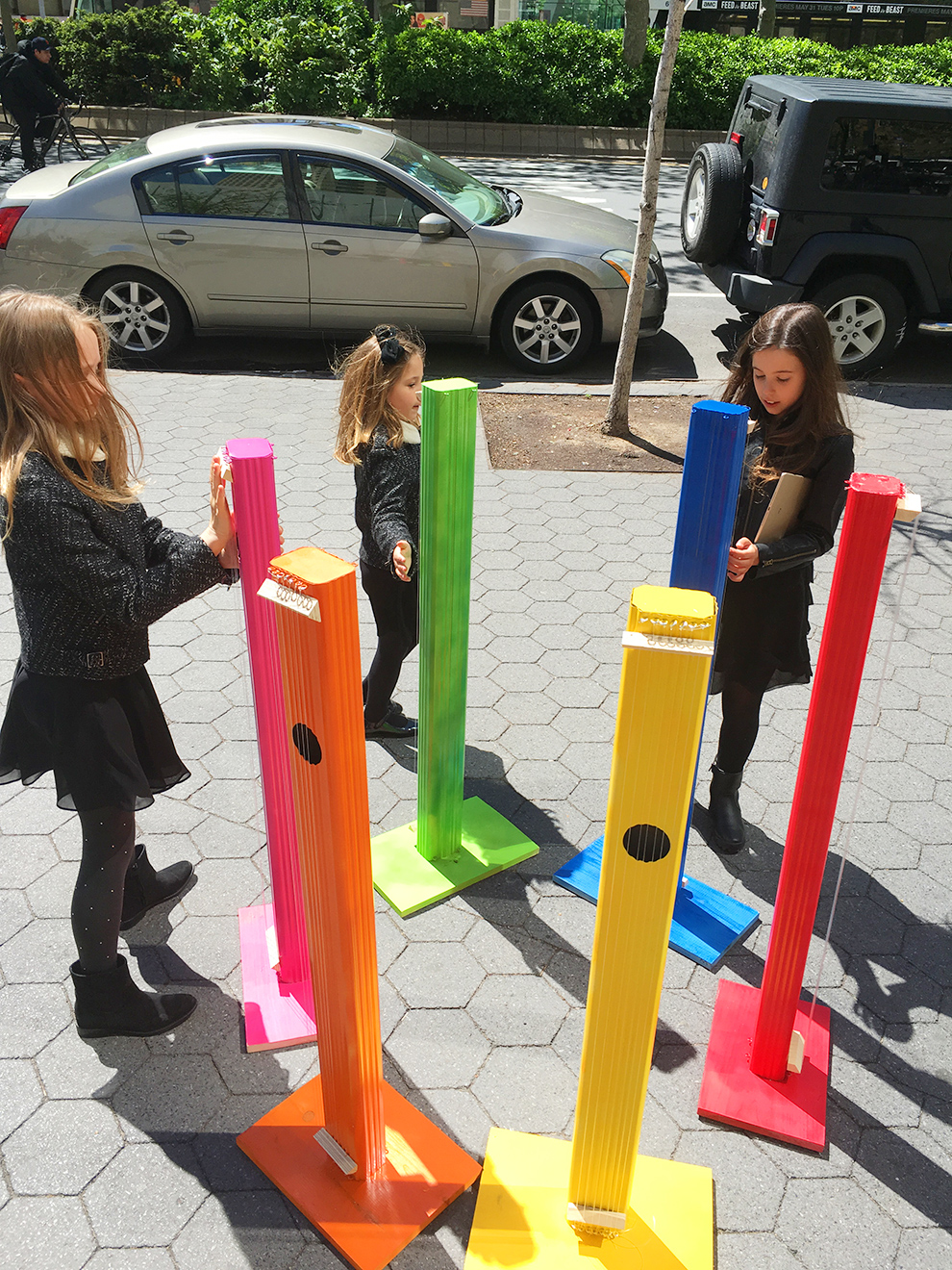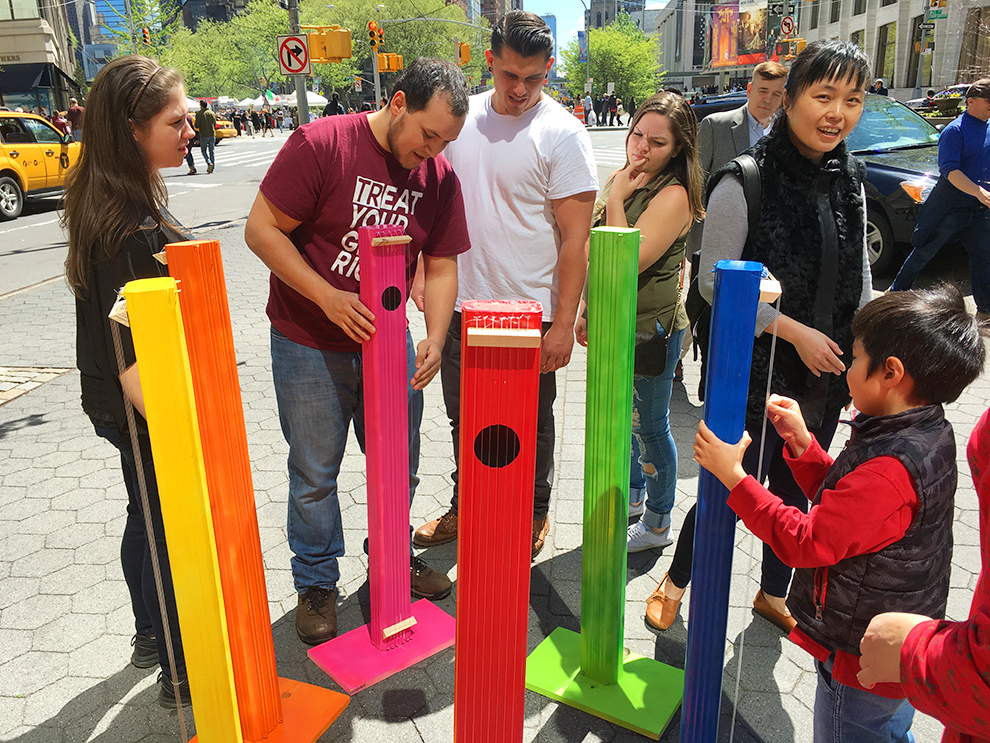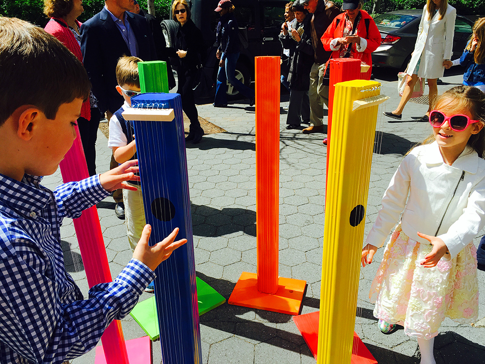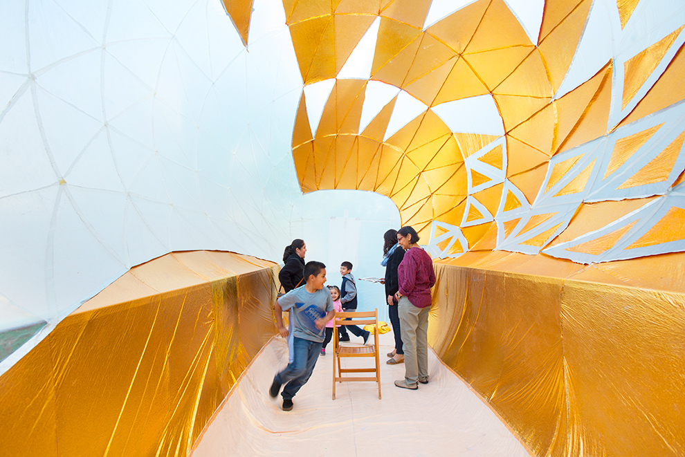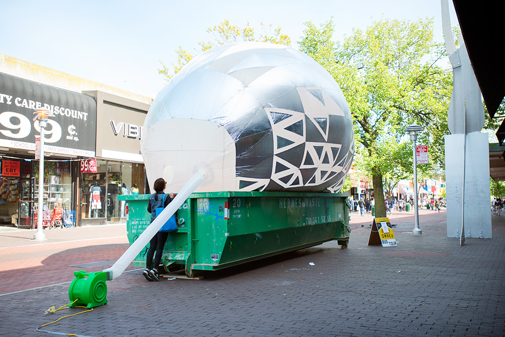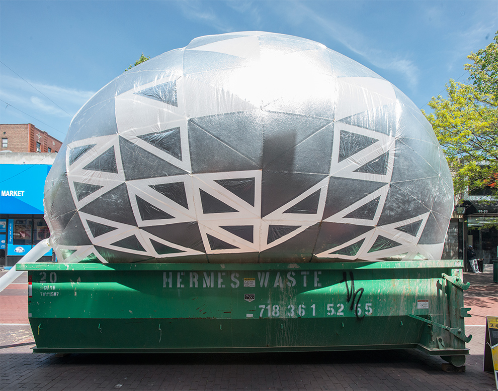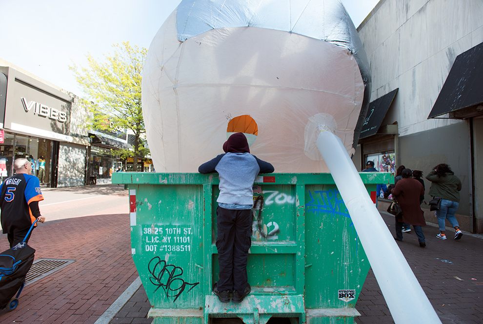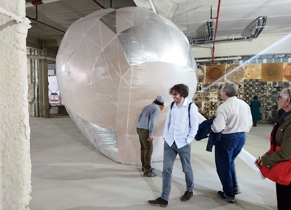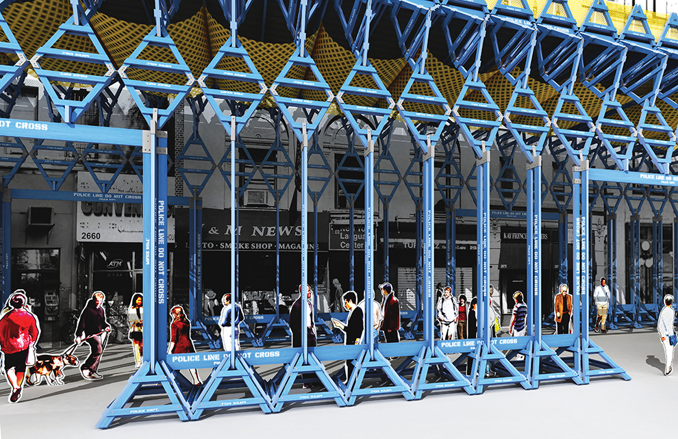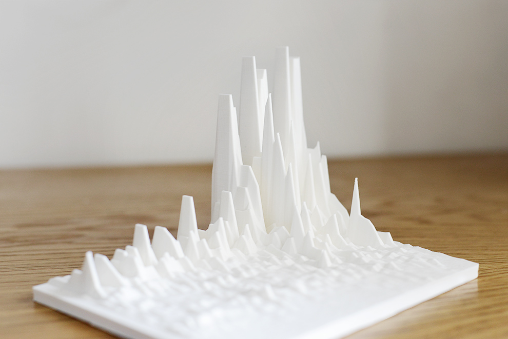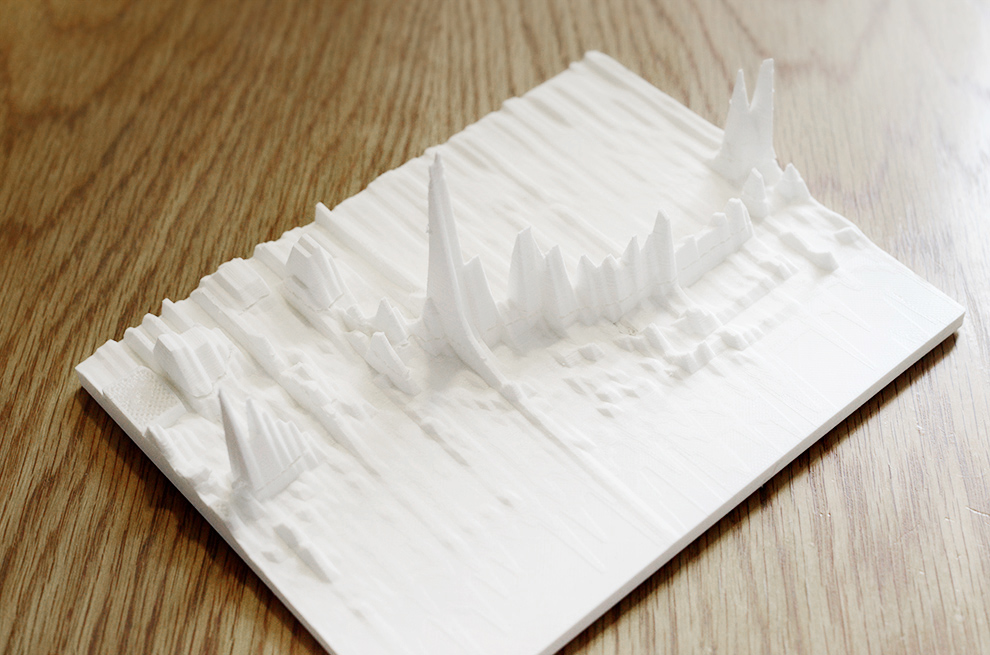
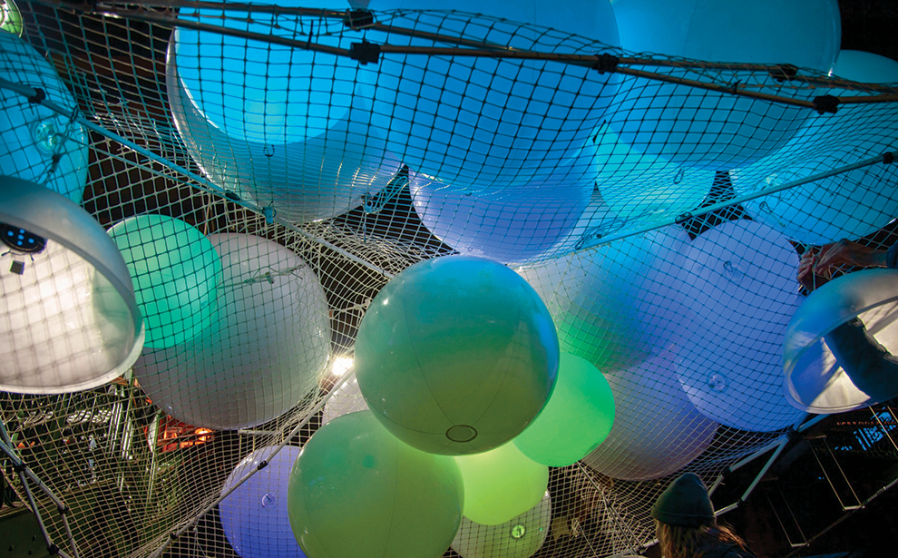
An amazing and talented group of students made something worthwhile and in a manner that I think is unique to GSAPP. Below are images from the final intervention – a mobile sound and light performance space. As a quick overview, we spent the first session reading, drawing, and talking to community groups about who gets to build things in the city and why. What systemic issues result in this urban area being neglected? The second session we worked hands-on and in close collaboration with a number of organizers and community artists including the Uni-Project, Uptown Grand Central, as well as Harlem’s young musician Carlito Ratti. I thought it was very worthwhile for the students to not only work collaboratively amongst themselves, but also to fabricate something meaningful and interesting for actual people to use and experience.
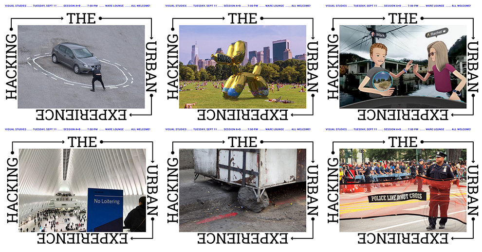
An abbreviated syllabus below, full syllabus here: https://medium.com/@john.h.locke/hacking-the-urban-experience-2018-18f267862c10:
Session A Overview
“Attack current conditions in a manner that will change them.”
– Siegfried Kracauer
“It’s easy to say we need recyclable, sustainable technologies, old and new — pottery making, bricklaying, sewing, weaving, carpentry, plumbing, solar power, farming, IT devices, whatever. But here, in the midst of our orgy of being lords of creating, texting as we drive, it’s hard to put down the smartphone and stop looking for the next technofix. Changing our minds is going to be a big change. To use the world well, to be able to stop wasting it and our time in it, we need to relearn our being in it…”
-Ursula K. Le Guinn, Deep in Admiration (2017)
This semester we will collaborate with the UNI Project (www.theuniproject.org) — a non-profit that creates learning environments in public spaces across New York City — to design, build, deploy, test and defend a 1:1 scale prototype intervention intended to facilitate interactive participation in public life.
How we build, how things are made and for whom, reflects the social, economic, and political values of a community. We have the opportunity to help shape those values in our own neighborhoods. Here, on the street, New York’s key urban questions can be explored and tested. This is where in the words of Michael Sorkin, cities are “distribution engines”, separating bodies and power in to distinct tranches, which require a constant vigilance to break down these spatial inequalities in an endless struggle to maintain free, open space that is accessible to all. We’re now living through the broken failures of neoliberal urban planning, where public benefit has been surrendered in deference to a developer’s personal gain. However, with tactical precision, we will apply ourselves to subverting the systemic decisions that have led us to this point, in an attempt to provide an alternate path forward. We can prove that things, ideas, installations can exist in public space only for delight, outside of market forces.
We will begin with Henri Lefebvre’s assertion for a shared “right to the city”, an essential reading of the urban experience against the privileged inertia of entrenched power, in which a pluralistic collection of citizens must collectively create their city. The temporary activations and assemblages that we develop can lead the way toward an urban environment that provides for the many. In this way, our work should by its own definition be critical, it should merge the social, physical, and experiential, and acknowledge the political ramifications behind architecture and planning in 2018’s America.
This course seeks to assert the relevance of the design and fabrication skills at our disposal as potentialities for increased relevance. Through the re-appropriation and re-imagining of existing urban conditions, the student will harness their entrepreneurial spirit to design and fabricate a working prototype that embraces the messy reality of New York. The student will begin by identifying a quality of the urban condition that includes the latent capability for engagement and work toward fabricating an adaptive, responsive and environmentally viable solution. Specific emphasis will be placed on testing and exploring through hands on research the possibilities of detailing and fabricating using unorthodox materials. Formulating a strong guiding thesis idea will be essential to the project’s success, but the core challenge for the student will be converting a strong idea into physical reality, something to be observed, tested and documented.
Session A Goals
By attempting to capture a broader audience for architectural interventions, a number of questions present themselves and the student will be challenged to anticipate possible eventualities — how will it be used? How can we quickly imbue meaning in our work? How do we engage with different communities? How do we collaborate with outside groups? Fabrication will be considered less from a formal quality, and more from a use, durability, improvisation and public participation viewpoint.
Ultimately the student will come out of the course with a healthy respect for two core concepts: Firstly, an increased skill in the use and applicability of the fabrication skills we have at our disposal for solving design issues using unorthodox materials in unconventional settings; and two, that there is an opportunity for architects to regain lost relevance by inserting themselves through unsolicited proposals into the public consciousness as stewards of urban well-being.
Session B Overview
What can architecture accomplish? Is it merely the competent combination of a client’s given program, site, and budget? Are we merely the credentialed executors of assignments? Or worse yet, is society at a point in which it no longer expects anything from us? Do we now have the courage to leave the safety of the assignment and transform ourselves into entrepreneurs and producers? Our goal will be to reclaim the mantle of empowerment. We will form new alliances with groups outside of the architectural aficionado, and imbue our work with dignity and worth to appeal to the non-architect, the average citizen, the neighbor.
Building off the skills and experience gained in the first half of the class, this second session will look deeper into the possibilities of public fabrications to functionally alter everyday urban encounters. What do common materials mean to people? What impact can form have on the reading of a project?
The goal will be to create a proposal for a mobile installation that can accommodate future progress and participation — a malleable first draft that allows a feedback loop with the neighborhood to give back and evolve together. We will push the notion that learning occurs through making, doing, and interactivity; while giving primary focus to the designing of experiences in lieu of objects. How can you engage with a pluralistic public to have them become a partner in your work? How does that experience become fun, easy, and understandable?
Session B Goals
The temporary final intervention should give you an opportunity to upend the distinctions between public and private. You can temporarily disregard social hierarchies, and choreograph a temporary experience that provides for alternative social encounters and shared urban encounters. New York is a palimpsest of change on top of change, but your temporary work should guide the permanent into more democratic, open, and acerbic directions.
You will learn to collaborate with outside groups, in a project for real people, re-defining notions of authorship in architectural work. You will explore new models of practice, and leave the course with an understanding of how your own form, program, and material assemblages can change urban experiences.
Many thanks to Sam and Leslie Davol at the Uni-Project for all their help and advice, as well as Carey King with Uptown Grand Central for the amazing support.
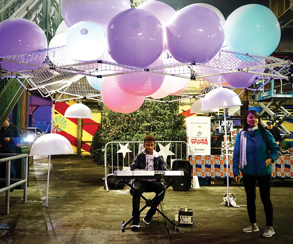
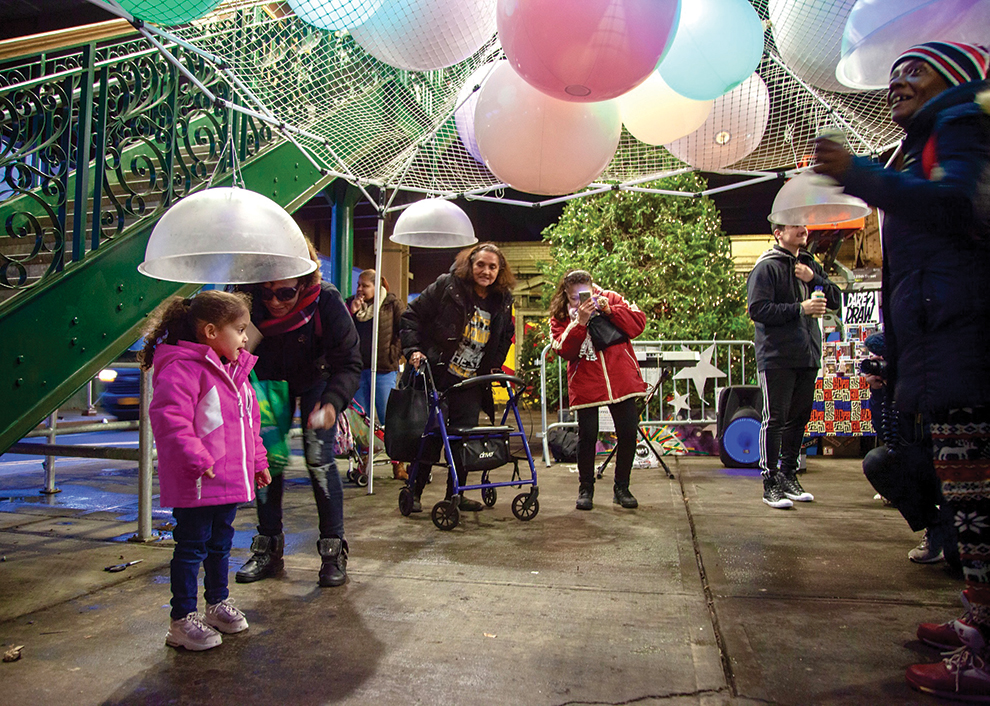
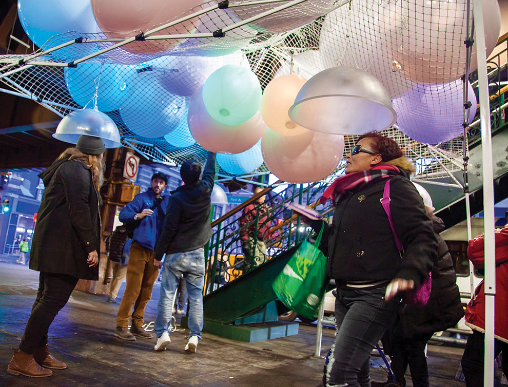
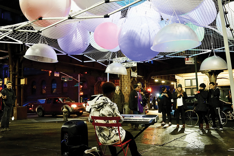
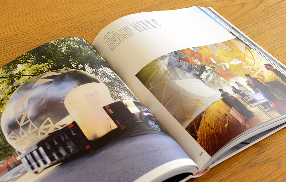
Many thanks to Sam and Leslie Davol for the project photography!
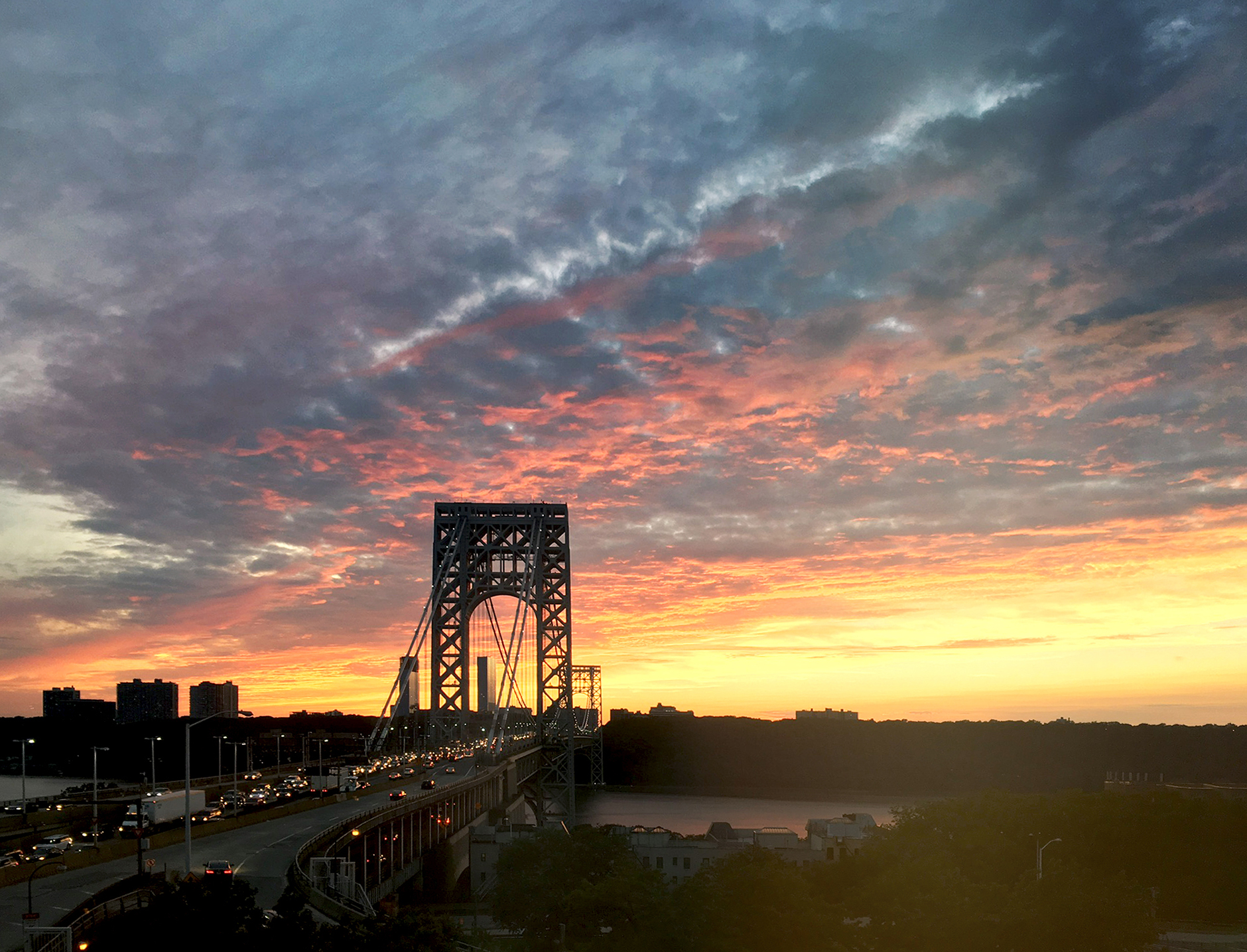
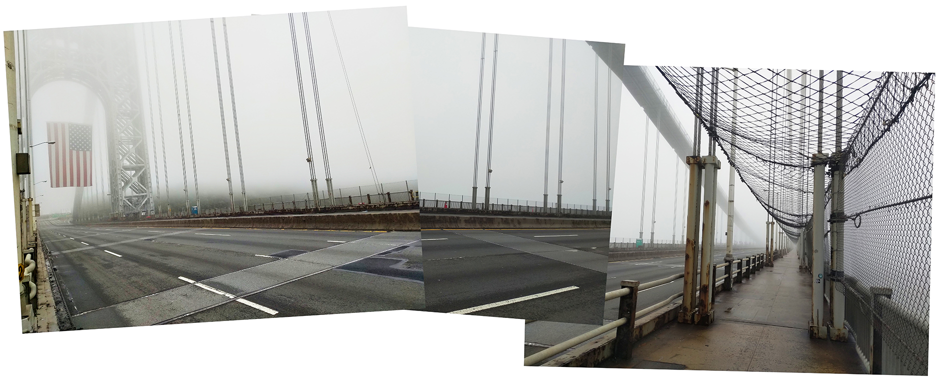
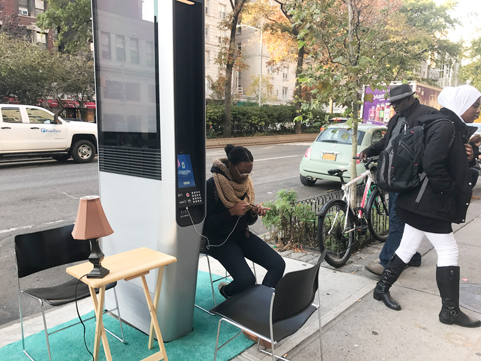
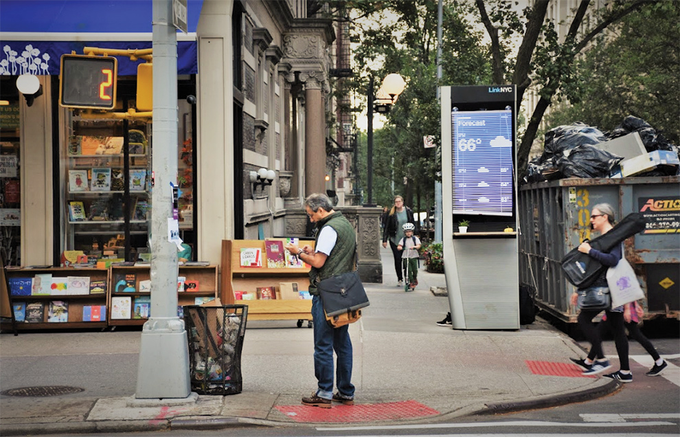
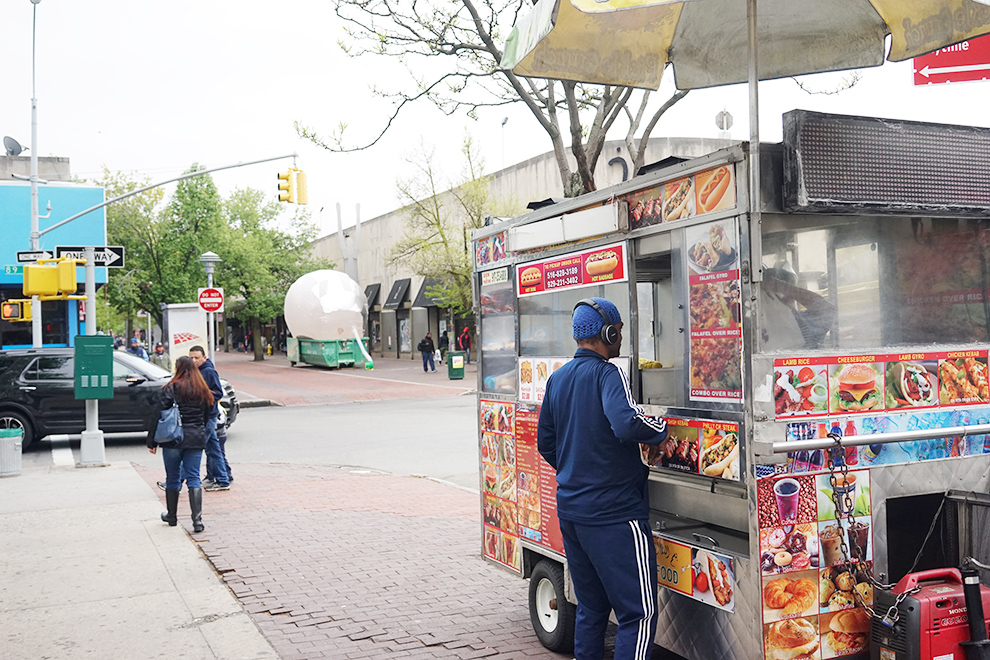
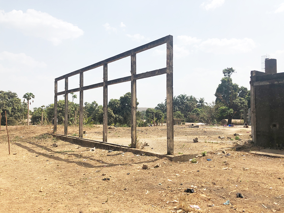 The project site (above).
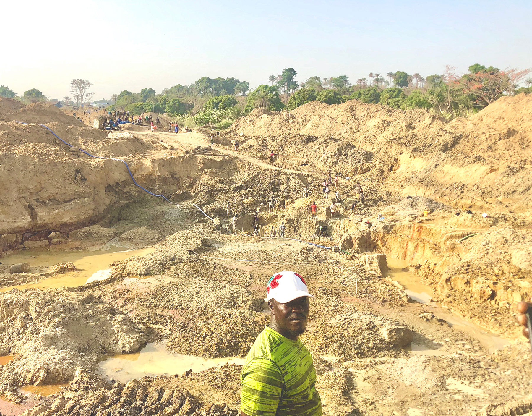

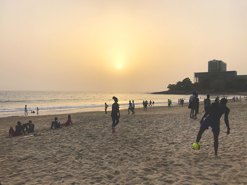 The Freetown beaches are some of the most beautiful and active beaches I’ve ever been to. So many people laughing, walking, and playing together as the sun sets.