JOHN LOCKE, ARCHITECT

  • Featured Work
  • Design Blog           
  • Photography
  • Graphic Design
  • Dept of Urban Betterment

About

Hello. I live in New York and work at The Living. I hold a graduate degree from Columbia University's GSAPP and an undergraduate architecture degree from the University of Texas at Austin. I have more than seven years of professional experience at noted architecture firms, including New York-based Rogers Marvel Architects and SOM. I also tackle freelance graphic and photography work with my partner in crime, the multi-talented Jackie Caradonio at Lion in Oil. In addition, I teach a course, Hacking the Urban Experience, at Columbia. View my CV here: CV(html). Thanks and have a nice day.

Contact

john.h.locke{at}gmail.com
310.735.3333

Architecture Portfolios

Portfolio 2002-2007 (issuu)
Portfolio 2008-2009 (issuu)

HOME / BLOG

competitions

2015119 Tags: architecture, competition, fabrication, urban | No Comments »

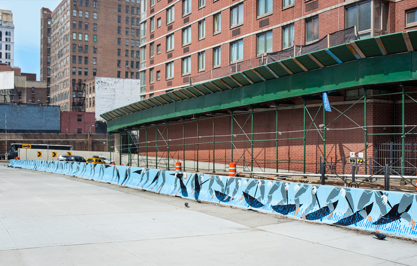
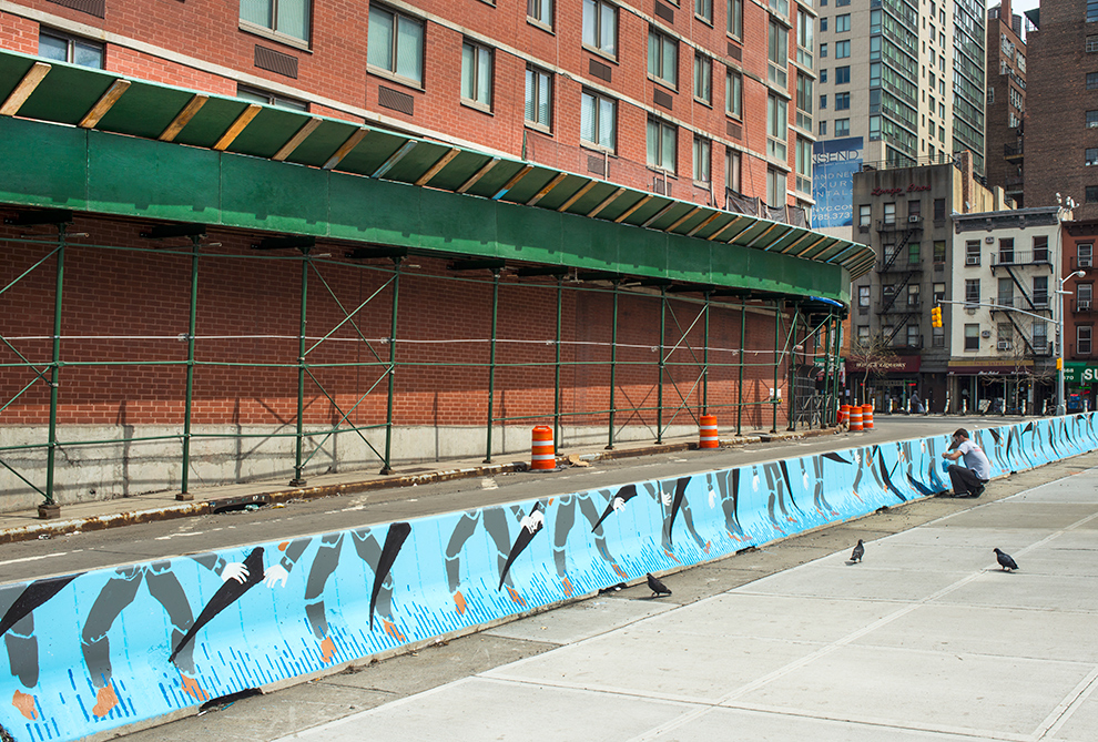
Urban Shed Competition

03_diagram

02_elevation

01_MODEL


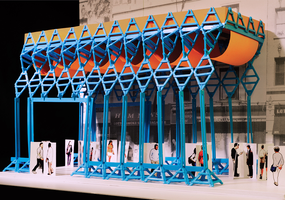
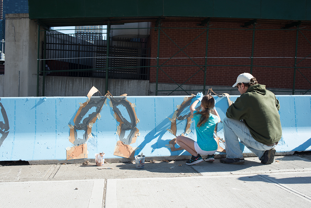
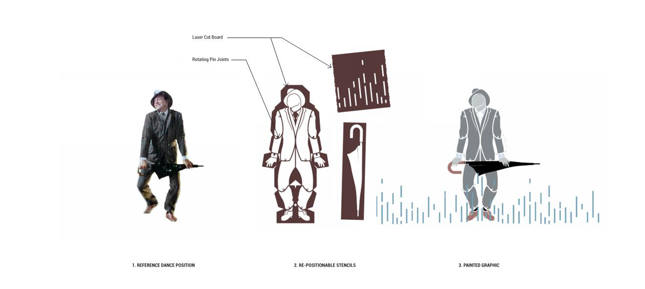
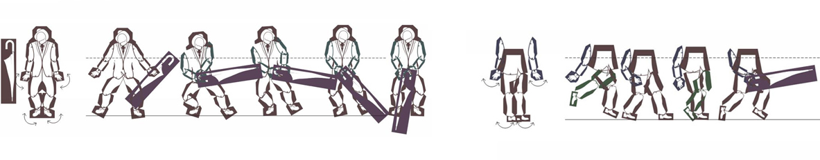
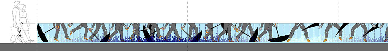
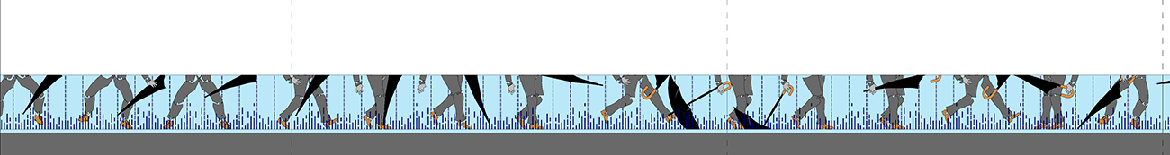
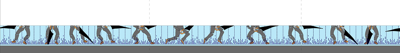
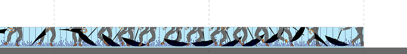
Presented here is a (losing) competition entry for a re-design of the ubiquitous “urban shed” – the pole and plywood constructions temporarily thrown up to protect pedestrians from falling building debris during facade renovations. They are an interesting typology, both because they are everywhere and are also built using pre-fabricated components in a completely market driven approach, every element has been pared down to cost per protective surface. Every couple of years someone tries and re-thinks these things, but due to the cost and existing, entrenched interests, these re-designs never go anywhere. The argument I was trying to push was twofold: 1) taking advantage of an existing material that already relates to street protection could offset costs, and 2) that the design would be exciting enough that building owners could reap some economical benefit through a boost in traffic flow by putting up something like this. Project text below:


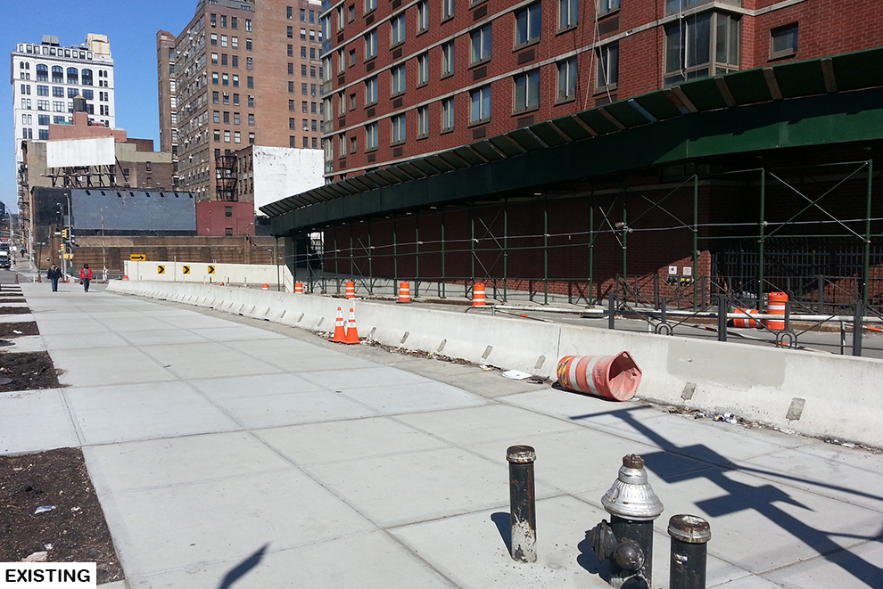
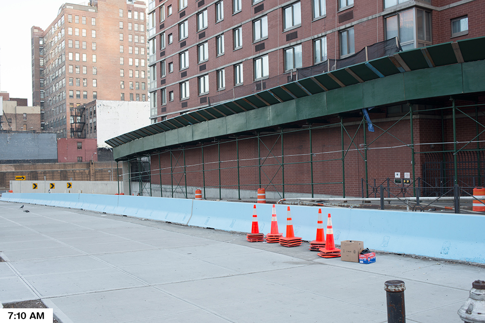
A city manifests itself through its architecture, its built form represents its values and priorities. This ideas competition hosted by the New York Building Foundation is an amazing opportunity to explore how the city and building owners will proceed to treat what is in many ways the most modest and ubiquitous of architectural elements, but one that we all encounter each and every day – the construction shed.


The questions before us are simple, will the form of the shed continue to be dictated by that which presents the perceived lowest cost per sf? This is a notion dictated more by complacency and inertia as opposed to New York ingenuity and data-driven metrics. Or, will the shed evolve into a form as slick and scaleless as the latest glass and steel construction, furthering the ever expanding gulf between New Yorkers and relegating architecture and engineering to the realm of a luxury item. Or, will it pursue a sustainable, iconic, human-scaled solution, which can adapt to changing needs in neighborhoods as diverse as ours?


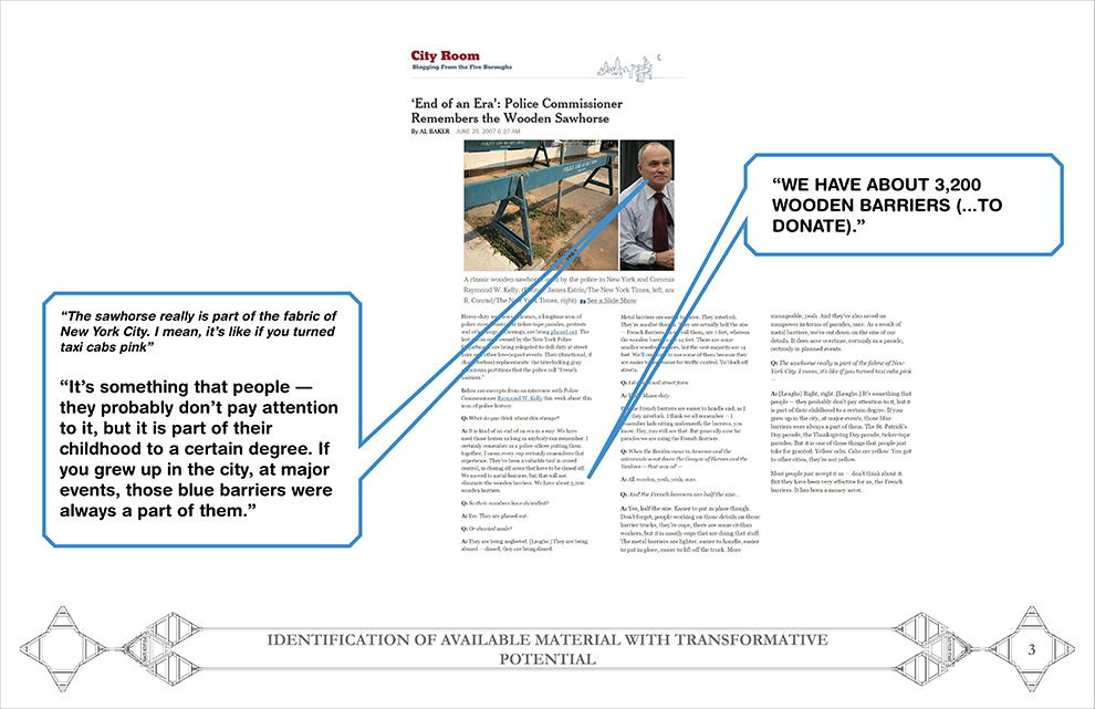
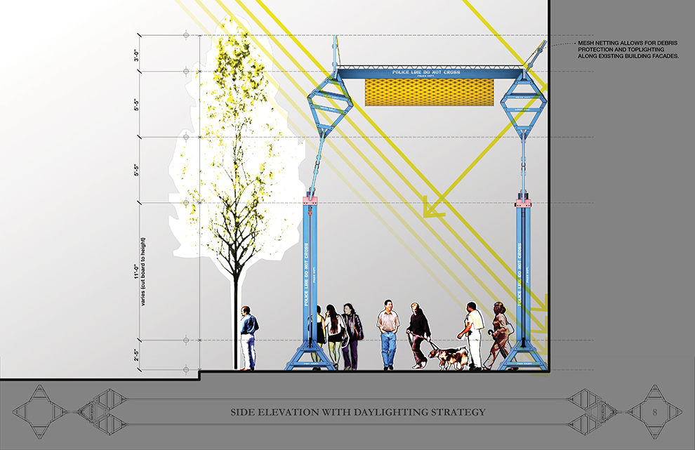
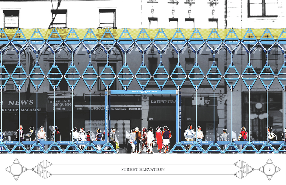
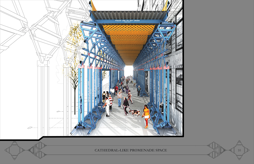
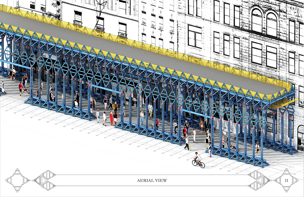
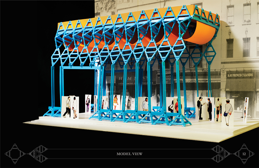
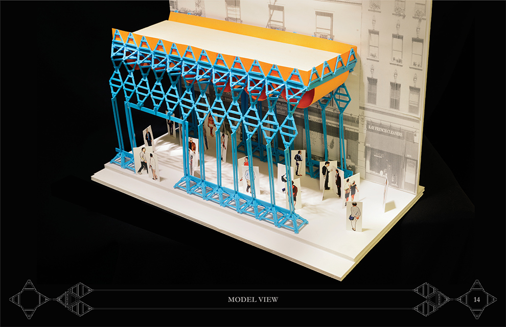
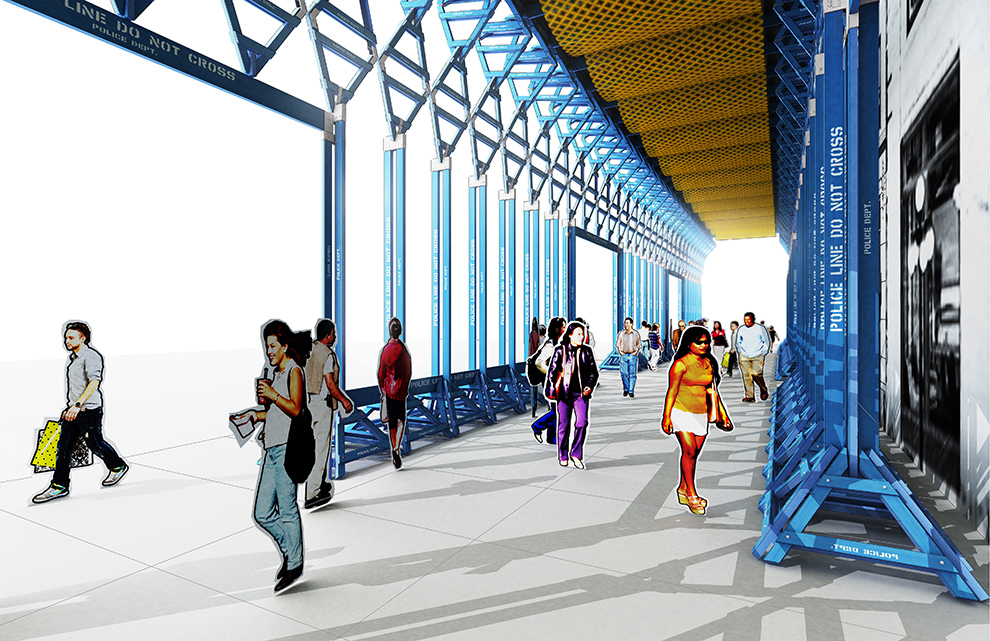
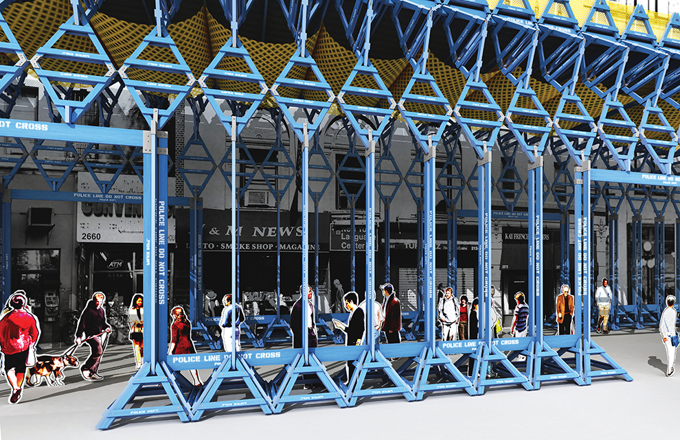
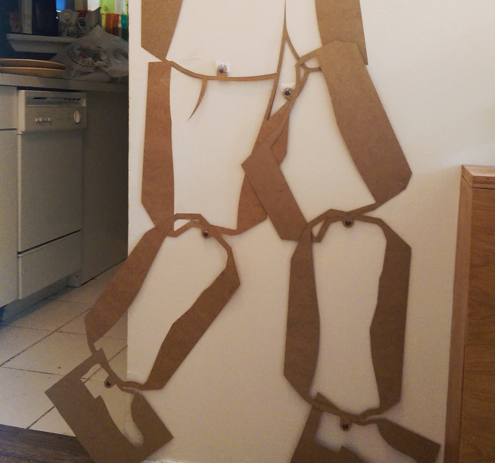
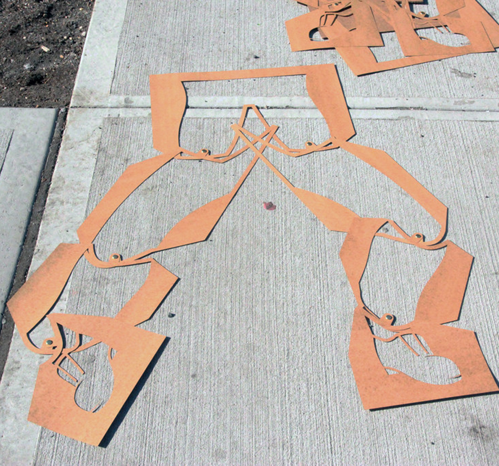
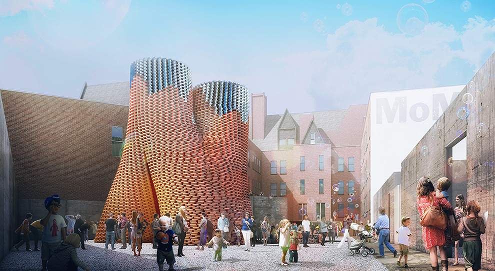
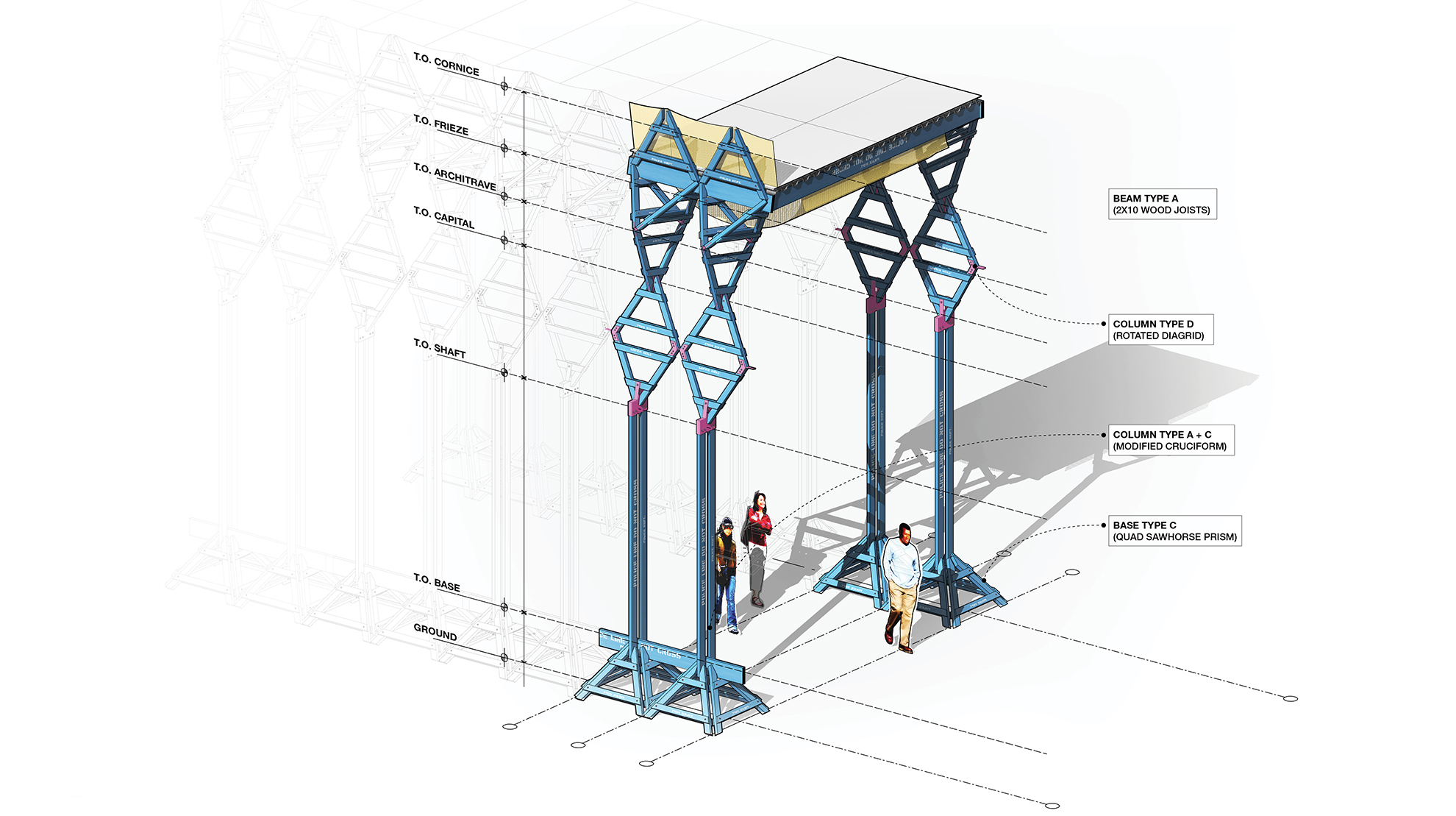
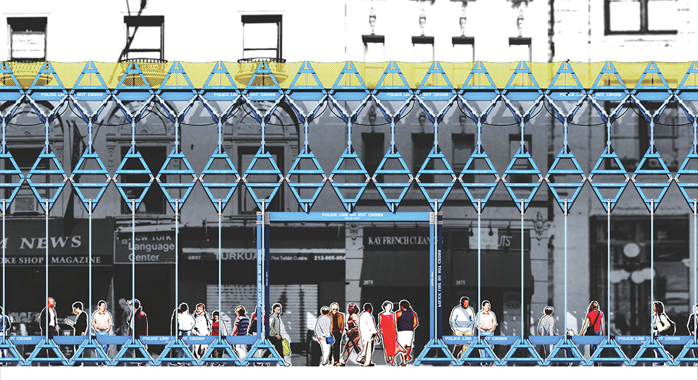
The proposal included here envisions a future construction shed built from reclaimed NYPD wooden sawhorses. These sawhorses were retired in 2007, but they are still available for donation and hold a prominent place in the collective consciousness of the city. Their familiarity with New Yorkers imbues them with an ingrained acceptance to their position as part of the urban streetscape – like seeing an old friend again, but their novel use here, elevates the basic construction assembly into an uplifting form that makes the shed into something more than pure tectonics.


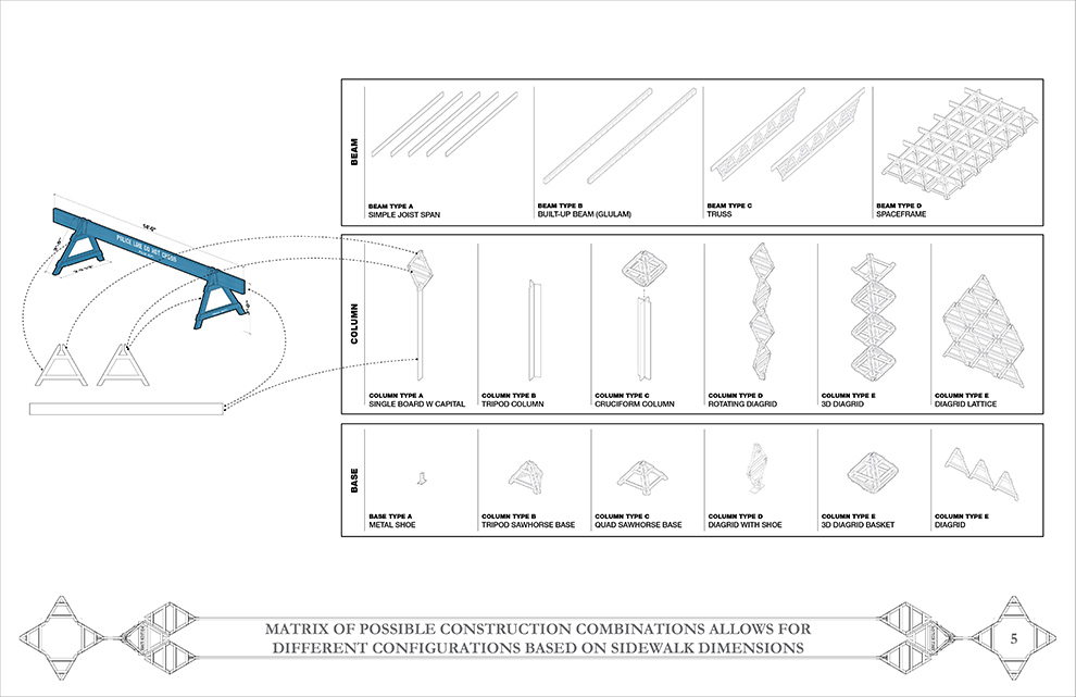
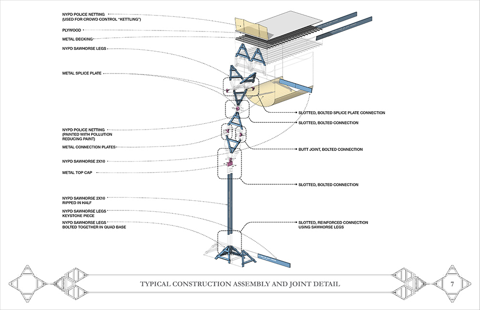
They also present us with an opportunity to acquire a readily available, highly-durable material for a low-cost. In a practical sense, the sawhorses in their previous life as crowd control devices had to withstand a number of structural requirements. Here, the existing sawhorse connection techniques – slotting, nailing and screwing – are used again, this time to withstand a vertical load through multiple connecting load paths and redundant connections that will meet and exceed Section 3307 of the New York City Building Code. Wood also allows for ease of assembly through cutting of pieces and through the use of inexpensive attachments and fasteners as required.


Lastly, this design represents the transformations inherent in the evolving city over the last 50 years. The NYPD wooden sawhorse material here is no longer one that restricts movement and creates artificial barriers in urban space, but rather it is put to a new purpose, one that enables free and open movement while providing shelter and protection for all.


Locke-Urban-Shed1Locke-Urban-Shed2

Locke-Urban-Shed3Locke-Urban-Shed4

Locke-Urban-Shed5Locke-Urban-Shed6

Locke-Urban-Shed7Locke-Urban-Shed8

Locke-Urban-Shed9Locke-Urban-Shed10

Locke-Urban-Shed11Locke-Urban-Shed12

Locke-Urban-Shed13Locke-Urban-Shed14

Locke-Urban-Shed15Locke-Urban-Shed16

 
20140428 Tags: competition, fabrication, graphic design, interaction, new york, urban | No Comments »

Muybridge + Kelly

overall
Final painted barrier
final01
NYCares Volunteers paint the barrier
install

stencil-design
Stencils with movable joints
stencil-design-03

Barrier made of (10) 20′ long modules
SECTION-01-rev

SECTION-02-rev

SECTION-03-rev

SECTION-04-rev

Stencils laser cut out of oil board with rotating brass pin joints
stencil01stencil02
200′ of barrier painted in 4 hours
corner-01corner-01corner-01corner-01

corner-01corner-01corner-01corner-01

corner-01corner-01corner-01corner-01

NYCares volunteers painted barrier number 10
install02
Final painted barrier images
final_01final_02

final_03final_04


My design for “Singing in the Rain” was commissioned by the NYC DOT as part of the Urban Art program to Beautify Barriers throughout the city. The site is located just South of the theater district and Times Square at 36th St and 9th Ave in Manhattan, and references musicals – especially one in particular – as well as motion, animation and street rhythm. The piece will be up for 1 year and made use of a series of movable stencils of figures with articulated joints to allow for variation in the 200′ barrier length. 20 awesome volunteers of all ages participating in the NYC Cares program (many who had never picked up a paintbrush before) were able to arrange the stencils and finish painting the design in 4 hours based off of a series of detailed instruction sheets.

2014025 | No Comments »

We Win!

ps1_2014
Coming to a PS1 courtyard near you in June!


http://www.archpaper.com/news/articles.asp?id=7086

20130511 Tags: architecture, competitions, fabrication, graphic design, urban | No Comments »

This space could be…


To generate interest and excitement for our BLOQ PARTY proposal, we wanted to start a conversation by showing how the program elements we produced could potentially activate the competition site. Competitions, design proposals and urban space planning oftentimes fall under the radar of the actual users of the site who are both unaware that a competition is taking place and then have no voice in the process or outcome. The plastic signs are intended to link the digital proposal to an actual physical space – less obscure websites and more public posters. It also helped to see how our space division laid out on the actual site, we had treated the eastern, narrower plaza area as space for movement and dynamic interaction – biking, running, skating. The western, more generous plaza was designed for slower, more spontaneous meeting areas. We hope the signs can begin to create a diaglogue for the best use of the space including potentially new and different program ideas that can eventually bring the space to life in a vibrant manner for all.

2013053 Tags: architecture, competitions, graphic design, urban | No Comments »

BLOQ PARTY


Designed with Mark Bearak and Yuval Borochov


What began as a competition for a temporary rehabilitation of an existing chain link fence along two blocks – adjacent to a pair of parking lots – quickly became a more encompassing proposal as we realized the latent potential of the two narrow, un-programmed plazas bordering the modest chain link fence. Located at the Delancey Street connection to the Williamsburg Bridge, the site acts as the symbolic gateway to the Lower East Side for those leaving and entering Manhattan, and as such, displays a great wealth of untapped design opportunity. As a temporary proposal of less than 5 years duration, we identified a variation of possible plug-in nodes that could be used to test ideas for the site and generate community engagement by bringing the scattered, diverse collection of LES attractions together at the fence, displaying the street-level density and multiple, overlapping functions that have historically characterized the LES. Budget and business plans were also developed to illustrate the feasibility of a more ambitious program at the site through a variety of funding and sponsorship options.


PROJECT DESCRIPTION:
The possibilities of programming a BLOQ are endless, ranging from a bike repair station, to a satellite location of a Lower East Side business, to a concert venue stage. Each block will have its’ own identity, but share geometric cues from its neighbors. In our proposal we will aggregate 16 BLOQS that will serve as a gateway to the LES while also providing an oasis of attractions within the neighborhood.
The site will consist of two city blocks and each section will have its own identity. We call the Eastern section the PIT-STOP based on its adjacency to the Williamsburg Bridge and its planned programmatic functions. The BLOQS located in this section will serve as a way station for pedestrians heading to Brooklyn or entering the LES. This section will have BLOQS with services such as bike repair, coffee and skate gear.


We call the Western section the CHILL space and we will treat it as more of a destination. The width of the site allows for larger gatherings of people who can congregate into the farmers market or catch a drink at the pop-up bar. Our proposal represents a handful of potential BLOQS; over the life of the project there are endless possibilities for temporary and permanent installations.


Further exploring the actual BLOQS, each zone will be defined by a fence which will act as a billboard for the community and patterns placed along the ground. Each section of fence will be a billboard representing an actual block of the LES. The design of each section of the fence will be a series of parallelograms that advertise local businesses within the represented blocks of the LES. The parallelograms will be colored based on following four categories: Shop, Eat, Explore & Nightlife. The adjacent ground will be a continuation of this theme containing patterns unique to each BLOQ.


The most liberating feature of the BLOQS will be created when the fence is used as a jumping off point to an architectural installation. We will bend, fold, cut, extend and warp the fence to accommodate the unique functions of each BLOQ. In some cases the drama of the gesture will be relatively modest; in the case of the market the fence will simply be extended horizontally to create a canopy to protect the produce. In more complex situations, structure and furniture will be built off of the fence to create a space suitable to host large groups of visitors. One of the largest BLOQS will be composed of a bar, stage and viewing area built within the distinct vocabulary of the installation.


The main purpose of the BLOQ installation is to activate the space. The BLOQ will not only serve as a gateway to the LES, it will serve as a destination for all New Yorkers. The project will never be static and its potential can be tested over time as the project evolves to suit the changing needs of the community. Eventually the project will not only be a representation of the vitality of the neighborhood, it will also serve as a benchmark for the evolution of the Lower East Side.


http://newyorkcity.arthere.org/art/bloq-party-2/
http://lesbloqparty.com


Existing Site

20130113 Tags: architecture, competitions, fabrication | No Comments »

Continuous Contour


Looking North from the Sculpture Park


Assembly Diagram


Elevation Looking West


Site View


Typical Connection Diagram


Quick Project Description
Continuous Contour is a folly built from one single 1050’ length of rope – sourced in Long Island City and hearkening back to the area’s historical role as a center of nautical manufacturing – as well as a series of guide wires and steel rings. Evoking a contour drawing where the pencil never leaves the paper, this rope becomes a continuous, eccentric line that winds its way through a series of metal rings to transform into a phantom geometrical construction, capturing space with visible boundary lines while still remaining imminently temporal and open. The folly proposal comments on architecture’s attempt to force order on the natural world by highlighting the impractical tension between the rigid, recognizable cubic forms and the seemingly chaotic guide wires that connect to the naturally occurring trees that circumnavigate the site. This forms a contradictory structure that is both delicate – being able to sway along with trees and grasping hands – but also completely in tension and dependent on each node to remain standing.


Description
The folly Continuous Contour is constructed from a number of locally manufactured and off the shelf materials. Long Island City was once a hub of naval construction and the area still retains some capabilities for producing nautical components, cotton rope primary amongst them. This became the basis for the design proposal and the main feature becomes a single, continuous line of dyed rope facilitating an investigation into the latent possibilities inherent in the material’s strength for flexibility and manipulation.


Architecture school begins with drawing, and one of the first methods taught in the development of a young architect is the contour drawing method, essentially a line drawing that traces the outline of a given subject – a simple means of emphasizing mass and volume on a flat two-dimensional surface. In Continuous Contour the subject becomes spactial and is manifested in a three-dimensional construction that forms the outline of a number of cubic forms that tumble about the sculpture park appearing to take flight as they near the water line. A canvas or plastic tarp is affixed to one side of the forms to potentially provide shade or a projection surface while further emphasizing the geometry. The single approx. 1000’ strand of the rope winds through a series of metal rings, back in on itself and then away again to form a unified decorative agglomeration. The eye can delight in following the eccentric path of the rope, tracing its voyage as it weaves through the park, transforming from a material that connotes a coiled, resting mass into a temporal folly that is now slightly recognizable as something structural. The folly defines space, both within its individual forms and within the park, defining zones of play and contemplation. However, as the folly is merely an outline – the graphical representation of space constructed from a linear material – it is inherently empty and creates a dramatic tension from the play between the two contradictory notions of void and outline.


The rigid, recognizably intentional geometric forms are held in place by a delicate system of guide wires attached to the park’s trees and a minimal number of ground anchoring points. The guide wires are constructed from flexible steel rope and a number of standard connection systems, amongst them stainless steel rings and carabiners. The folly comments on architecture’s ambition to manipulate forced, ordered forms out of the chaos of nature by emphasizing the seemingly chaotic web of guide wires required to stabilize the cubic volumes that appear to hover above the ground. The overall structure of the folly becomes delicate in one sense, in that it gently sways in the breeze in tune with the supporting trees, while the effects of someone tugging on the rope on one end are felt and seen as a rippling throughout the overall system. The folly is then at once elaborate and extravagant, necessitating a detailed site survey for tree locations and a complex system of guidewires in tension to form the node points, while it is also built from modest, common materials.


After the exhibition ends all of the materials can be easily reused and recycled into a number of alternate uses. Due to its softness to the touch, cotton rope is frequently used in railings and could become woven together in a net or other shape to make a wonderful addition to a number of city playgrounds. Likewise, steel rope is frequently used for railings and other tensile applications, but can be easily melted down and recycled.

20120911 Tags: competitions, fabrication | No Comments »

Light Caryatids


3D model of the Caryatids at the Temple of Erechtheion, constructed from flickr images and Autodesk’s 123D Catch. A little buggy, but close enough.


Sited at the corner of India and West St. in Greenpoint, the project situates itself as a gateway, a ceremonial entrance to Pier 11 and the East River Ferry. The four Caryatid models are milled out of standard Dow rigid foam insulation.


Activating the fluorescent lights allows wattage to bleed through where the foam material is thinnest, illuminating the ghostly forms of four of the maidens. The four foam panels match the rhythm of the warehouse windows above and reveal themselves as non-loadbearing elements, while still taking the expected position of structural elements – placed under the building’s overhang. Here light takes on volumetric properties, giving life to the caryatids and briefly rendering them in an effervescent glow that contrasts with their current Hellenistic confinement, hewn from Grecian stone and forever supporting the Porch’s entablature above.


Projected budget: $415

2012072 Tags: camouflage, competition, graphic design | 1 Comment »

crystal camouflage


Continuing my love of camouflage and painting jersey barriers in a way that is probably too heavy on the new aesthetic vibe, but sill enjoyable nonetheless.


Related: Satellite map images with missing or unclear data

2011091 Tags: camouflage, competition, graphic design | No Comments »

razzle dazzle

razzle02


Inspired by both razzle dazzle camouflage and my middle school trapper keeper, this barrier entry presents a strong graphic face to the street. While the concept of camouflage may certainly seem like a contradictory tact for a protective barrier whose sole purpose is to remain unhidden, by using bold, angular geometric forms to blur the barrier’s edges, this in fact increases its perceived range. The illusory effect of the forms induce nearby traffic to slow down, producing a safer, more bike and pedestrian friendly thruway.


razzle01

20110728 Tags: competition, fabrication | No Comments »

light it up

light_02
light_013


With a budget under $300, the installation is realized as a spatial prototype for how a fleeting work can provoke an increased engagement between users and public space. Built with over 200 led lights and conceived to take maximum advantage of a temporarily repurposed historic building, the work becomes as ephemeral as a passing comet, creating a new constellation in the night sky, visible from the streets of Brooklyn for one night only.

2011057 Tags: competition, graphic design | No Comments »

high five, or: no brushes needed

conccanvas
A mural designed for a competition as part of a public art/farm space in the Bronx. The design started simply enough, with a walk through the Bronx and seeing the message “being great is the best revenge” scrawled across an abandoned mattress. The sentiment seemed to aptly sum up the spirit of possibility and potential inherent in every one us that has ever been underestimated or ignored. This led to the method of application of the message – not with paint on brush, but rather by paint applied directly via the volunteer’s hand, slapped down with conviction on the concrete canvas. Each unique creator becomes part of the final composition, through an emphatic gesture that is sometimes messy, with colorful fingerprints and palmprints merging together and breaking out of the geometrical lines of the fonts. The mural and painting technique will unite all those that volunteer and create a lasting memory of community togetherness.


I finished as a finalist, congrats to Oscar Lopez for a great winning entry.

20110225 Tags: competition, graphic design | No Comments »

a city of private eyes

barrier011

barrier02c


For a jersey barrier competition submission, we started with an iconic New York quote from Agatha Christie as indicative of the city: “It is ridiculous to set a detective story in New York City. New York City is itself a detective story,” and played off the recurring themes of mystery and dual meanings inherent to the make-up of our city. New Yorkers strive to challenge themselves, whether by running through the park during the marathon or following their career dreams, and we wanted to elevate something that is typically a solitary challenging act pursued underground in the subway – solving sudoku puzzles – to the street level, making it a communal, shared act. The design then works simply on two levels, as both a reflection of the city, and at the smaller scale, of the acts that makes New Yorkers such apt problem solvers.


The design will be quick to apply. Using only a limited color palette and a repeating stencil system, we will be able to economically create a bold, colorful graphic statement that will encourage all those that walk, bike, and run by the barrier to think about and interact with their great city.

2010117 Tags: competition, graphic design | 2 Comments »

jersey barrier mural

web05a

A quick competition entry Jackie and I put together for a mural to be painted on a jersey barrier somewhere in the city. The murals are painted by a dedicated group of volunteers over one beautiful NYC fall day, so instead of specifying a fixed design, we proposed a set of instructions that the volunteers could perform relating to the types of gestures that are associated with travel and roads, turning the act of painting the mural into a type of game. We designed new types of brushes that are attached to runner’s legs, bicycle wheels and extended from automobiles to create an abstract layering of movement vectors.


Running


Running


more »

20100620 Tags: architecture, competition, grasshopper | 6 Comments »

inflatable mobile voter center

street_view
A quick entry I put together for a mobile voter registration and information center competition which had a pretty cool set of limitations – it had to be under 1000 dollars, fit inside a 3’x3’x3′ box, and be assembled and ready to hit the streets by September. The immediacy and modest budget were compelling and a nice change of pace. An inflatable structure was used to get around the rigid packaging requirements to produce the maximum volume to surface area, that, and I really dig the giant inflatable union rat that has been popping up around lower Manhattan streets. Unfortunately and inexplicably, the deadline was pushed back to 2011 (which is not an election year) so I guess I’ll be waiting to see how I did.


concept1
concept
The gesture of the “i want you” poster was extruded and placed in a cylindrical shape for maximum exposure. Each arm becomes a customizable exhortation to vote and the end cap can be written and erased with a dry erase marker. The gesture is returned by the prospective voter who has to reach into the arms and place the completed form inside the unit.


dwgs


inflate
assembly

more »

20100117 Tags: competition, graphic design | 1 Comment »

wtc construction fence proposal

wtc01


Jackie wrote a great project description for our competition entry for a fence around the world trade center construction site: What makes New York’s skyline so powerful is not the skyscrapers themselves, but the void between and around them, the vibrant hues of sky that hug their every angle. Skyscape focuses on that negative space in a site-specific work that combines photographs of the space above the construction site taken from surrounding boroughs over the course of a single day. The idea is that, not only will our skyline change dramatically with the addition of the Freedom Tower, but the shape of the sky itself, the space it encompasses, and therefore, the relationship between the buildings, the sky, and us will change. We still recognize the buildings’ forms, but they become the void—the sky is now the subject.


wtc02


more »

« Older Entries

COPYRIGHT © 2011 \ JOHN LOCKE \ ALL RIGHTS RESERVED (RSS)

TOP OF PAGE

last update: 201102:1627