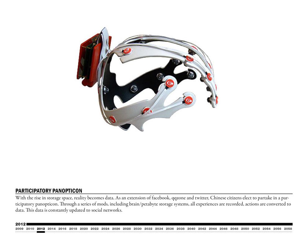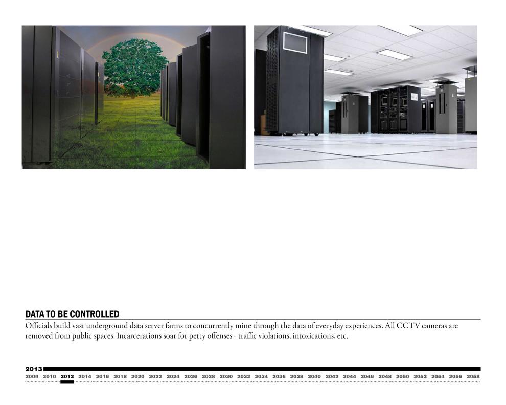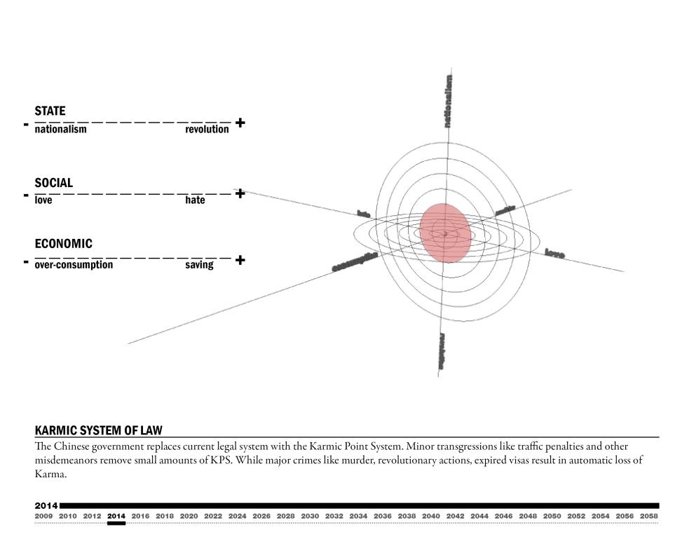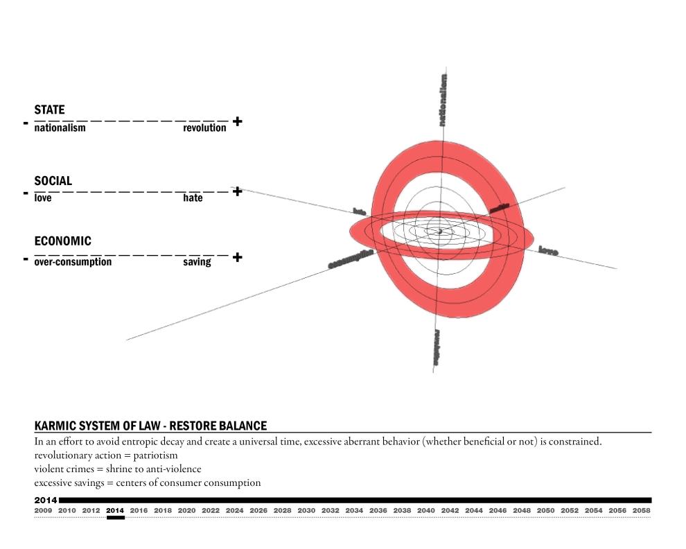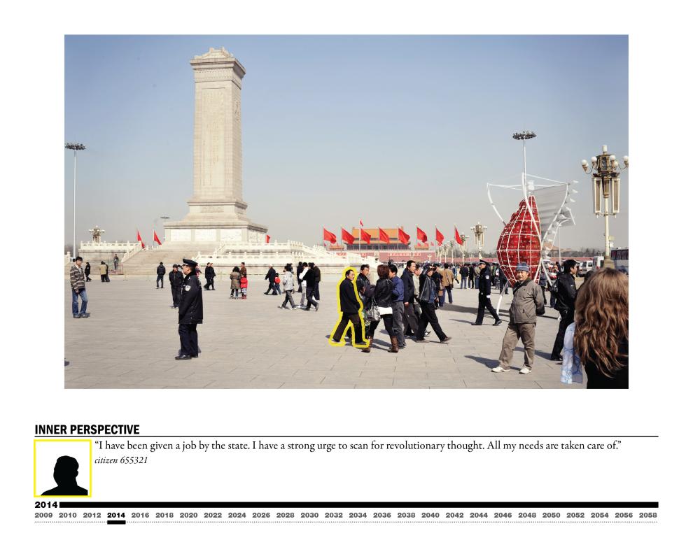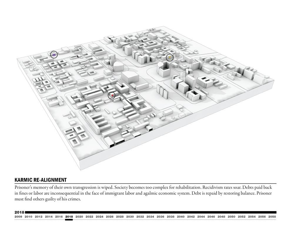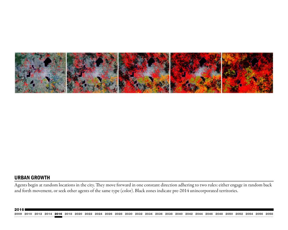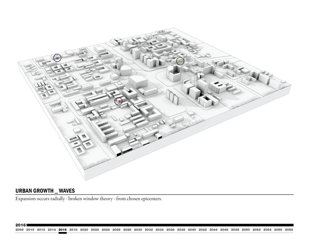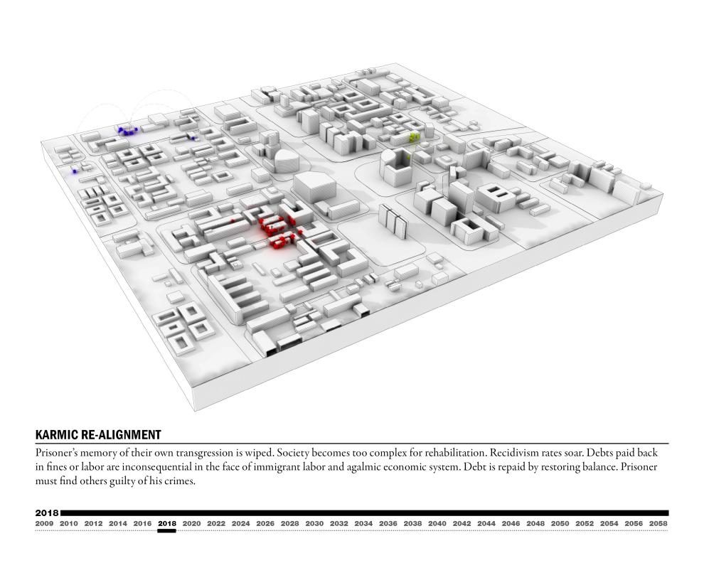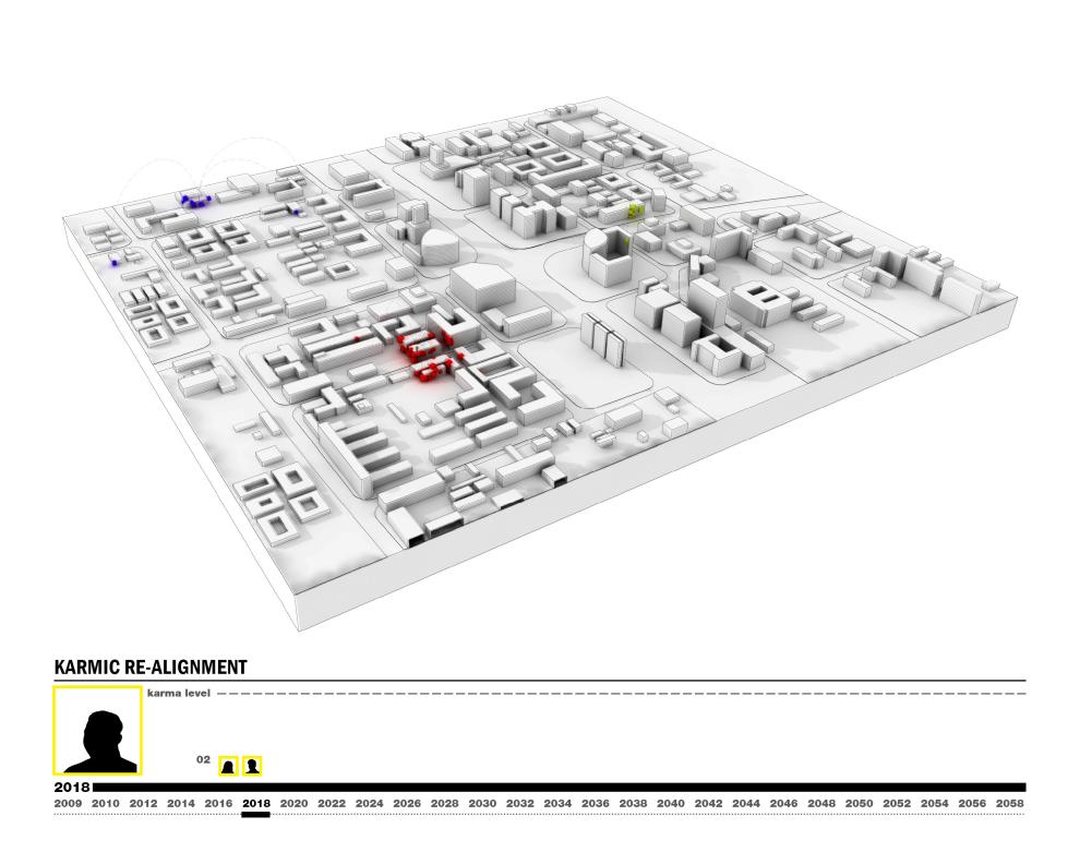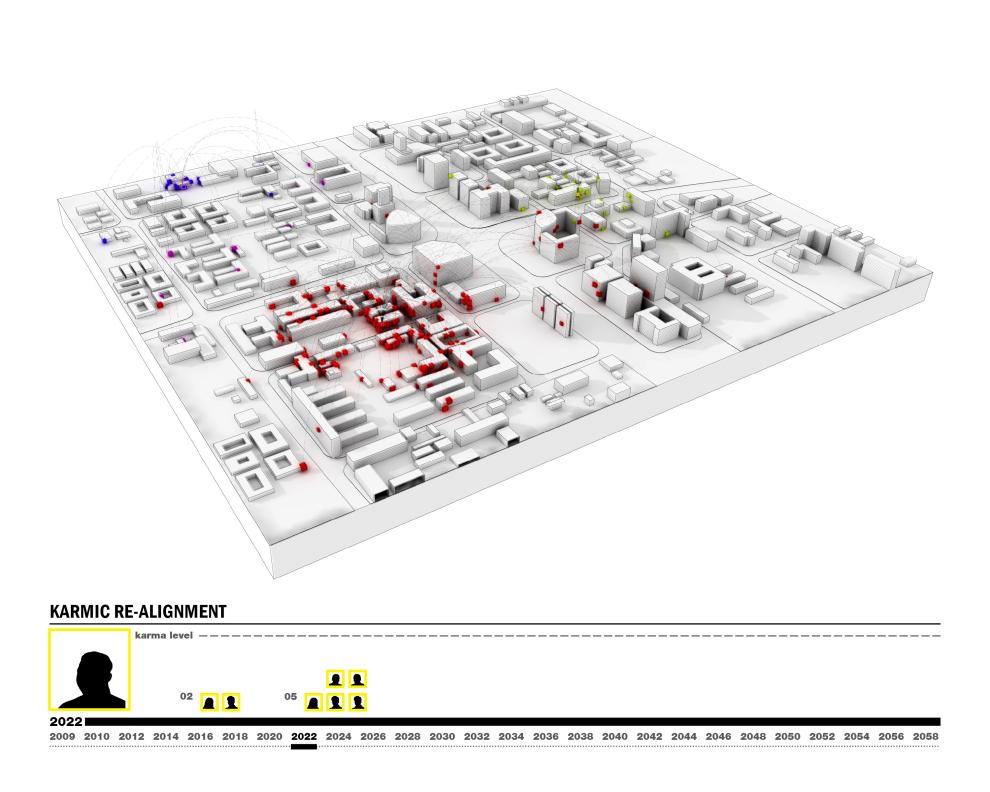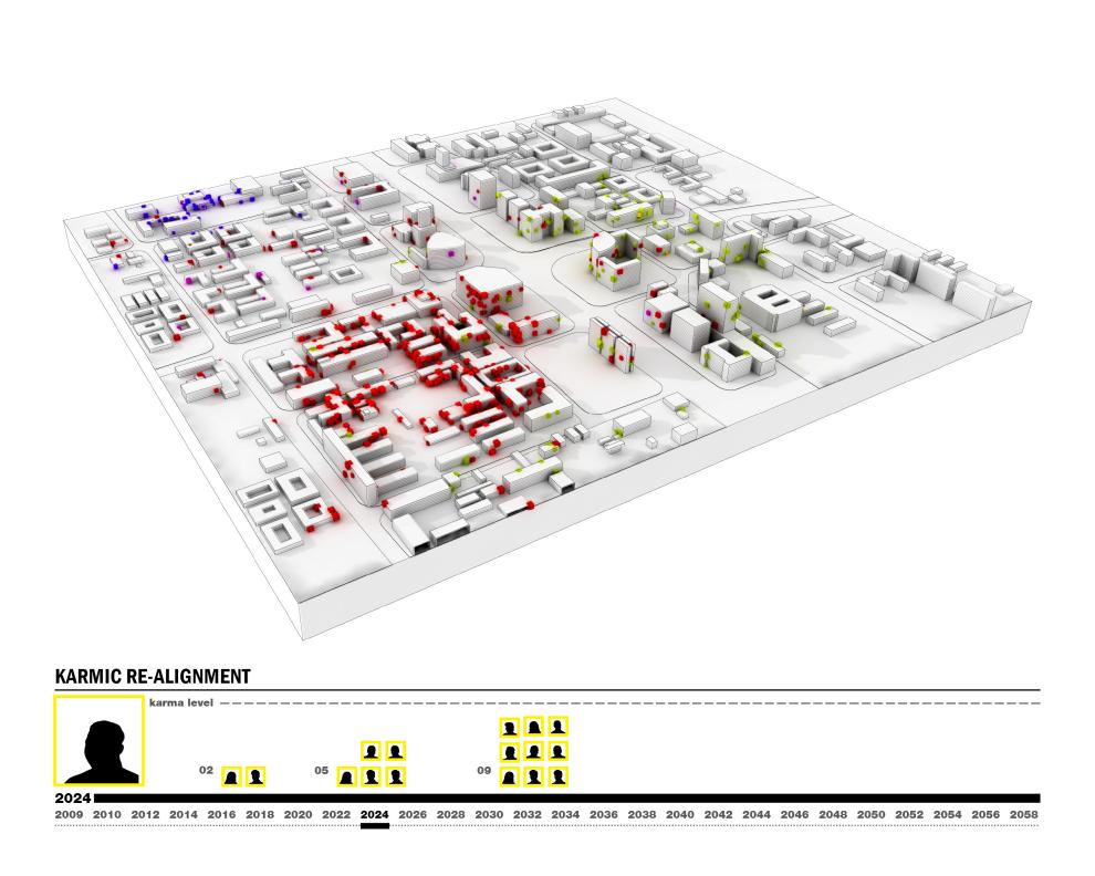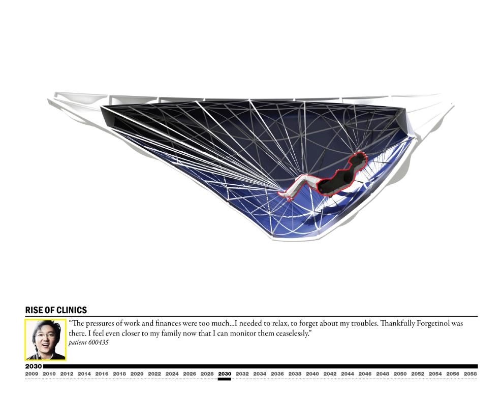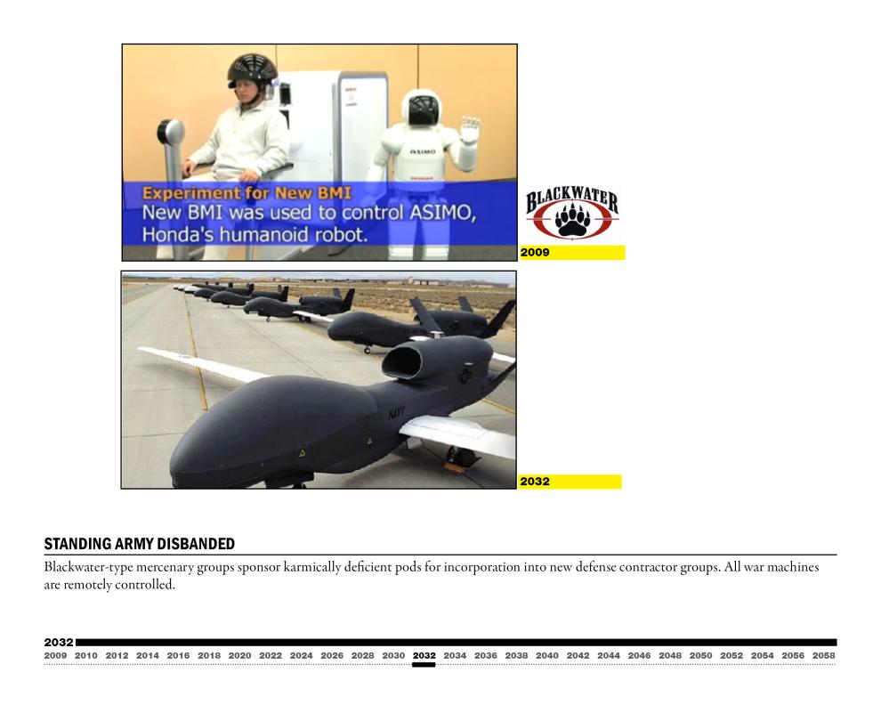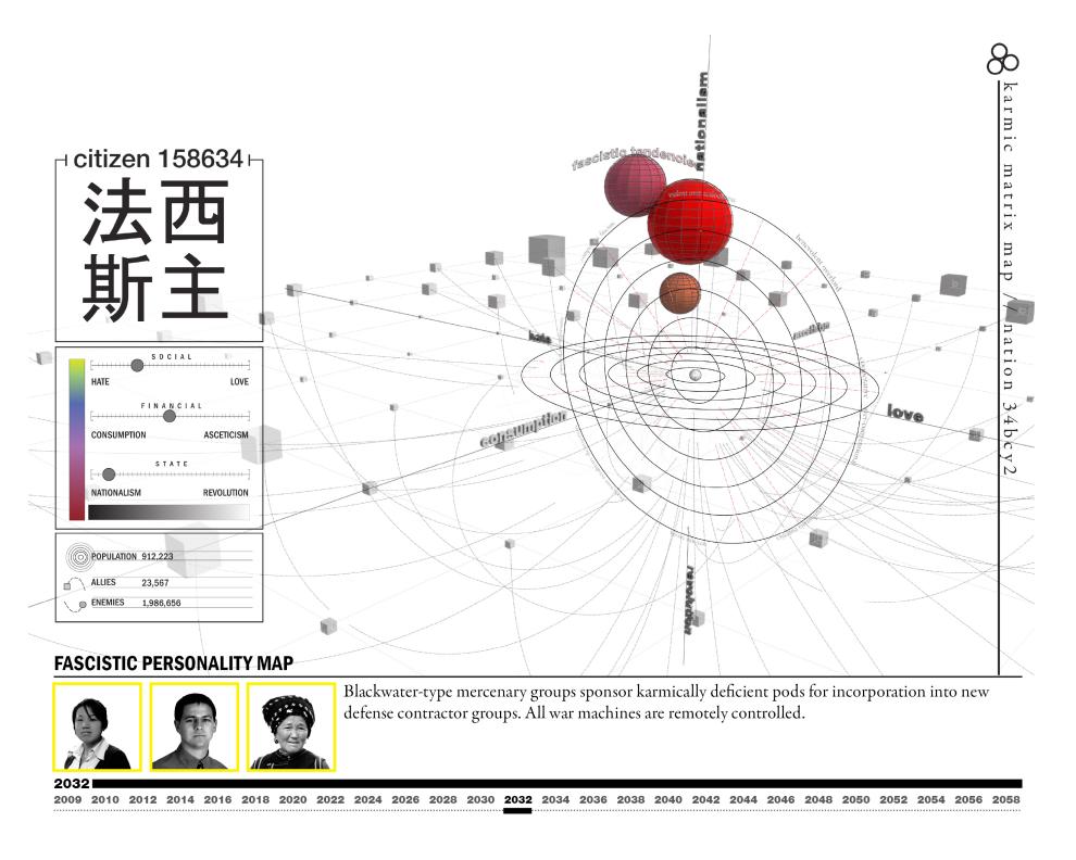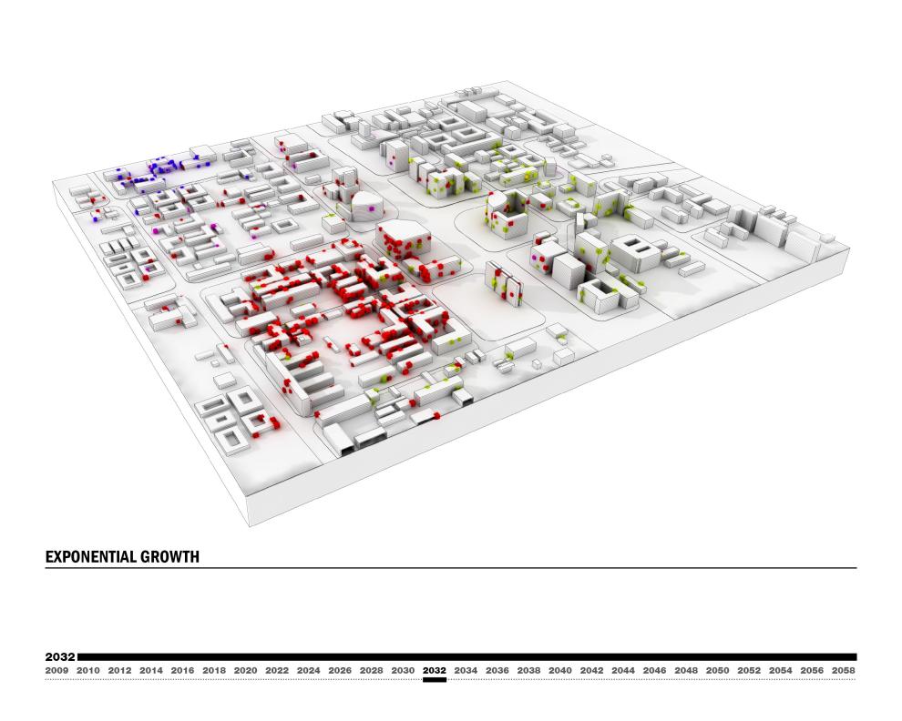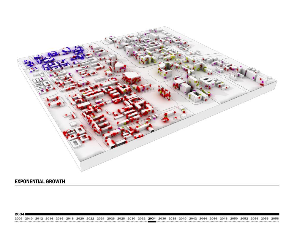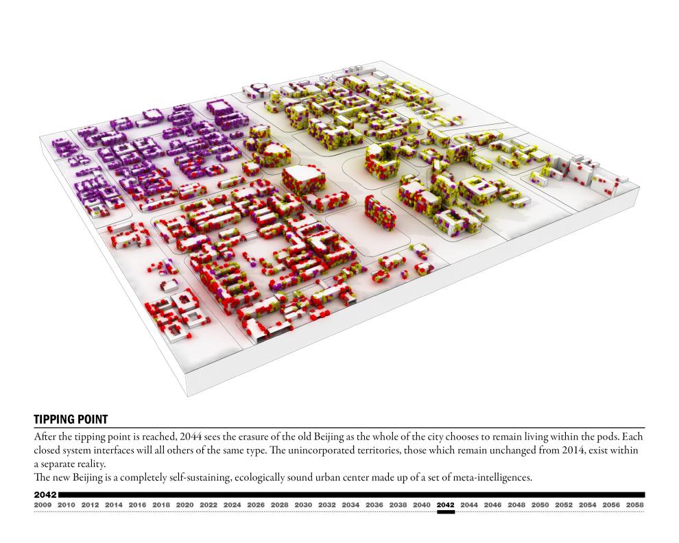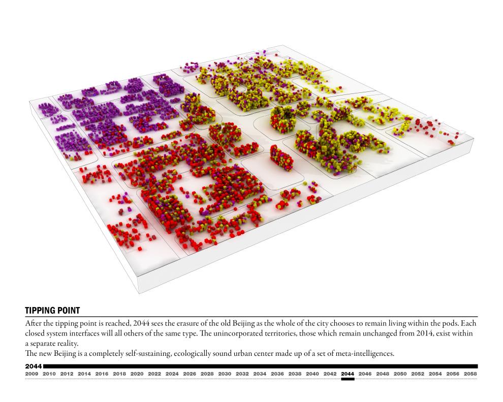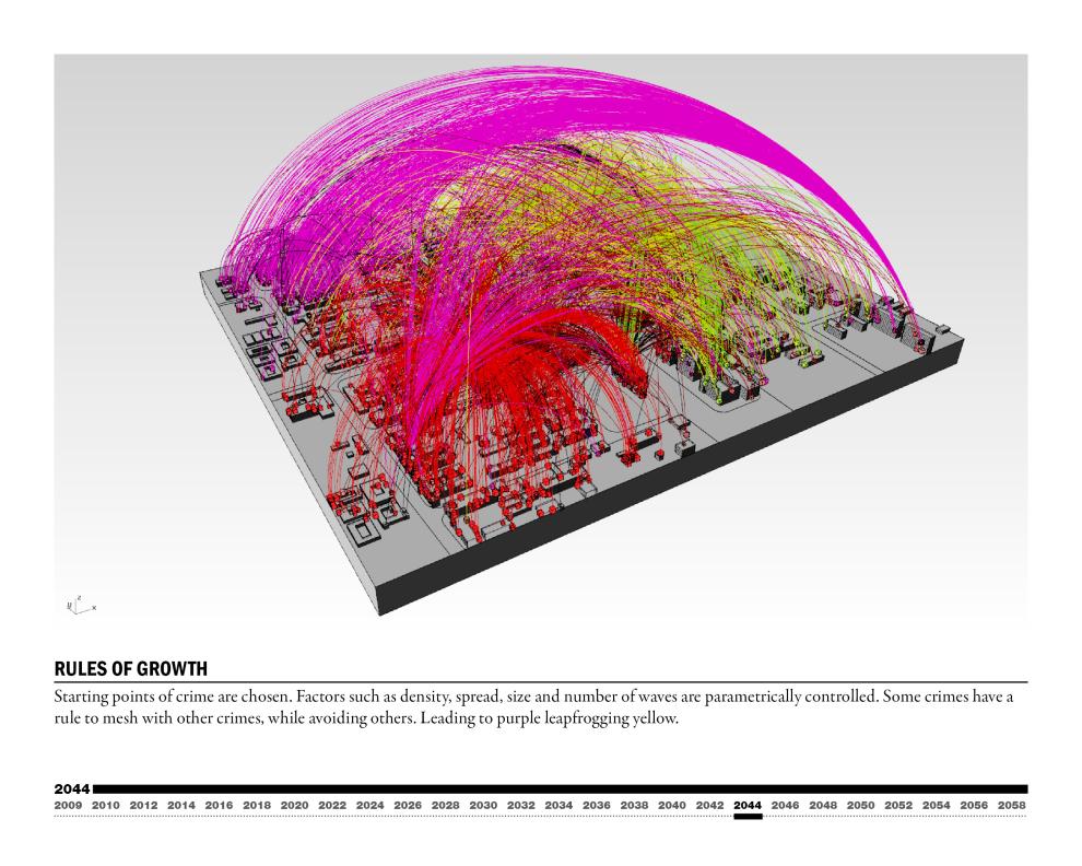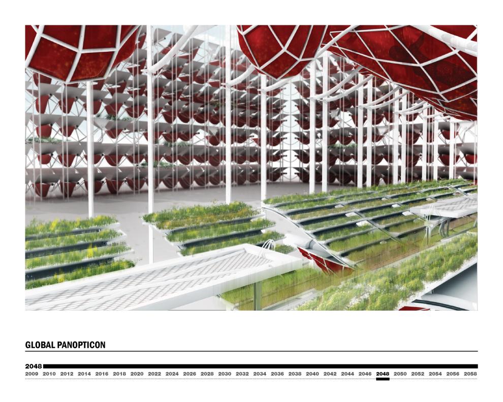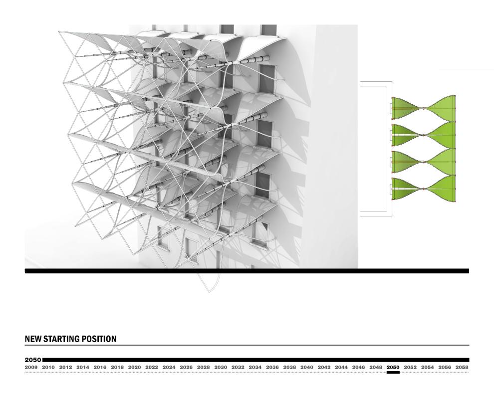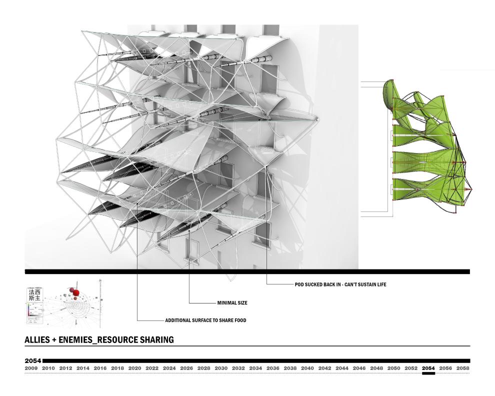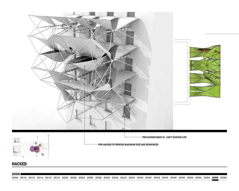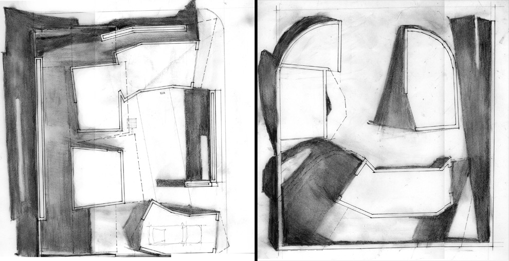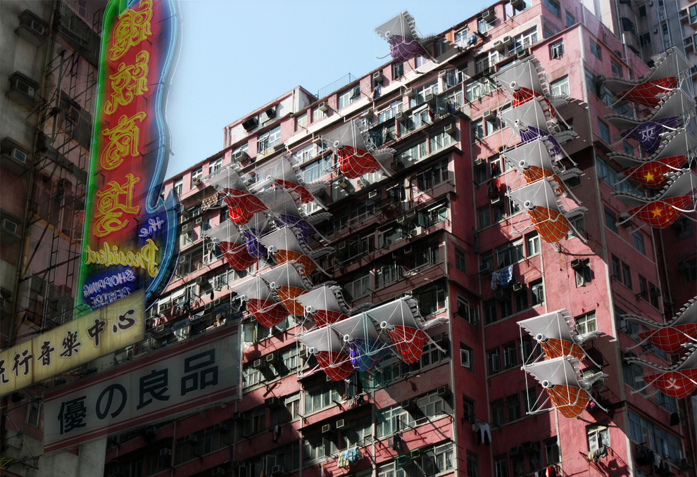
I didn’t really cut anything from the presentation included below. So, yeah, there’s a lot of slides. It’s (almost) the entire final presentation. I left it pretty much intact because not only 1) I can never edit my own work, but 2) the project is conceived more as a sci-fi narrative of Beijing and it will hopefully make more sense if read in complete order. And you can always just scroll way down to the end for some sweet images. This was for Ed Keller’s SpeedTerritoryCommunication studio, Spring 2009.
quick project description:
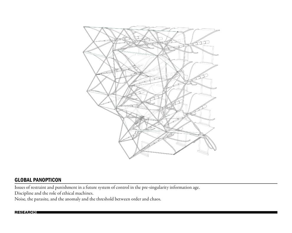
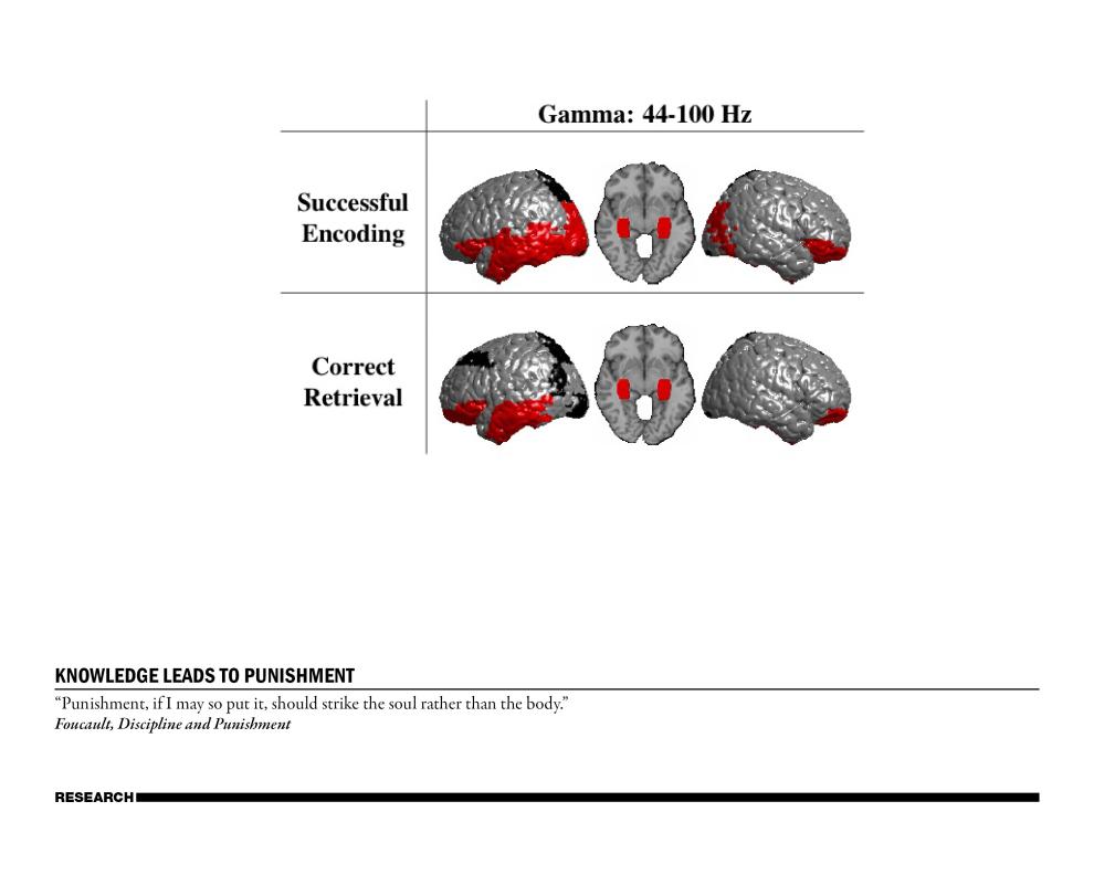
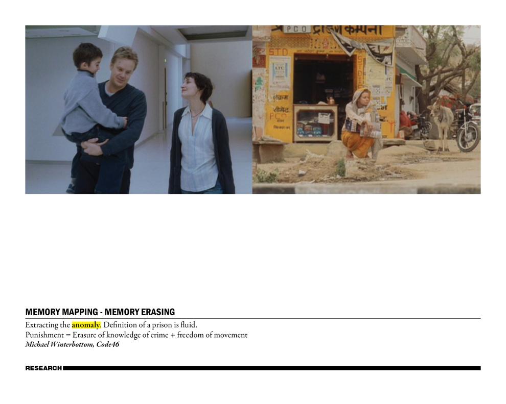
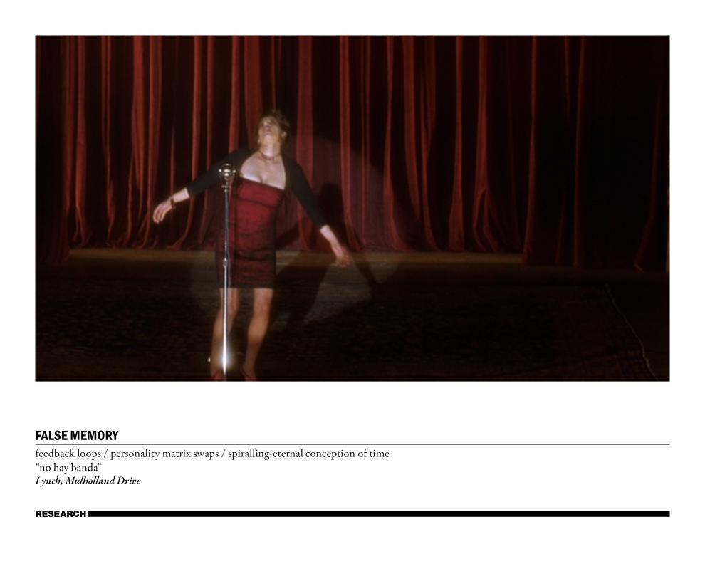
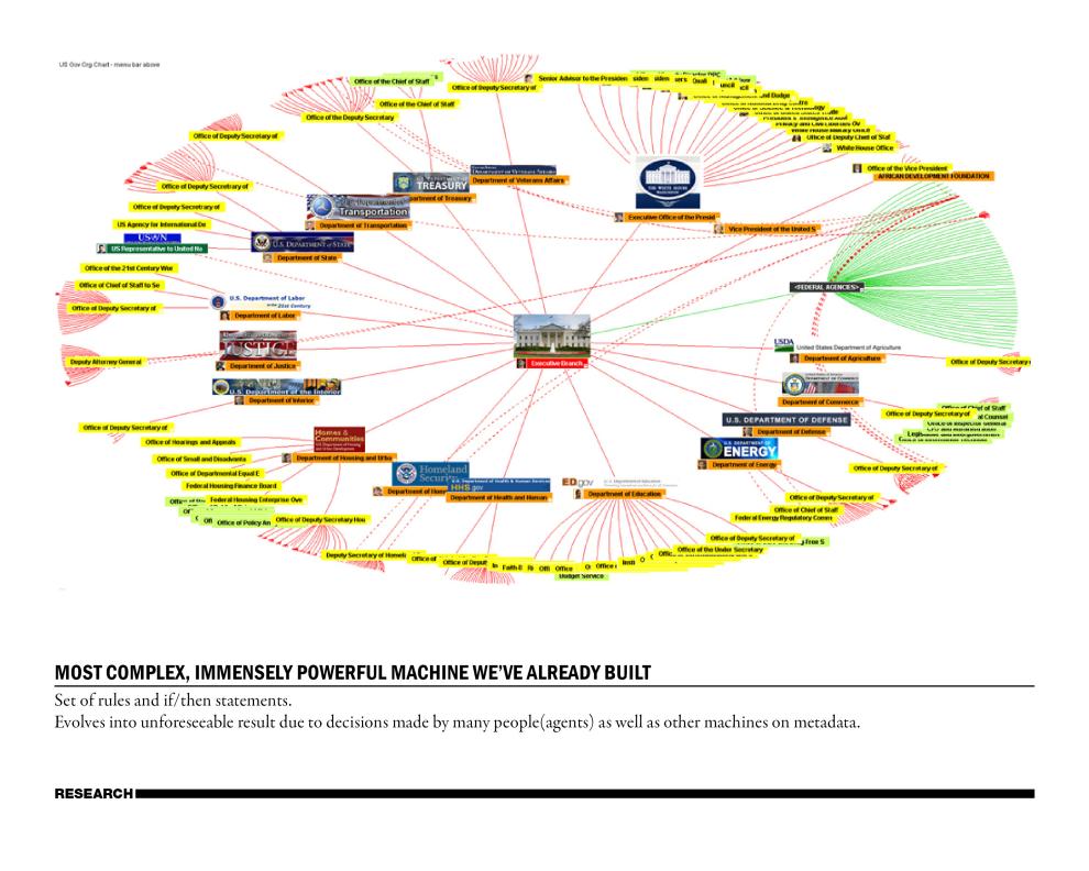
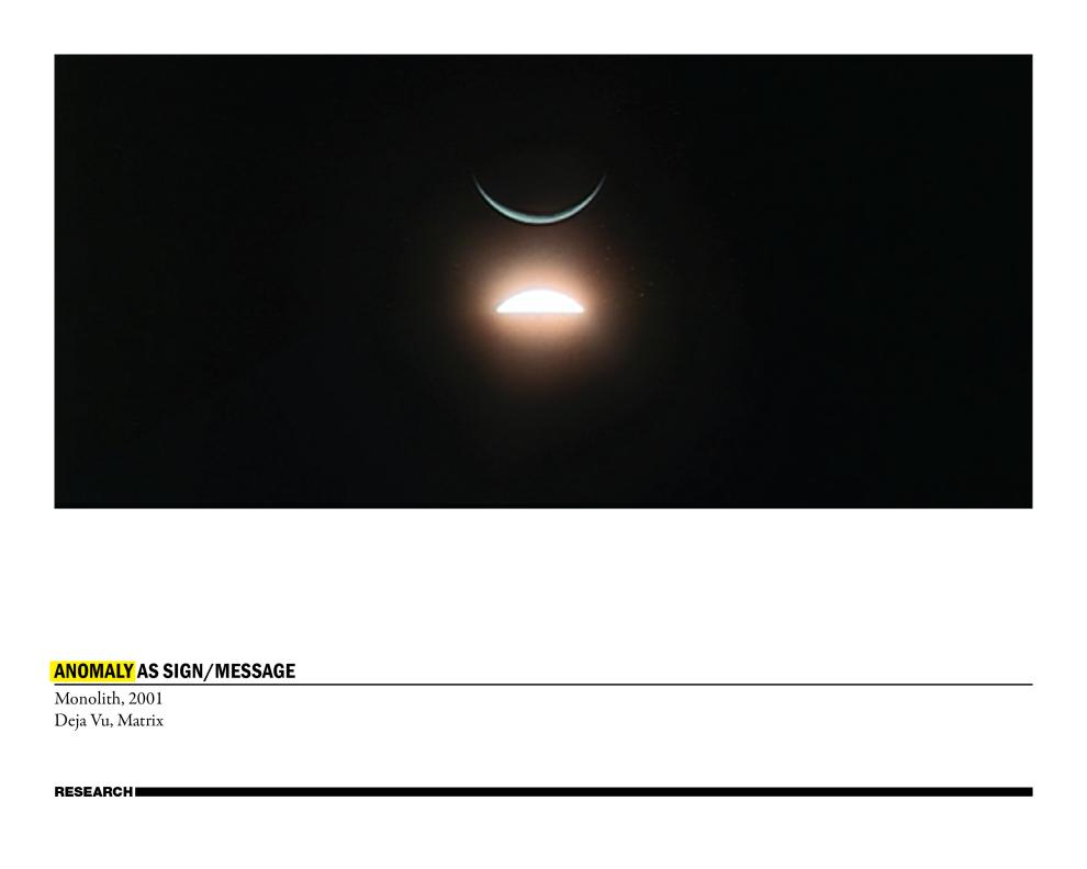
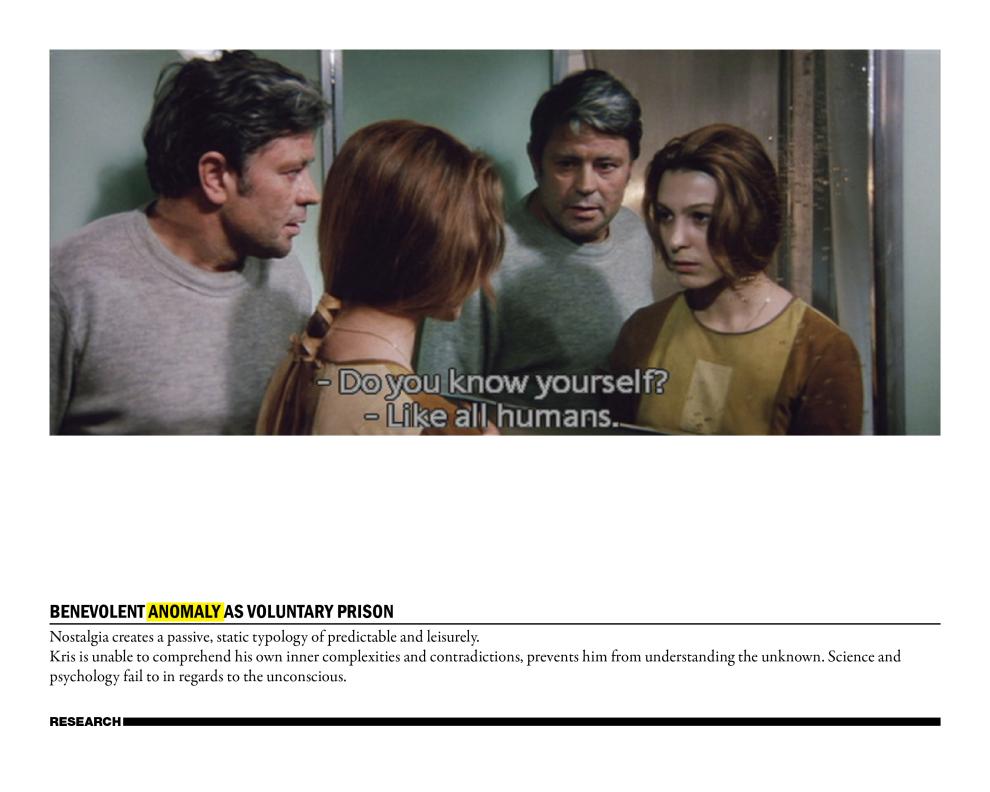
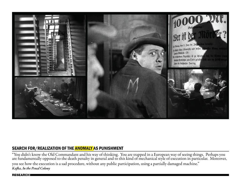
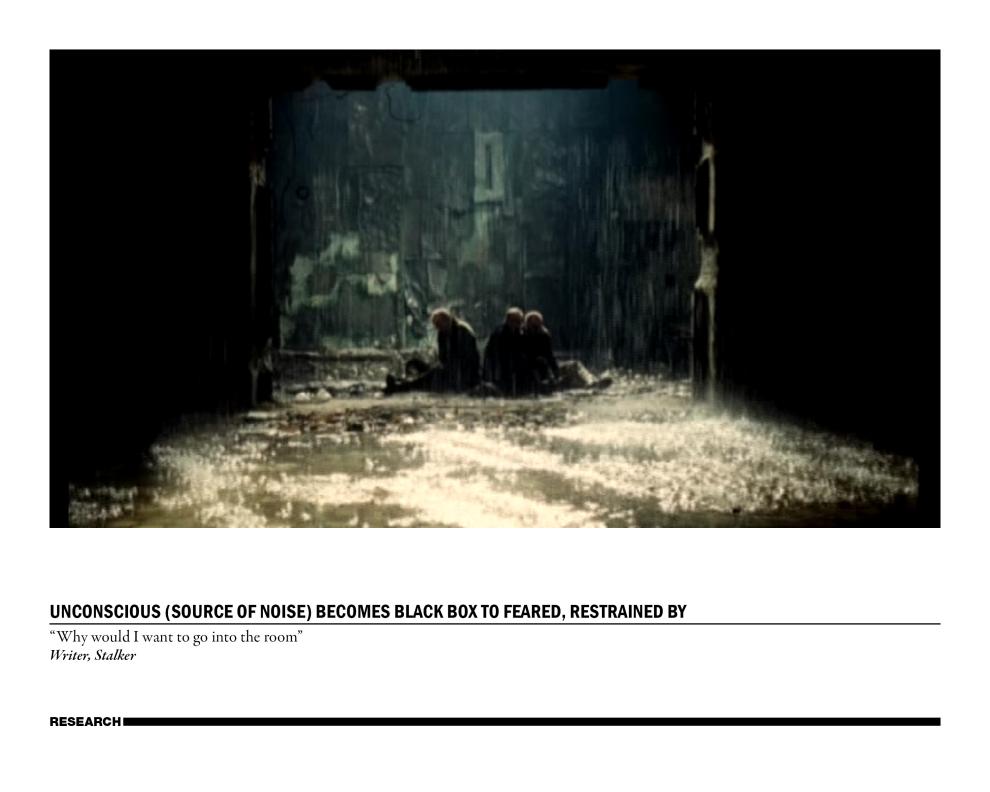
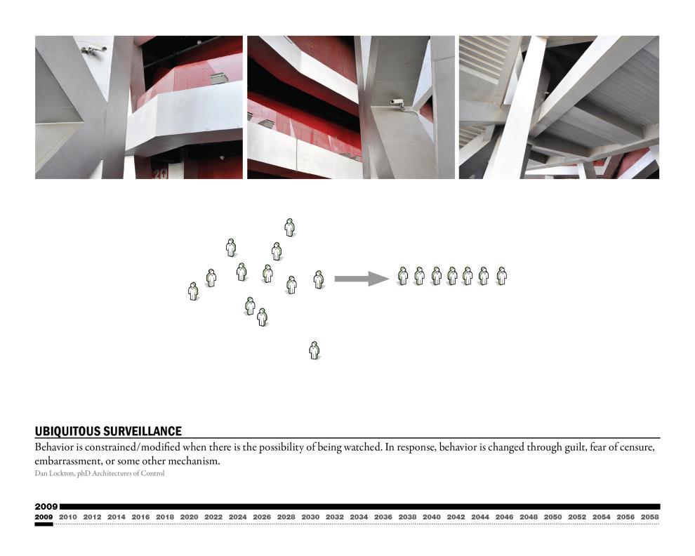
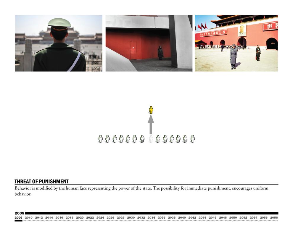
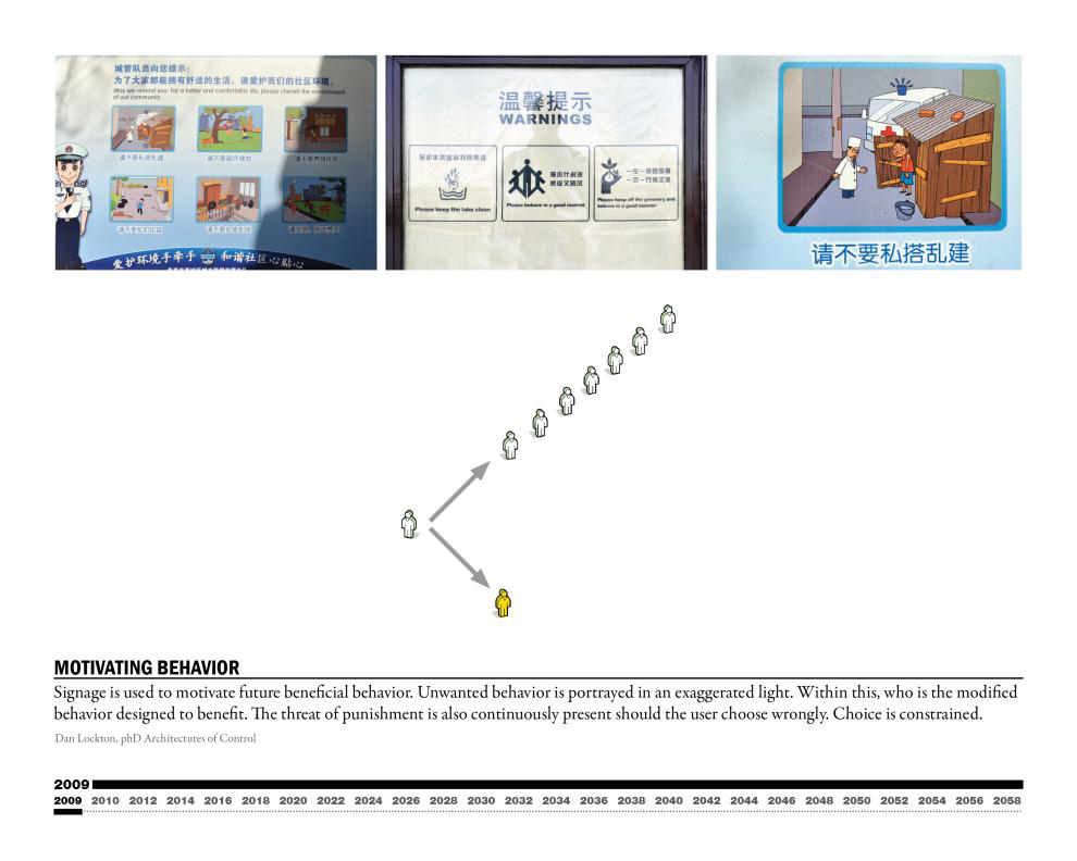
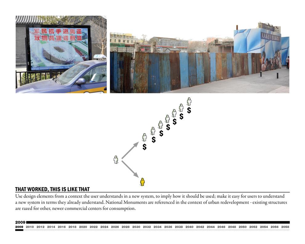
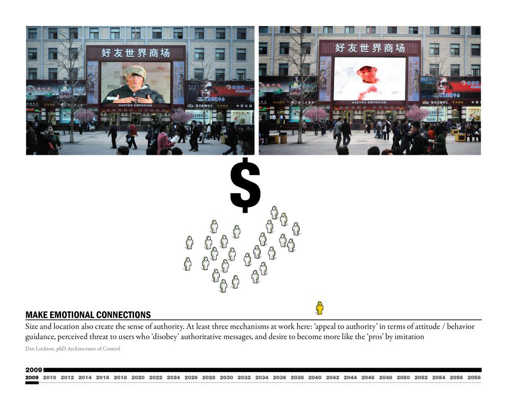
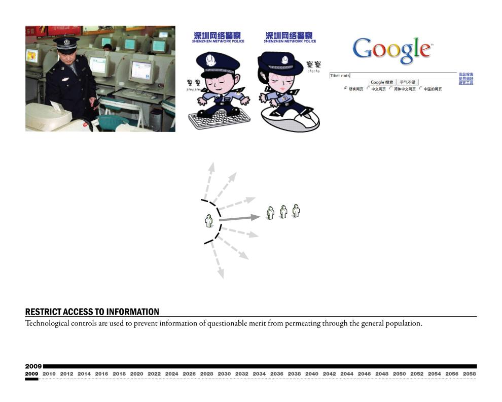
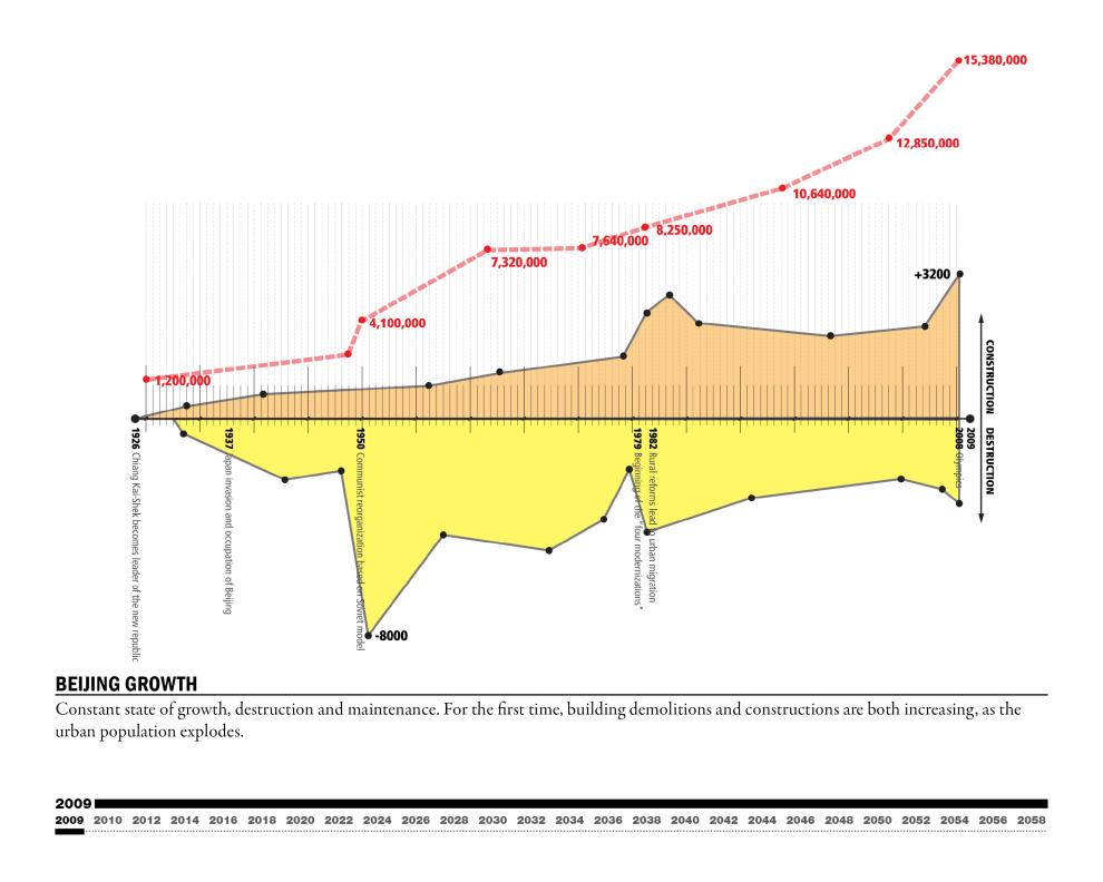
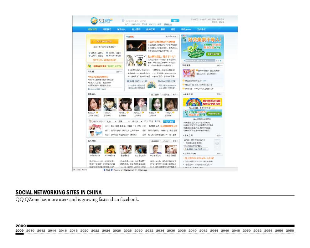
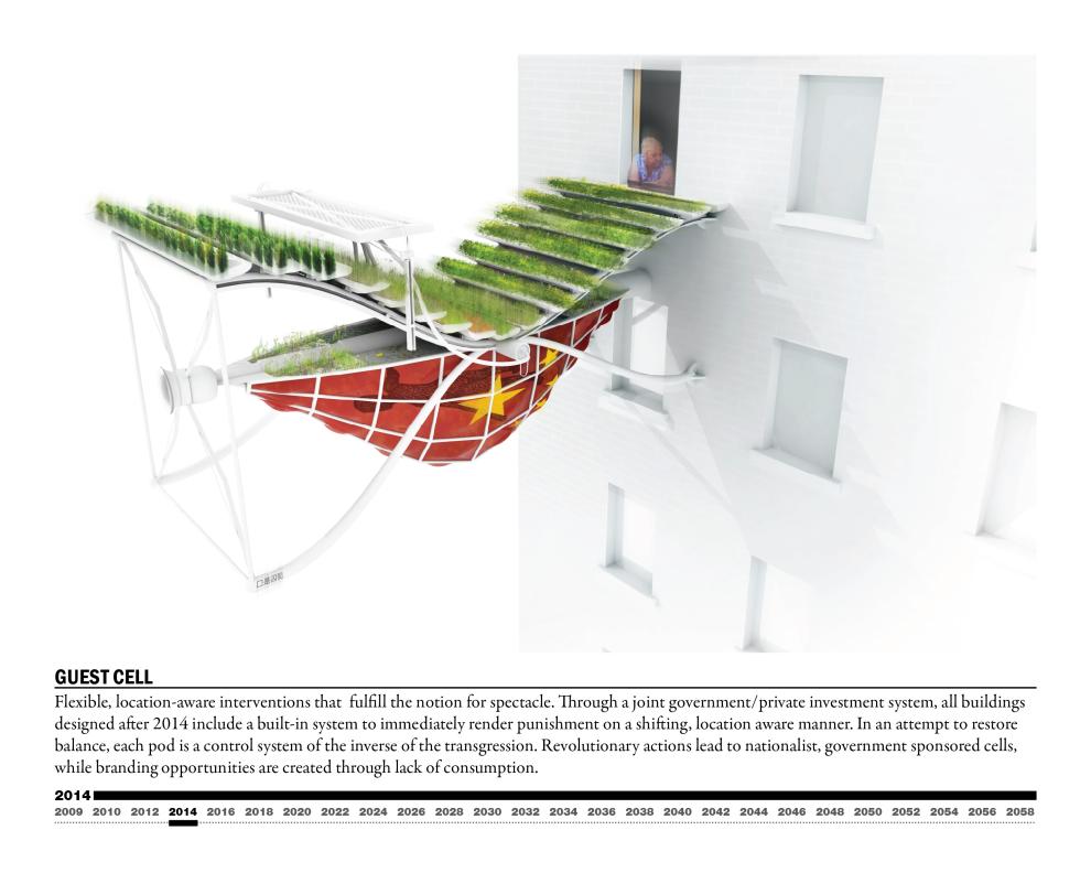
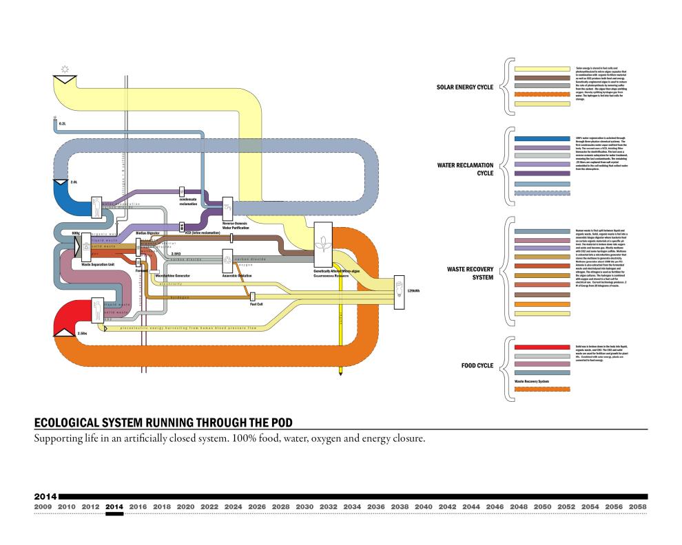
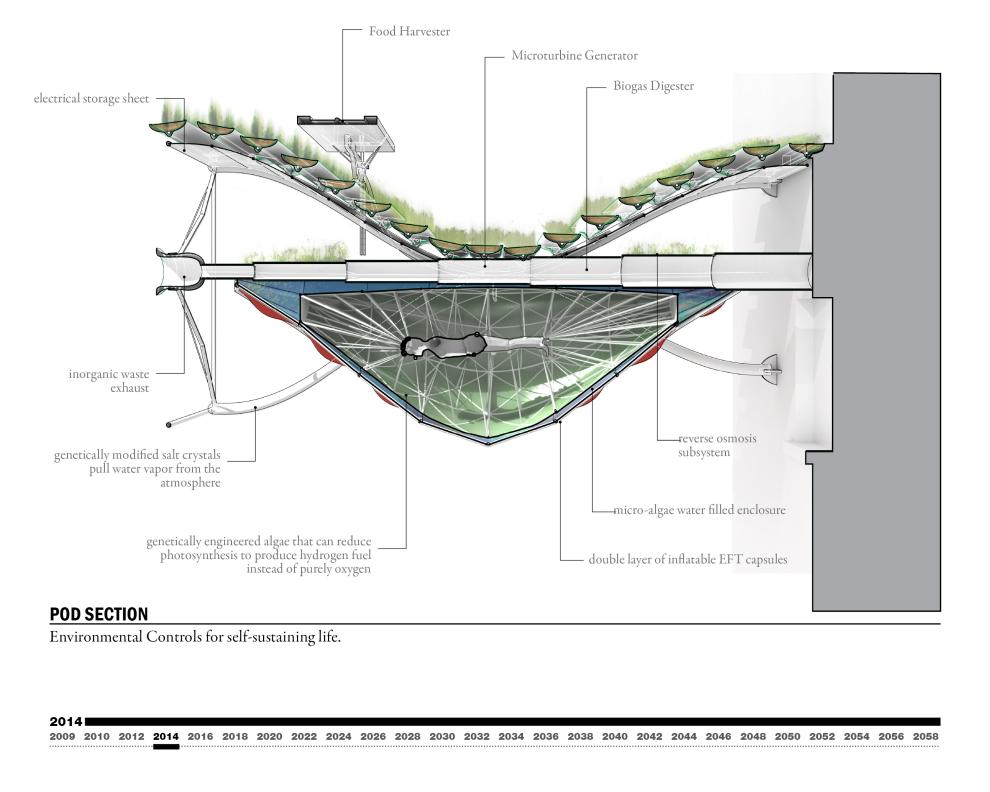
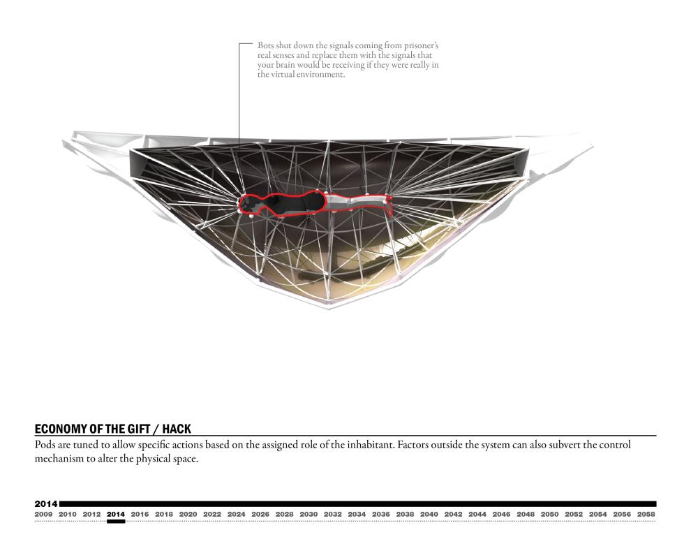
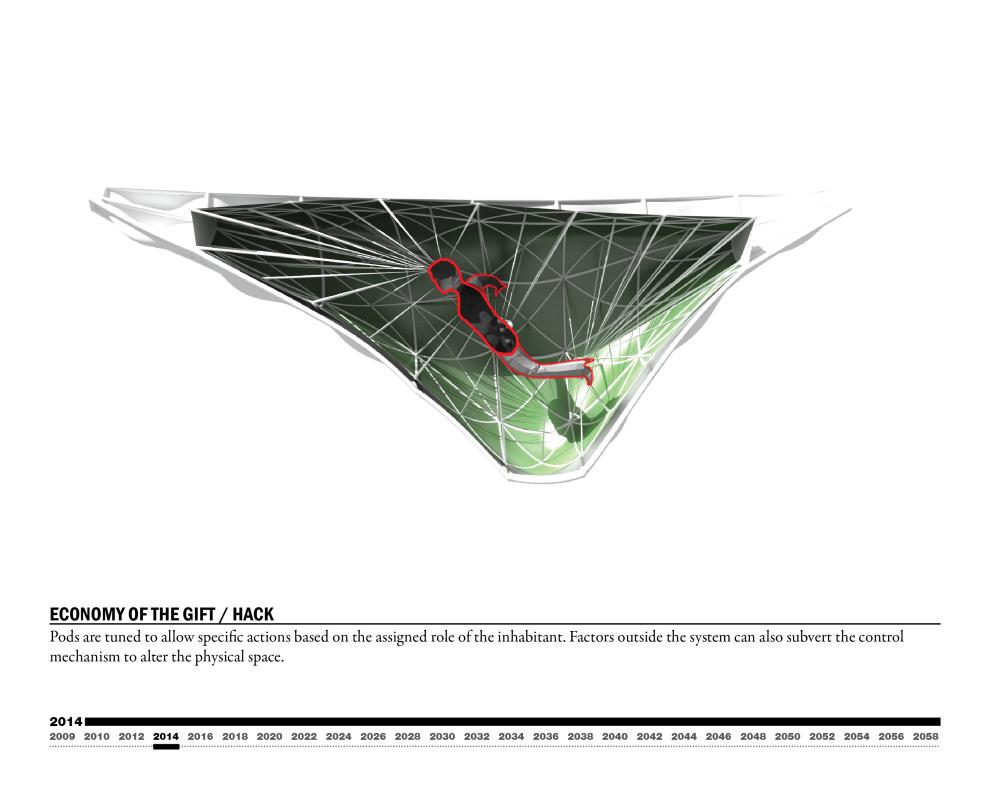
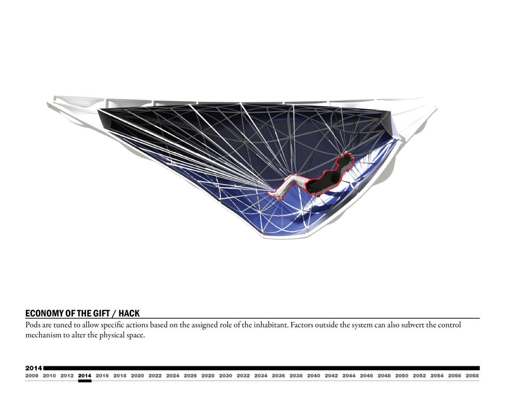
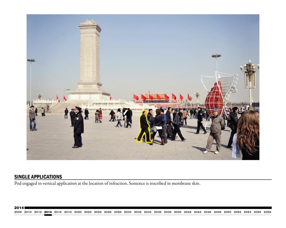
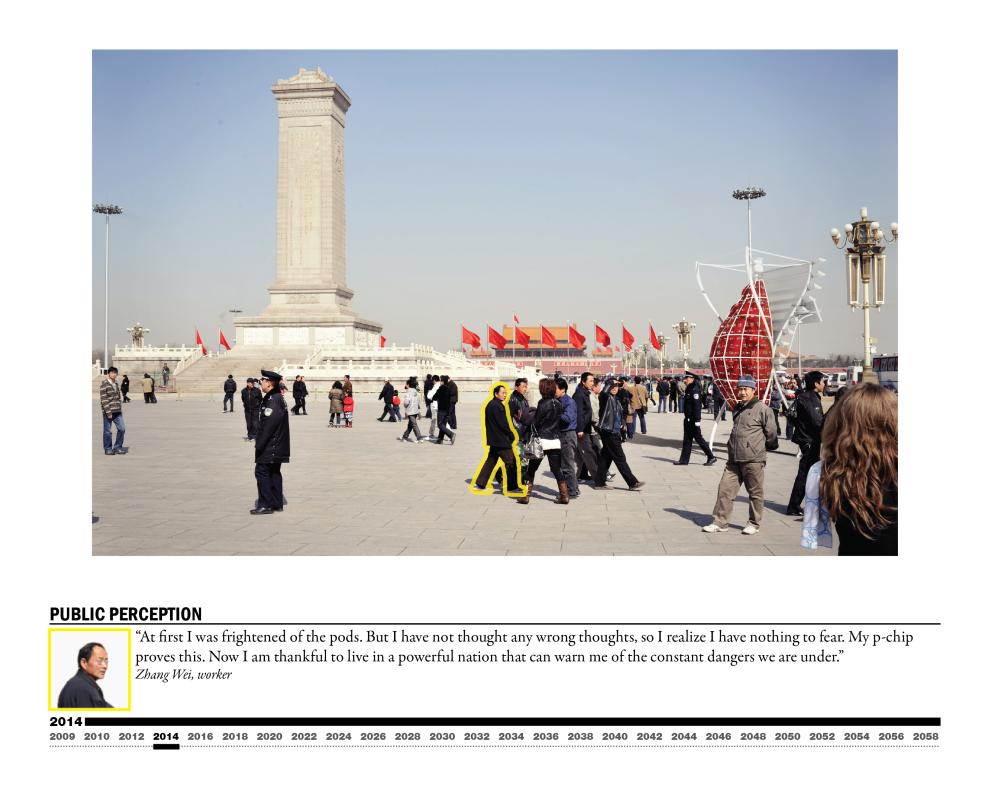
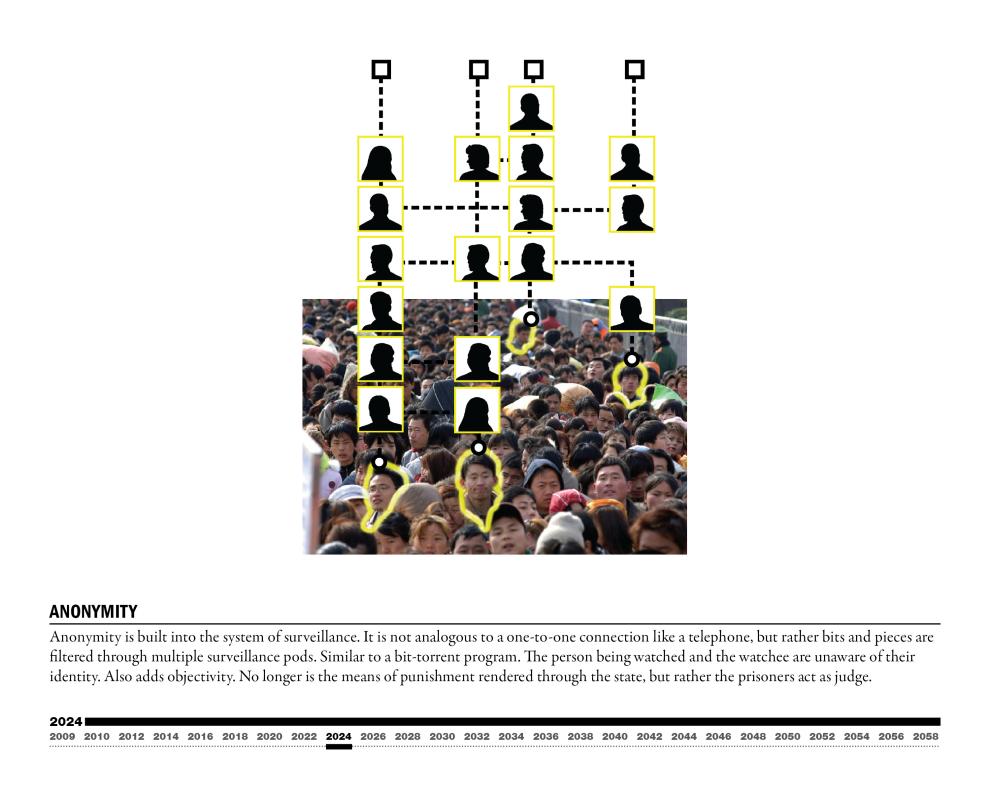
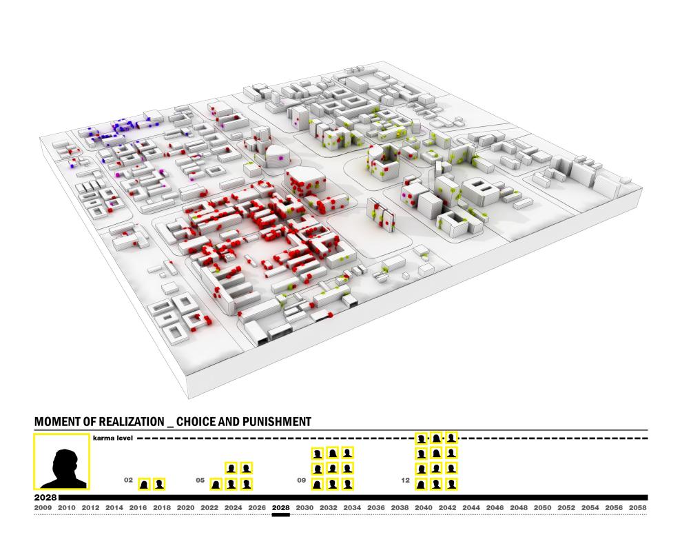
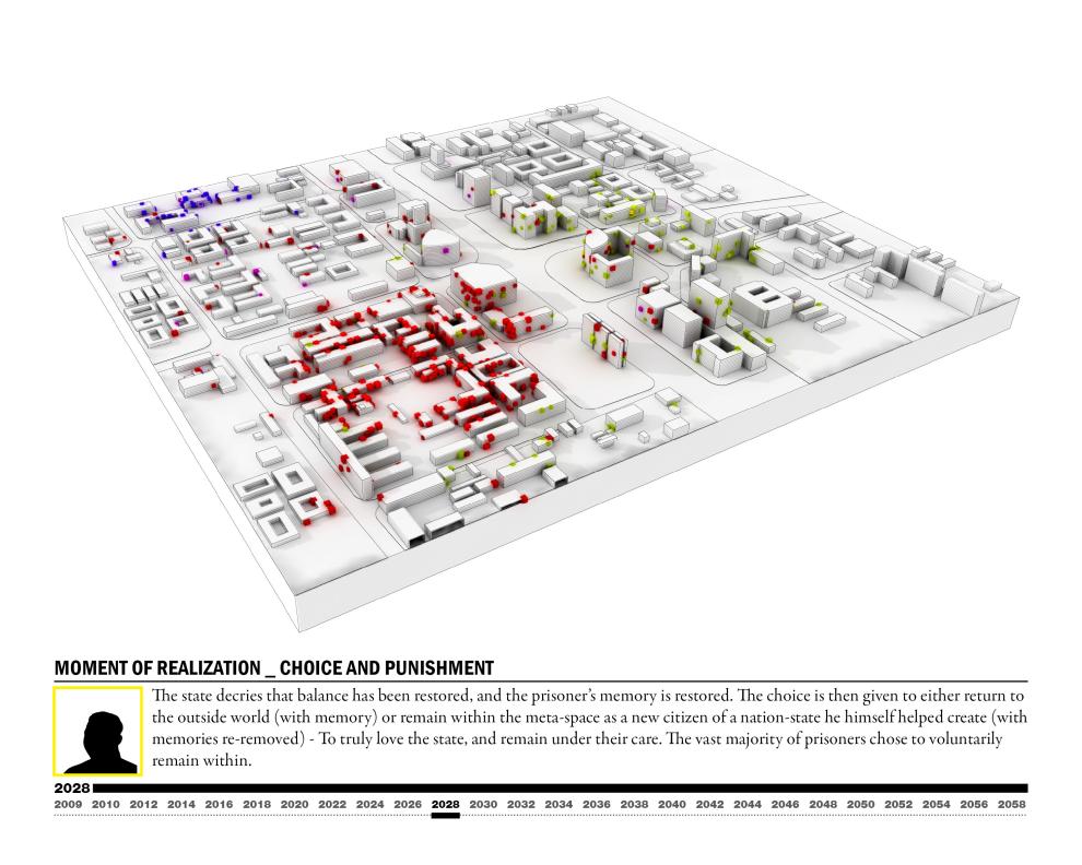
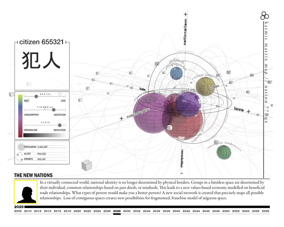
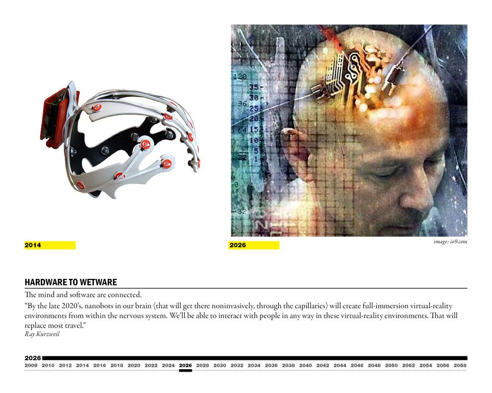
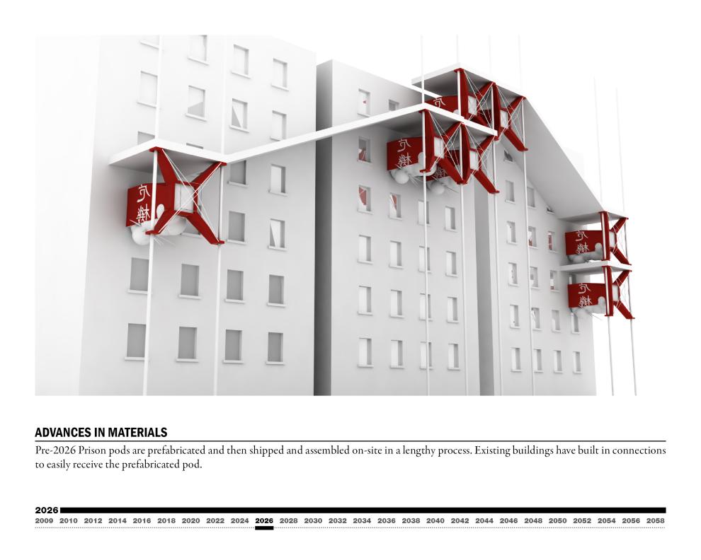
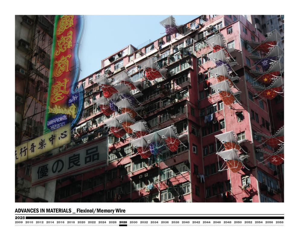
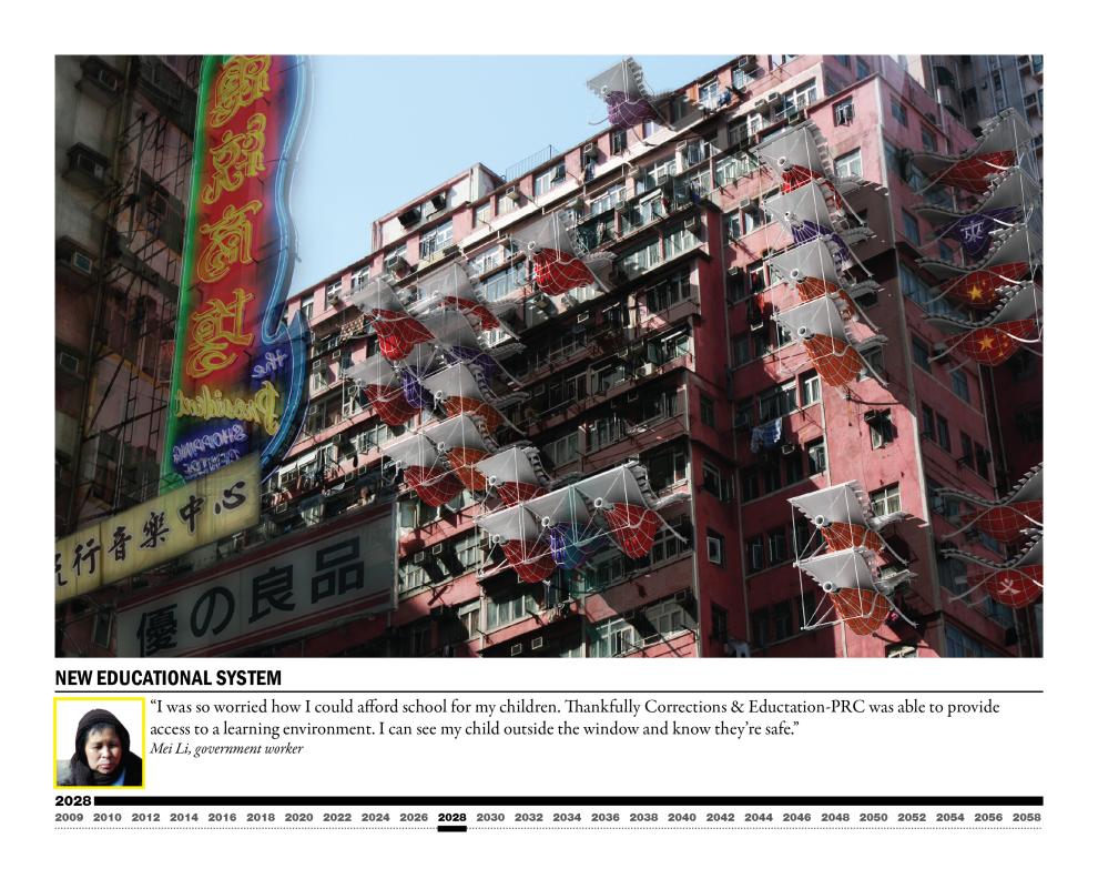
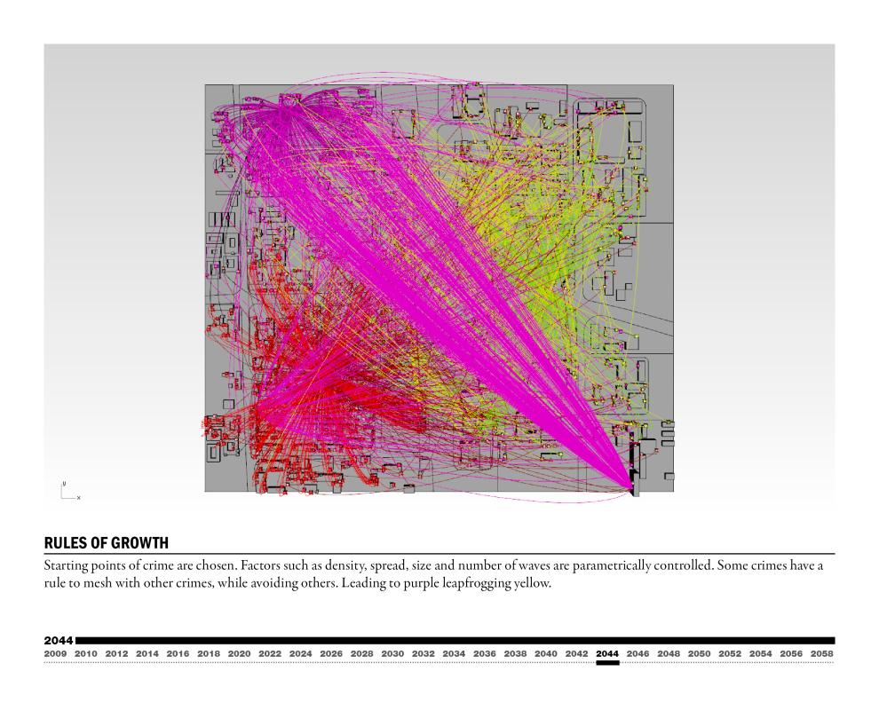
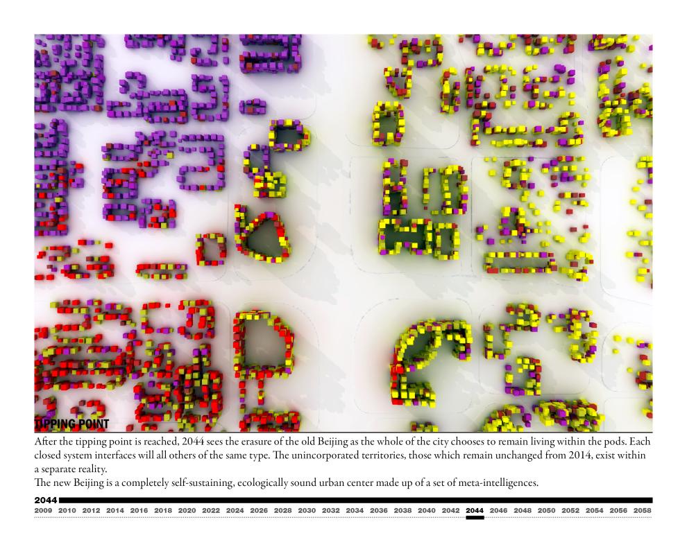
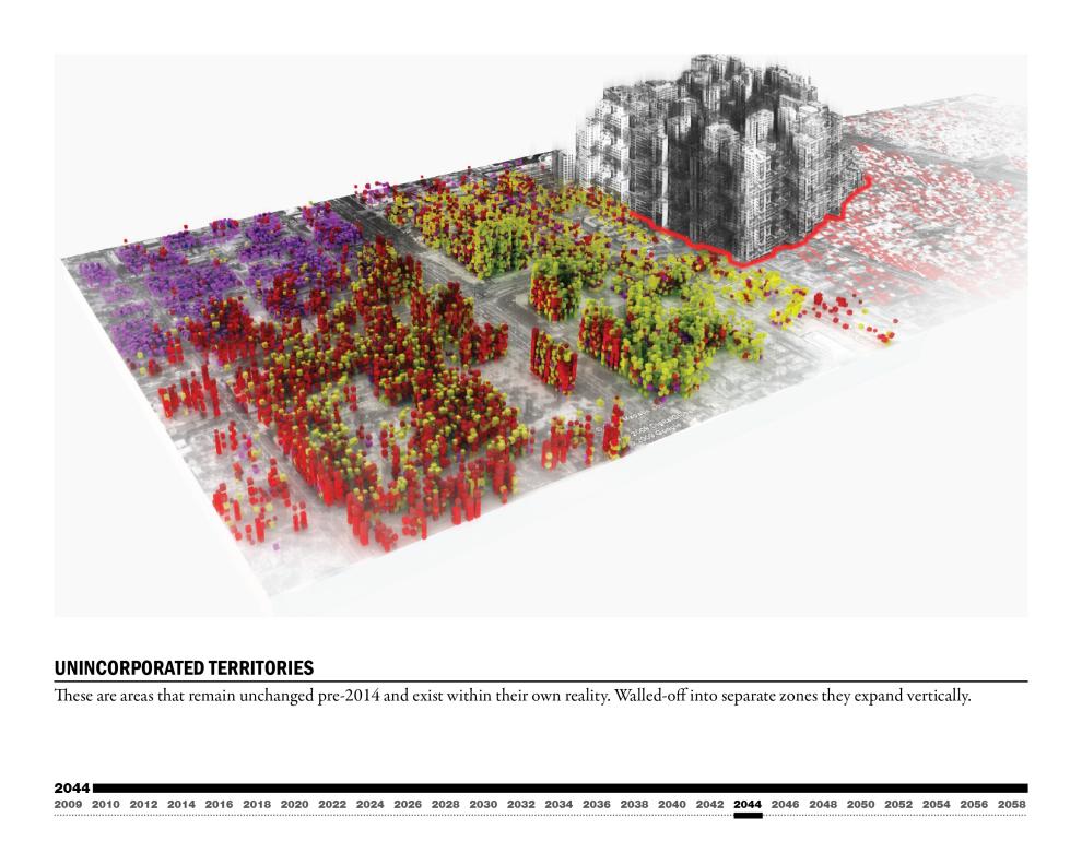
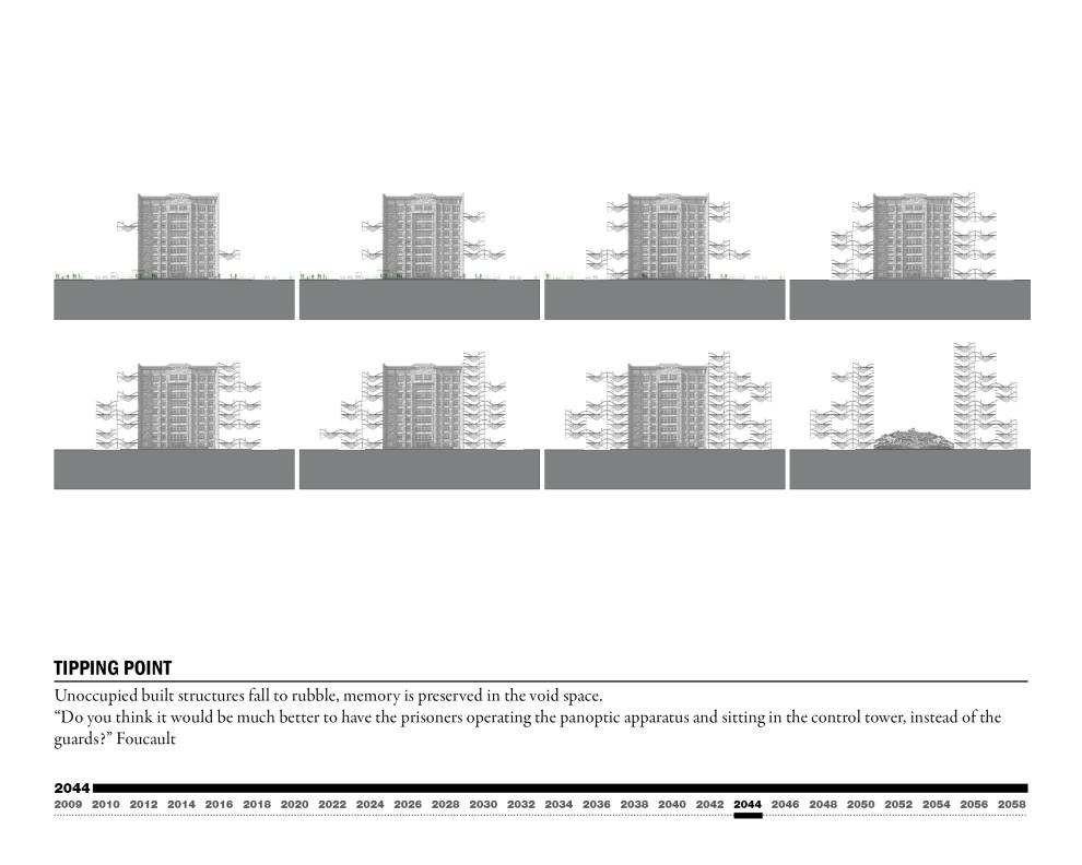
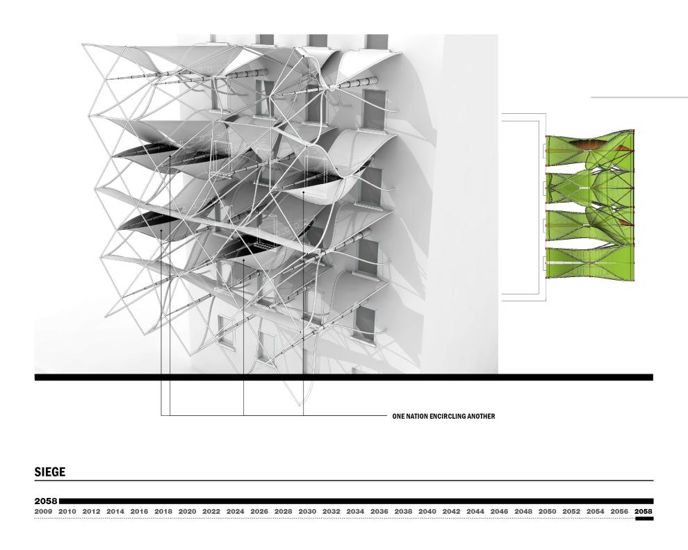
Architecture is a system of control predicated on limitations. This project is a study of the existing control systems in Beijing and a projection of how architecture and technology will merge to change not only prisons, but also the urban environment, the social stratification of society. Also addressed are what confinement and freedom will mean in relation to our relationship with how we build our world.
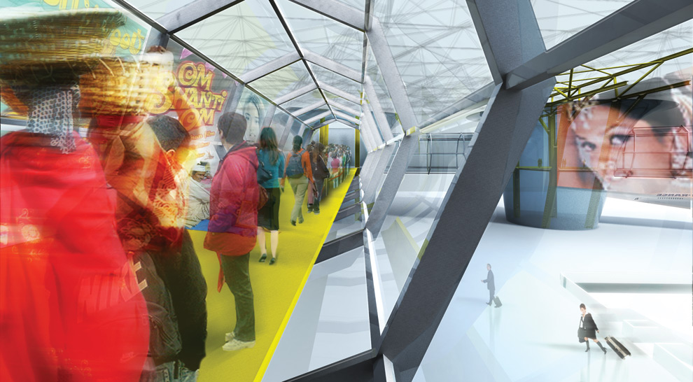
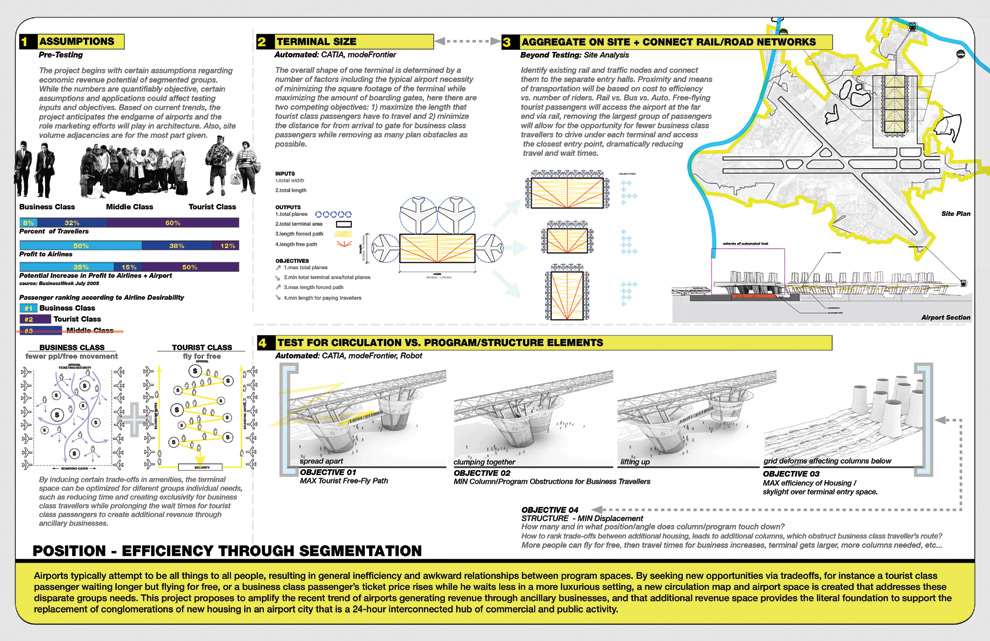
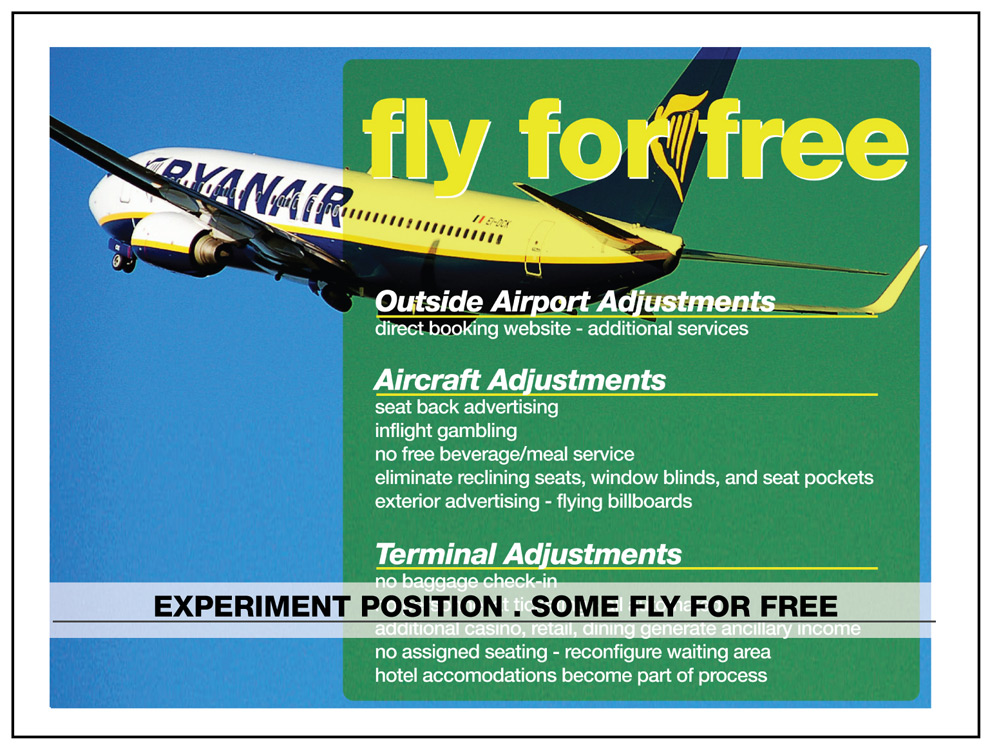
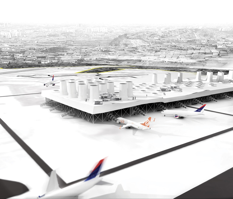
Quick Project Desciption: Airports typically attempt to be all things to all people, resulting in general inefficiency and awkward relationships between program spaces. By seeking new opportunities via trade-offs, for instance a tourist class passenger waiting longer but flying for free, or a business class passenger’s ticket price rises while he waits less in a more luxurious setting, a new circulation map and airport space is created that addresses these disparate groups needs. Optimal relationships between airlines, airport, and users are handled through parametric models and genetic algorithms.
What is the metric for a good design? Or rather, now that parametric modelling allows us to easily create thousands of variations of a given design, how do we chose the “correct” one?
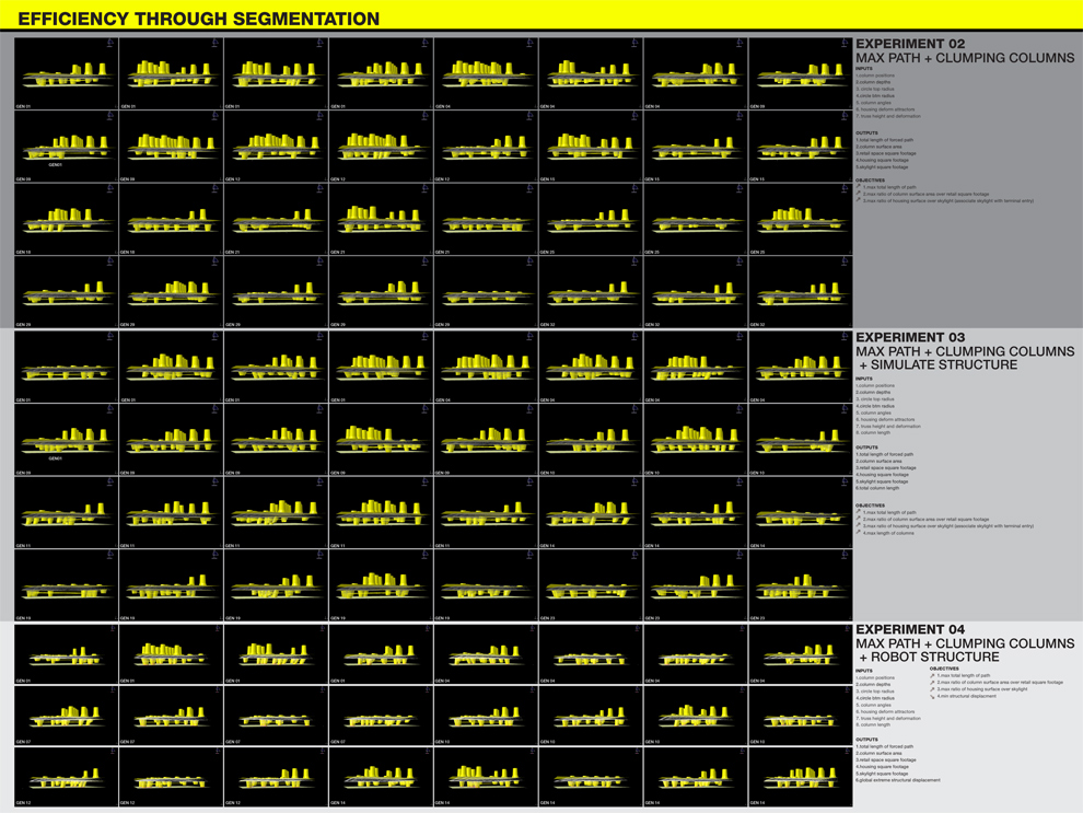
First, Creating a parametric model in catia, whose inputs are optimized through the engineering program modeFrontier with additional structural finite element analysis coming from autodesk’s newly aquired robot. The challenge became how to convert your design position, parti, whatever, into a quantifiable metric that the software can optimize for. For instance, to optimize for material efficiency, you could let the software optimize a shape for maximize volume with minimal surface area. After 3000 designs you’d have a sphere, but things can get very complex fast when you begin optimizing for competing objectives. See our complete studio blog here. Project description…
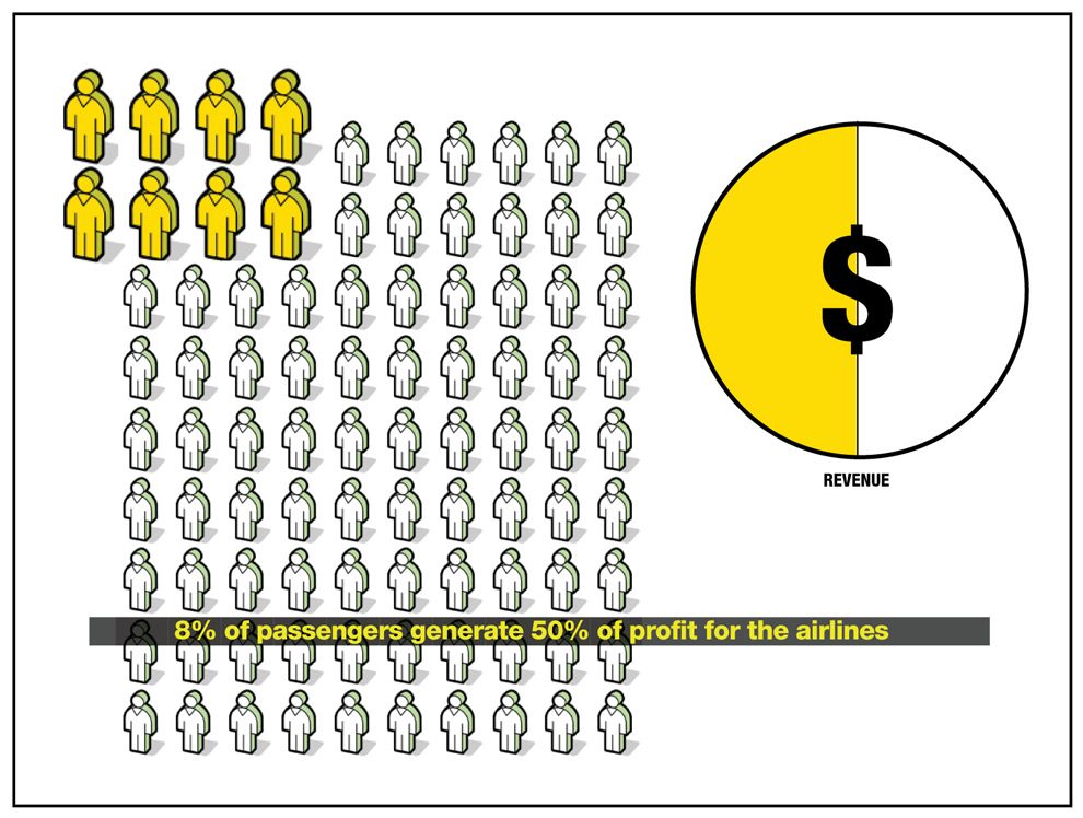
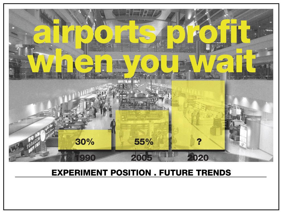
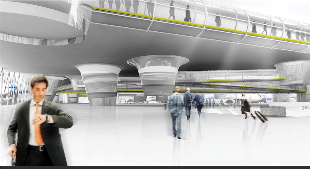
I was drawn to the metrics of passenger economy and profit. Airports typically attempt to be all things to all people, resulting in general inefficiency and awkward relationships between program spaces and passengers, especially business and tourist class. By seeking new opportunities via tradeoffs, for instance a tourist class passenger waiting longer but flying for free, or a business class passenger’s ticket price rises while creating multiple, separate dedicated entry points that allow shorter waits, a new optimized circulation map presents itself.
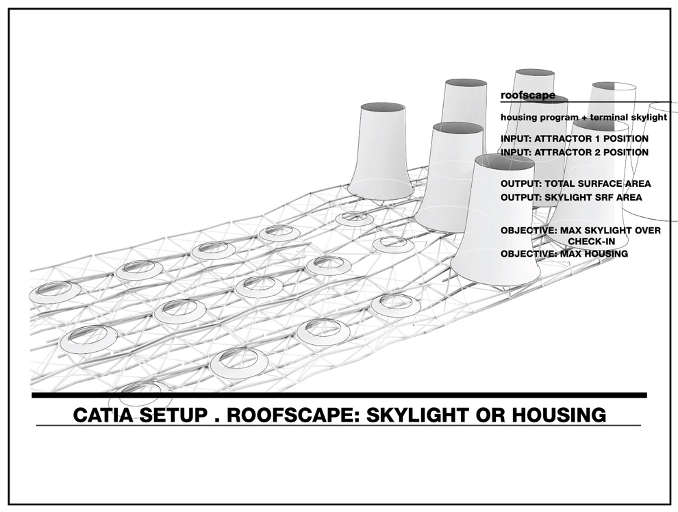
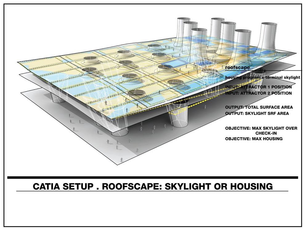
Each hanging element is a program + structural column connected by a circulation tube. Within the circulation tube tourist class passengers have the opportunity to fly for free, passing through each commercial program space. One objective is to maximize the length of the tube – thereby allowing more passengers to fly for free maximizing the airports ancillary profits. Another objective is to create an unobstructed space for business class passengers requiring few of the program spaces to touch the ground but rather hang, allowing business class passengers to freely pass through below. The more columns that touch the ground, the more structurally stabe the ceiling space frame becomes, allowing more housing towers above. The program mediates between these competing objectives finding high-performing, unexpected solutions and it becomes the role of the user to rank and chose designs based on desired criteria. Most housing = most columns = fewer business class travellers, etc…
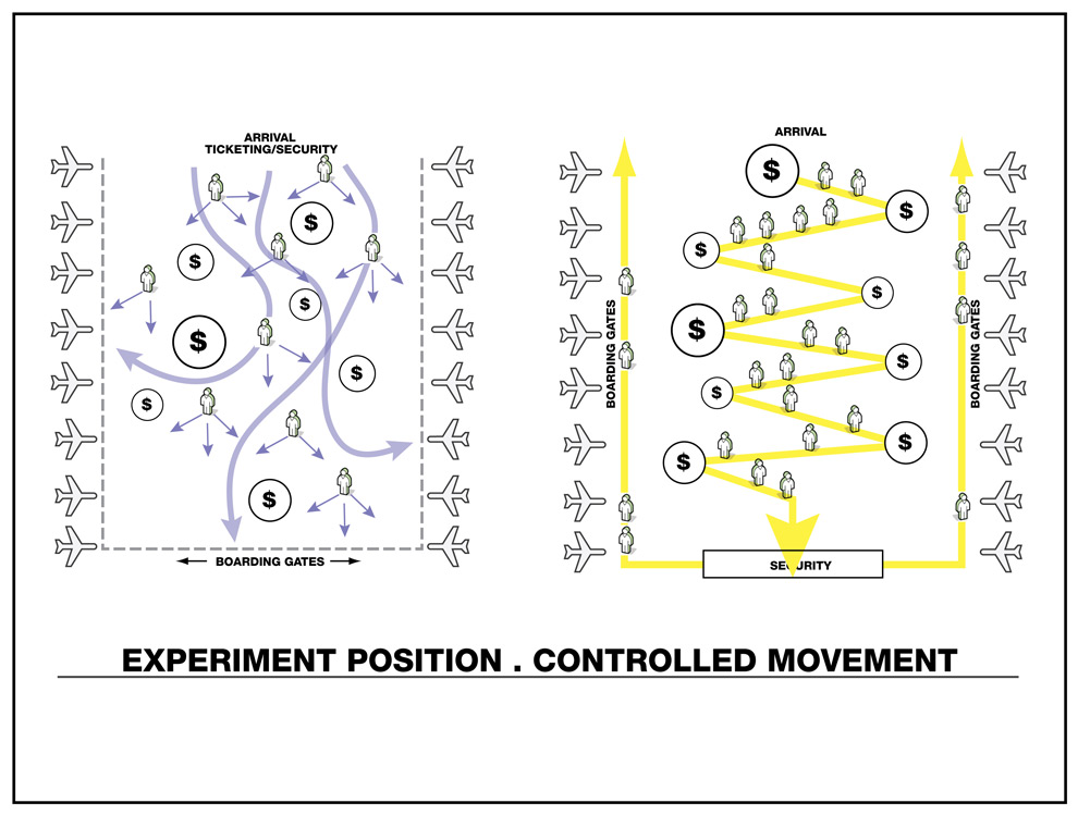
Freedom of movement for business class passengers on the left, forced path through retail space for tourist class passengers on the right. Trade offs of flying for free.
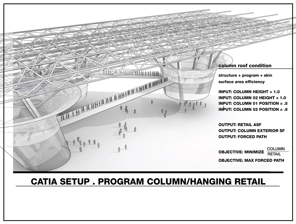
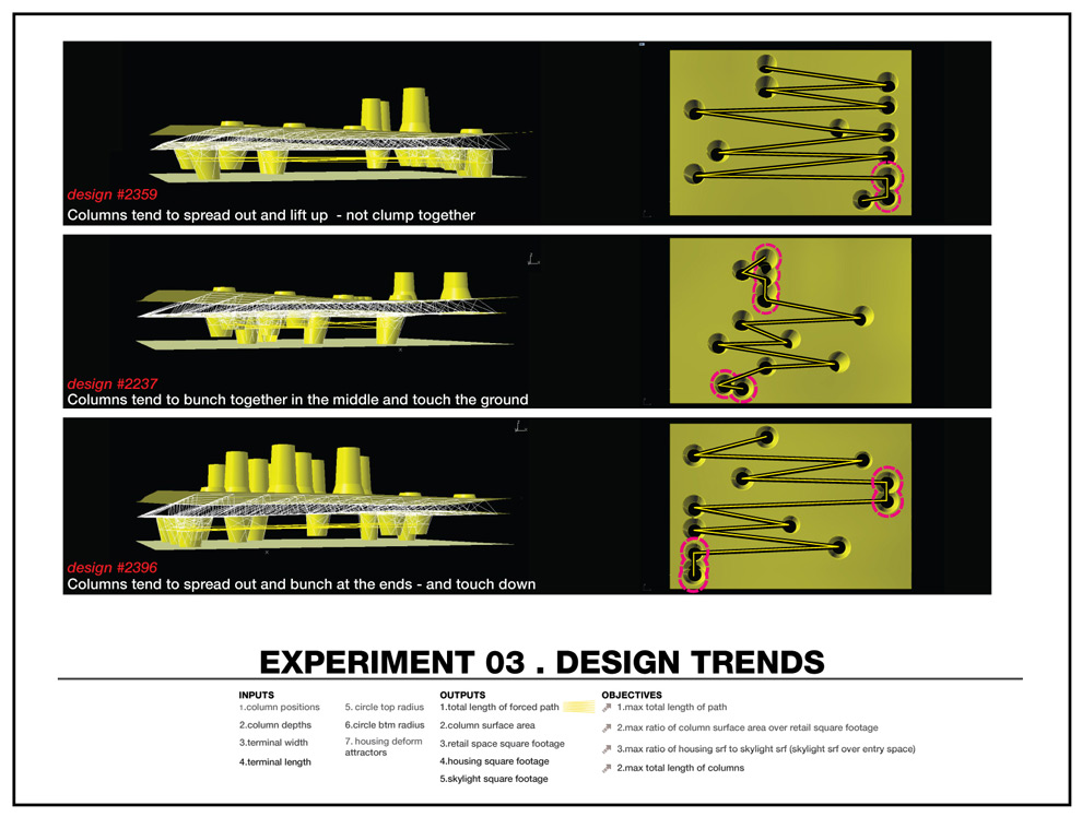
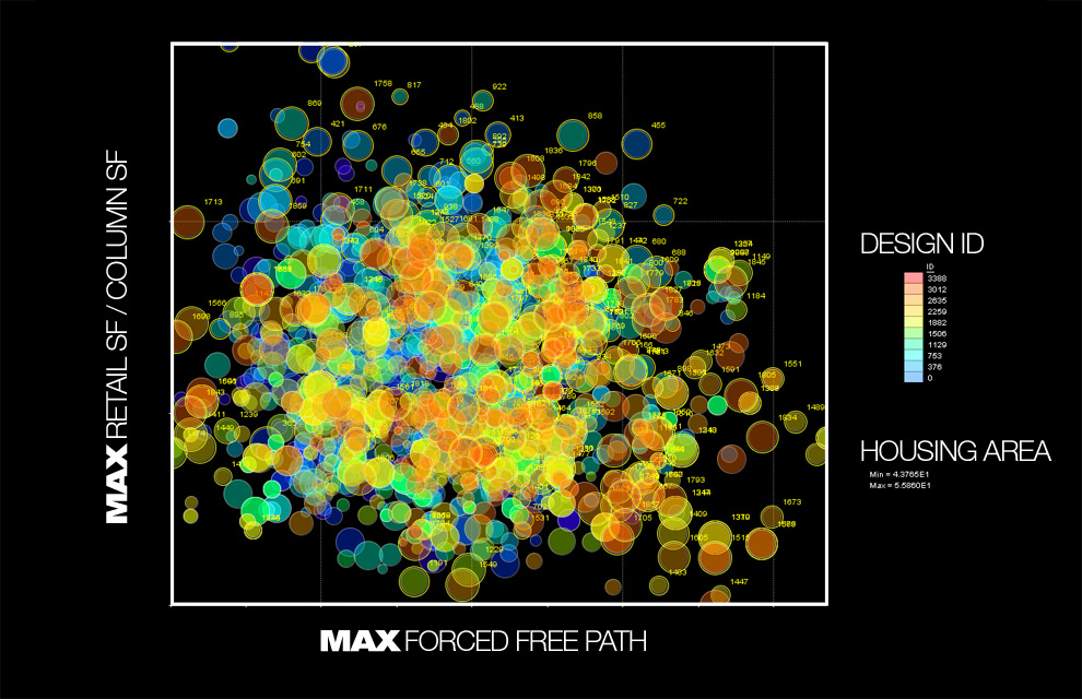
The addition of structure as an object creates more complex results

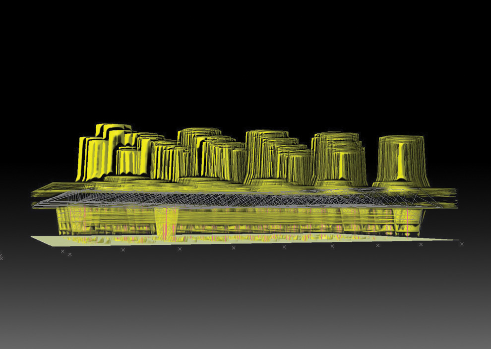
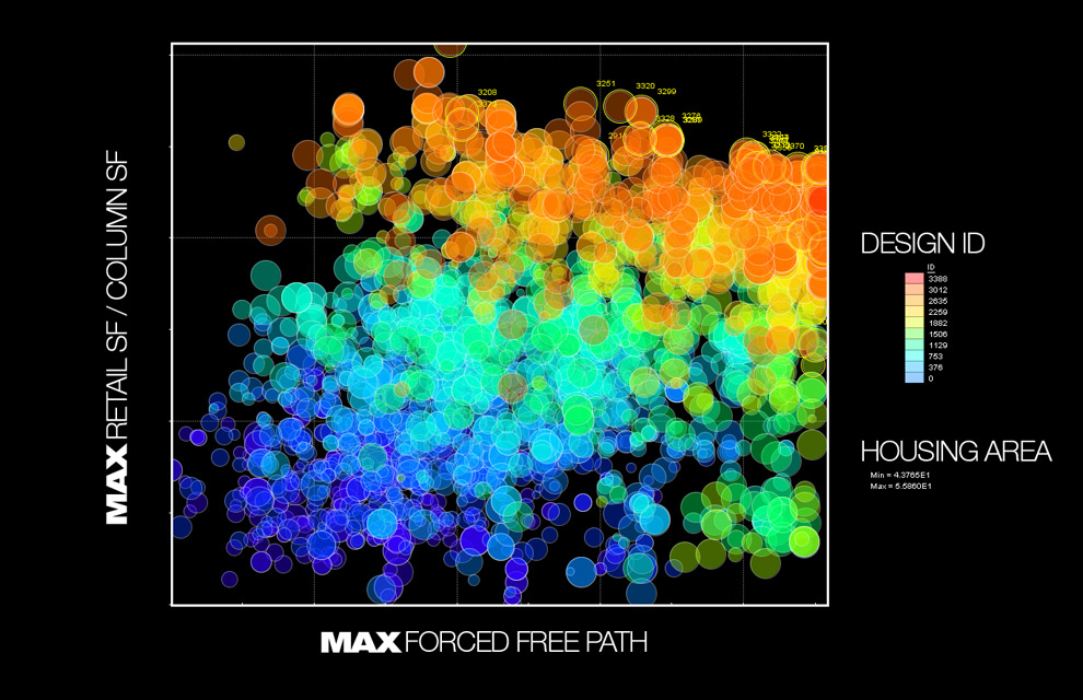
Overlay of 2500 designs to detect trends
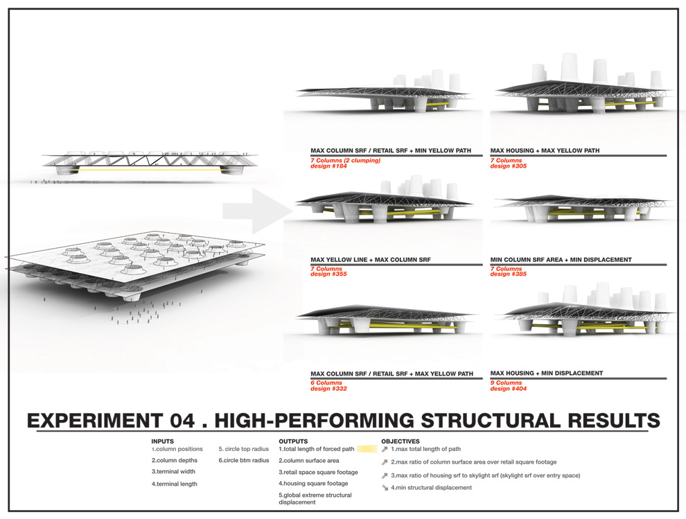
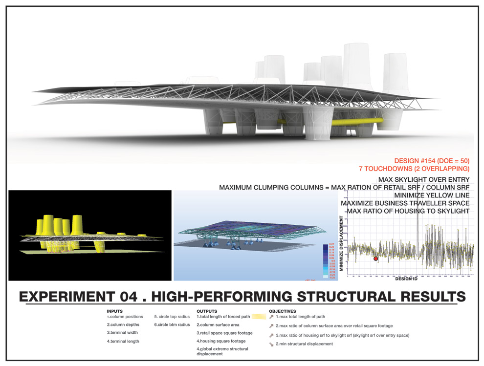
Unexpected, high-performing results. Columns shift to one side with housing towers above, while cantilevered roof tapers to minimize movement.

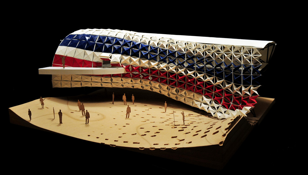
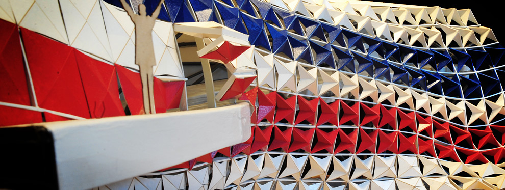
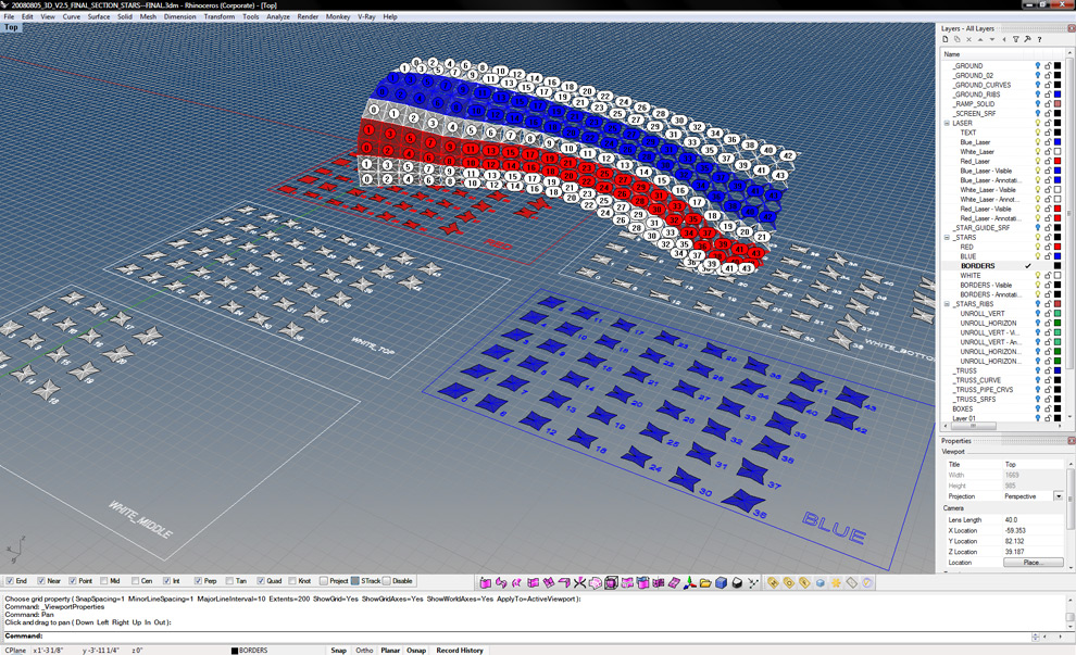
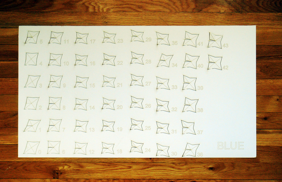
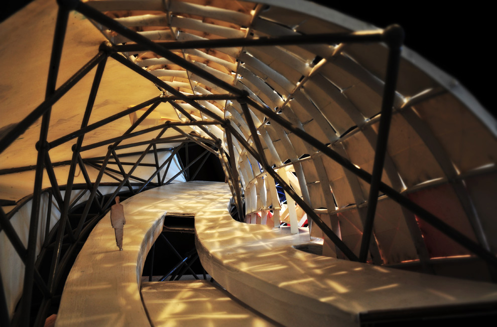
After my final model from last summer was somehow misplaced in the trash, then the compactor where it was crushed into a little cube before being placed in a trash barge a mere 36 hours before the final review, five months later the lazy days of winter break seemed like a good time to rebuild. One of the benefits of digital fabrication is you just have to re-lasercut all the files, though there is a certain level of zen like calm in folding and gluing 300 panels. The modular panels and truss were created in grasshopper, then scripted in rhino to unroll onto sheets.
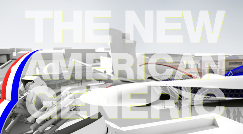
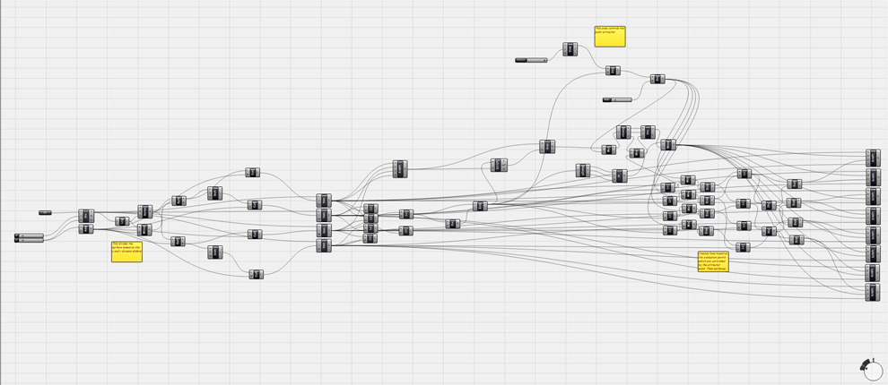
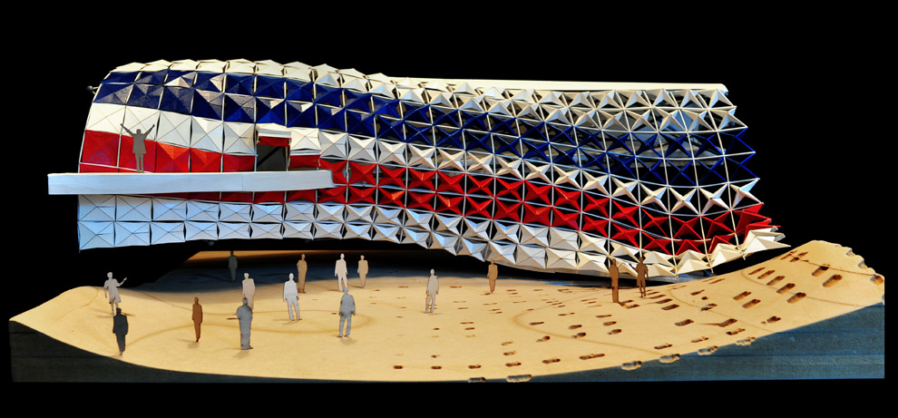
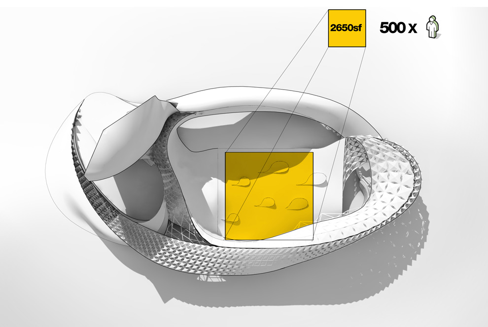
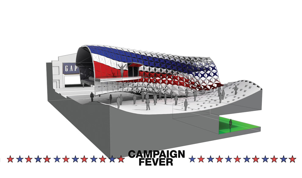
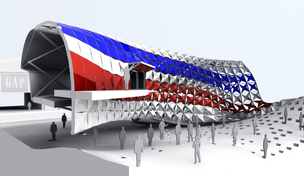
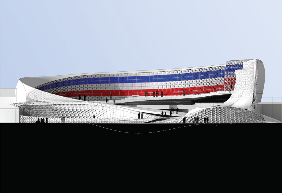
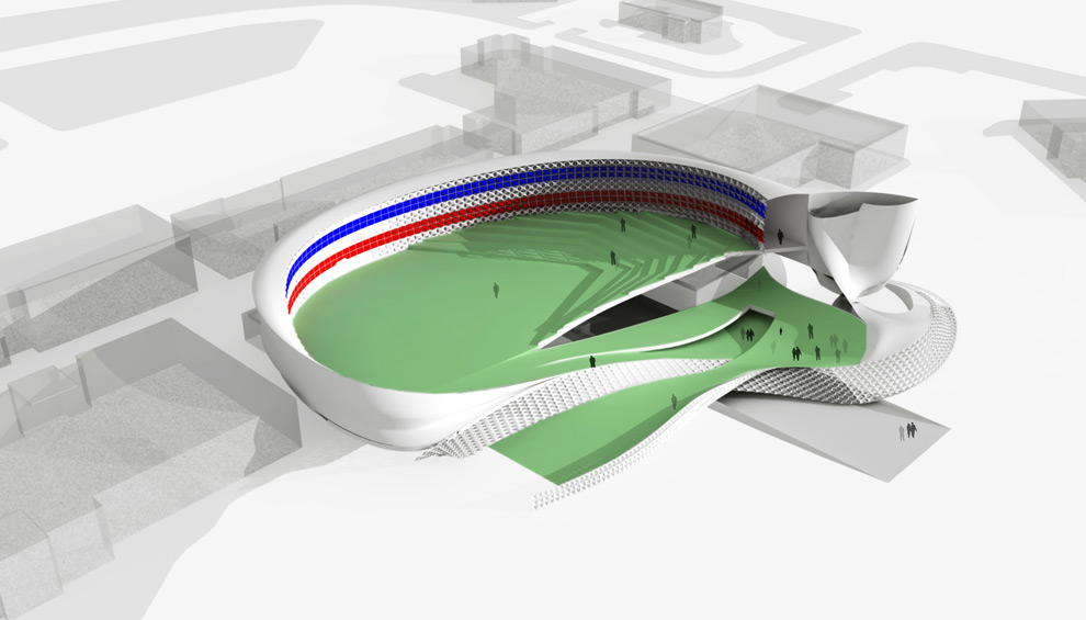
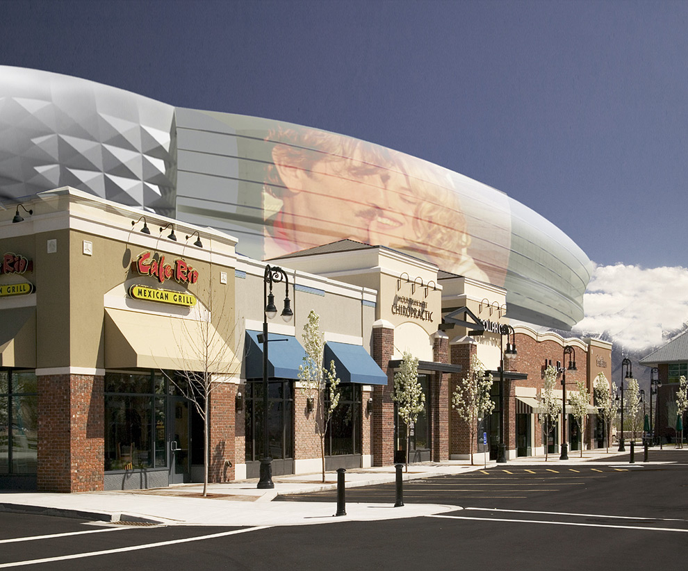
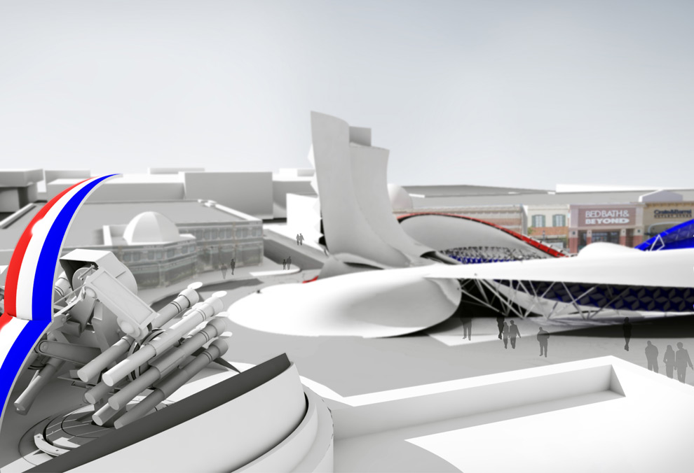
Quick Project Description: In America, the most active civic space is no longer public plazas or parks, but rather a new typology—“town centers”—Mall/Promenade hybrids of housing, public space, and shopping. This is where people gather, and into each of these places a civic function is inserted—political debate arenas where the viewer is no longer passive but takes an active role in the decision process, and is loudly confronted with a newfound political reality.
The project becomes a version of American Flag 2.0, something that doesn’t only wave from above in the wind, but rather demands work, a back and forth engagement between voter and candidate. The goal is that these can be sold to these town centers and through their sheer ubiquity and the rise of spectacle as a means of increasing shopping revenue, these proposals become the new American generic space.
Moving forward from midterm, I began identifying eight specific sites in the six battleground states that will have the most impact on the 2008 election. Two sites were explored further, specifically the purplest county – Franklin – in the purplest state – Ohio – located in the Columbus metroplex area. The Easton Town Center in Ohio displays a number of contradictions, home to the largest university in the country, but also numerous military contracting connections, including North American Aviation which manufactured components for the B-1 bomber in addition to missiles and guidance systems.
Each site was chosen not only for its status as a battleground state, but also as the 21st century incarnation of what constitutes public and civic space in America today, the outdoor shopping, dining, living spaces that are labeled as the new urban Town Centers, evolutions of the 1970s covered mall. If the goal is to affect and inform the greatest number of voters/shoppers, this is where the project would have to go, a placeless place lacking any form of civic engagement
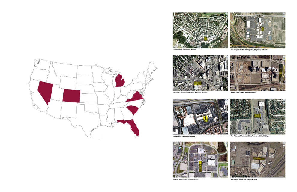
sites chosen were “town centers” in battleground states
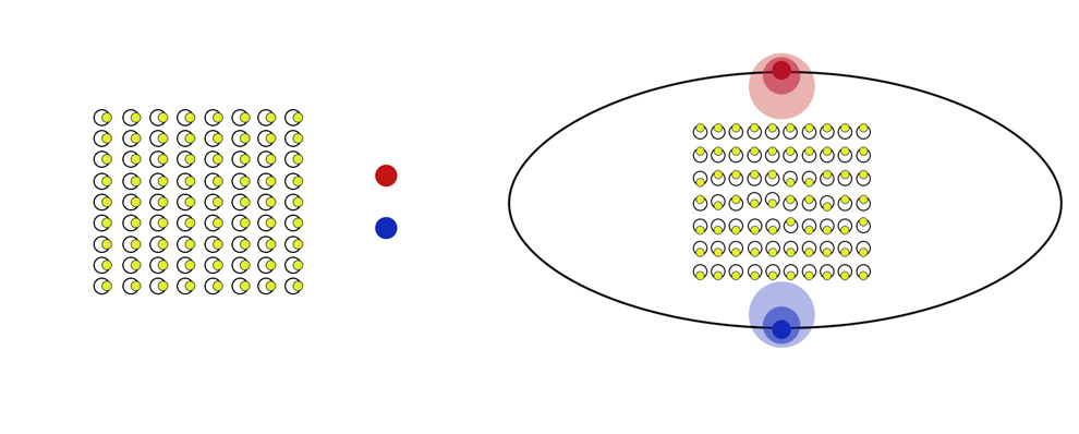
existing debate setup and audience participation on the left, proposed new debate setup on the right. audience begins to be an active participant
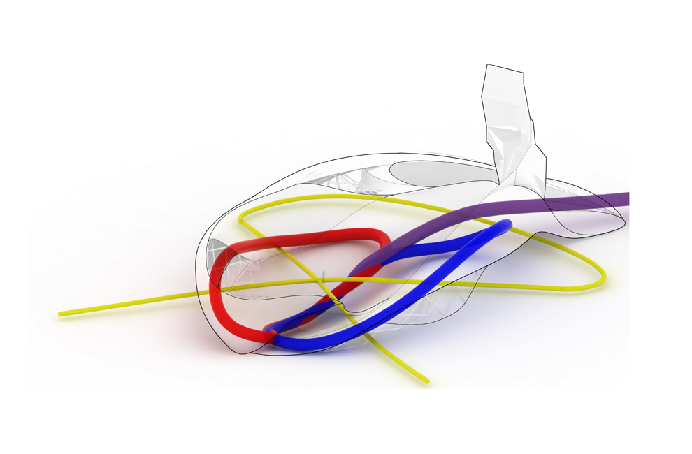
intersection and overlapping of candidate versus audience circulation vectors
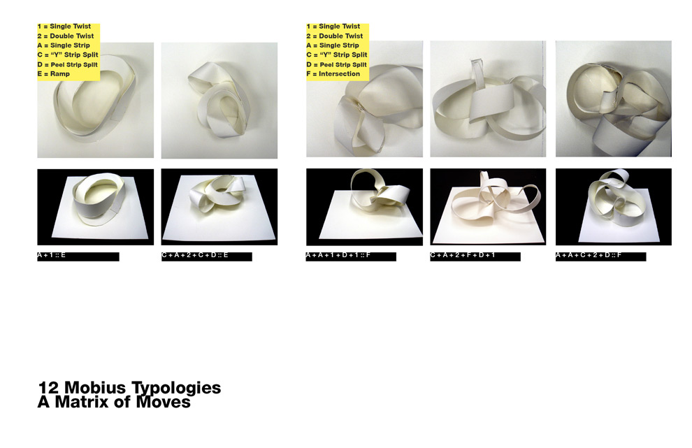
initial formal studies
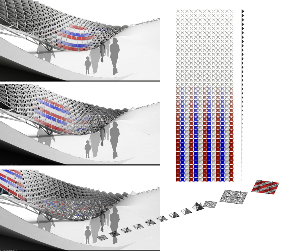
from stars to stripes, operable panel studies that heighten the anticipation of the speaker’s approach
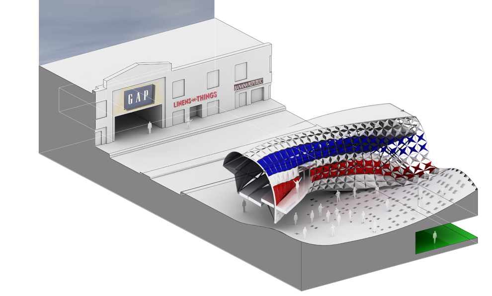
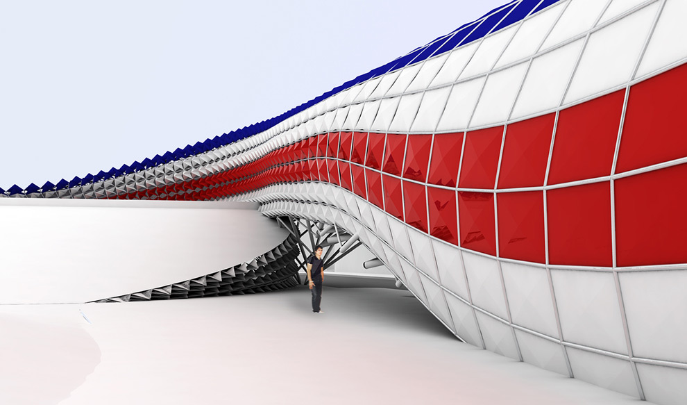
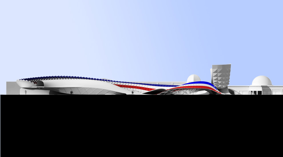
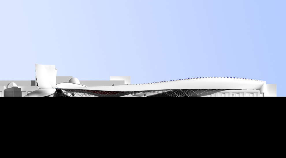
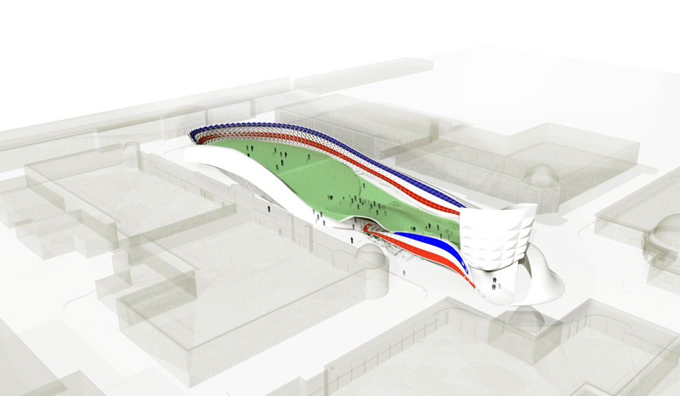
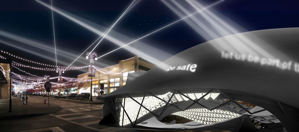
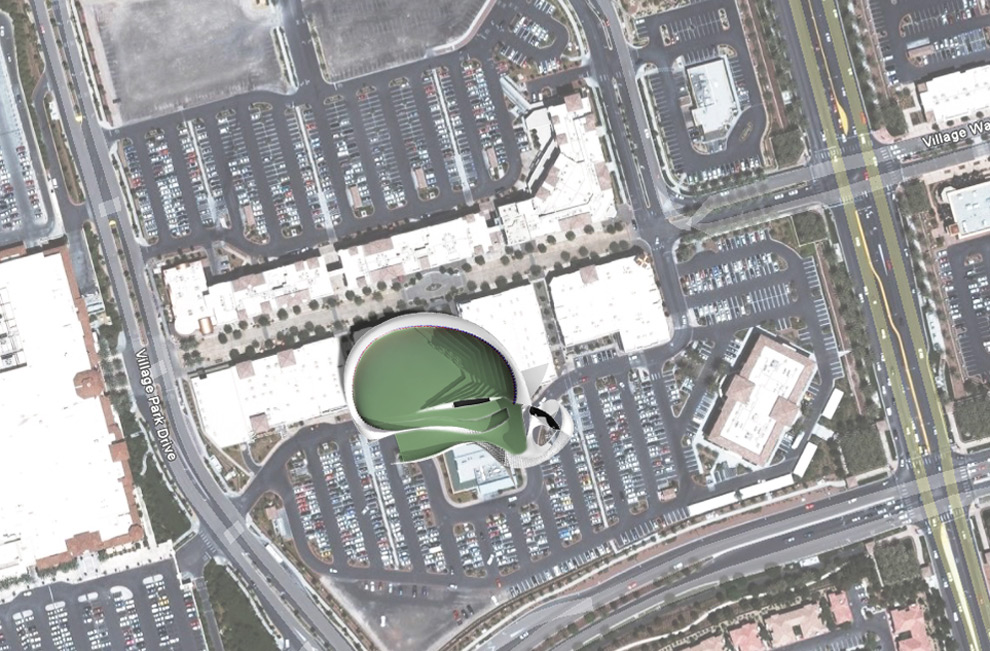
second site, Clarendon Virginia Town Center
see here more model photos
see here for additional renderings

car/truck shape study model 14.5”x7”x5.5”
layers of bondo molded over a rectangular metal base
The perception of color is relative. The interaction of multiple colors creates a new relationship that alters the nature of the individual shades. The light quality in the project is important to the reading of the building shape, therefore, stable colors were chosen that are also dull, cool and light. The value of the red/blue colors were the same, creating an underlying unity while also influencing the perception of the forms reflecting in sunlight – and hidden in shadow. The colors reinforce the overall formal gesture while maintaining the indivual integrity of the facets. This was the third component of the Shape Studio, the first component can be viewed here.

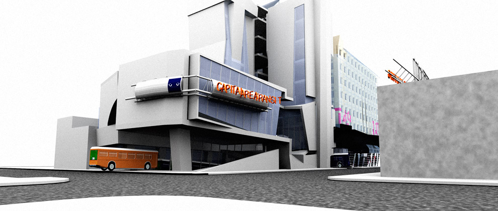
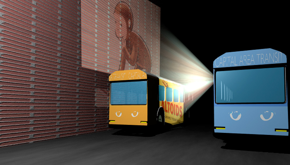
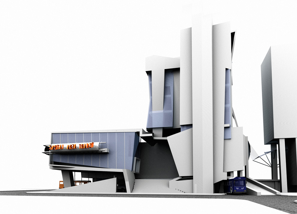
Far too often the ones advocating increased public transportation are absent when it came to riding public buses. The capital metro brand has become too associated with a misrepresentation of resources and nondescript buses. We proposed to do away with the old name and replace it with ‘Capital Area Transit.’ Much of the imagery for the logo and design of the bus stop came from ‘CAT,’ the idea of nimbleness and sharp vision. This also created something inclusive, bringing more people together by a shared name that allowed the riders to give the transit system their own slang term, not an official nickname.
I wanted to simplify the contradictory organization method, and replace it with a more universal color-coding system: each route will be color-coded and each bus stop will correspond with the color of the bus. With television screens commonplace in automobiles and advertising becoming increasingly obtrusive, we sought to take this one step further: starting with the idea of the eye, I proposed fitting the buses with image protectors. Passing cars, buildings and people all become part of the image. Changing projection and led screens on the bus help target specific audiences. They can be programmed to display different images to specifically target economic and ethnic parts of the city. Also, the coveted rush hour times could bring in increased revenue.
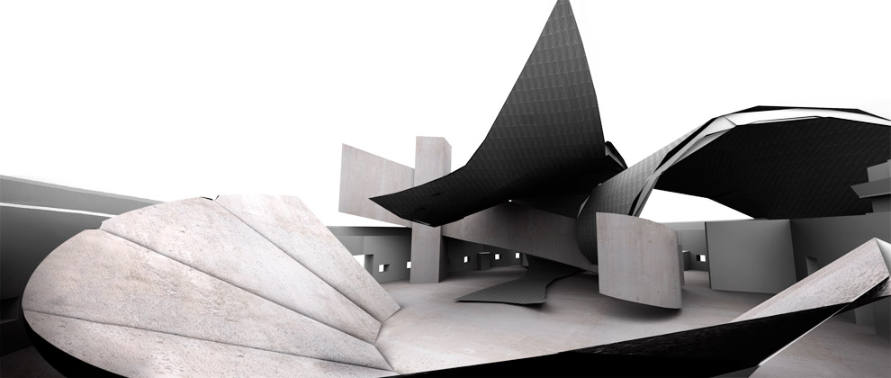
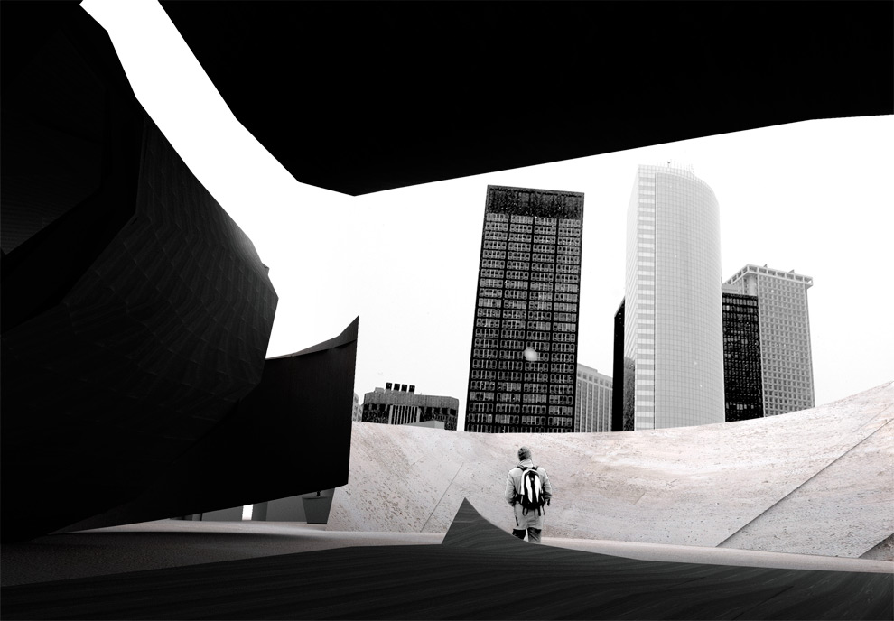
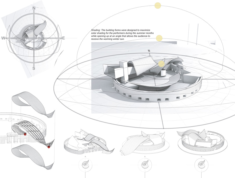
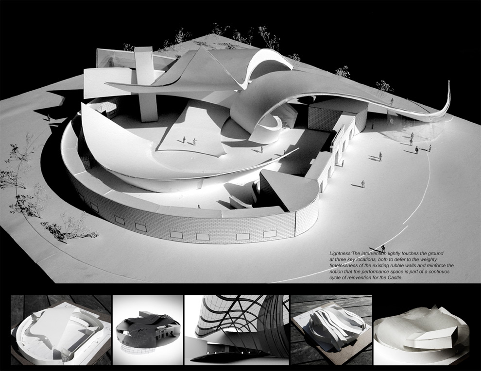
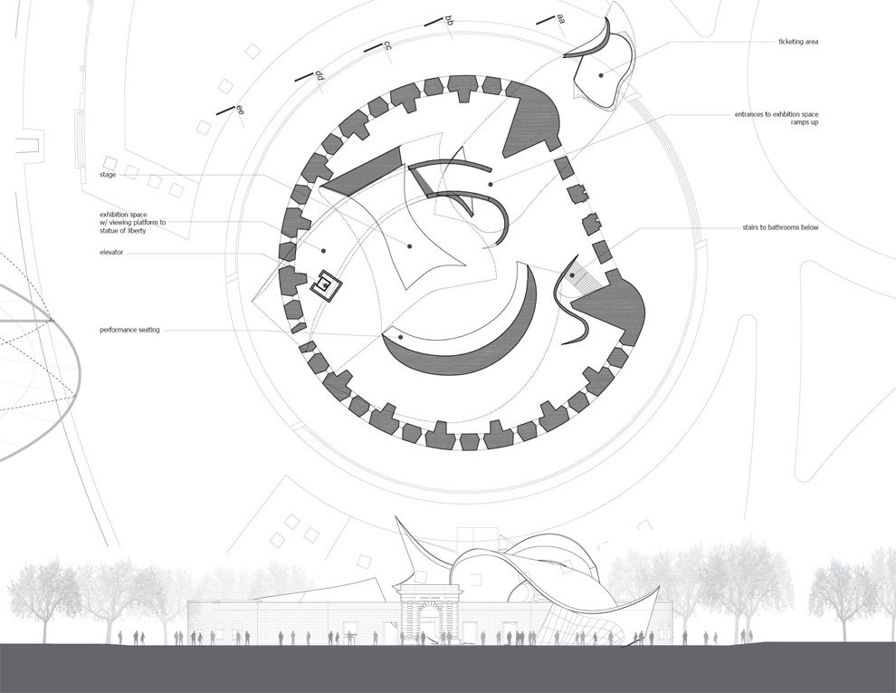
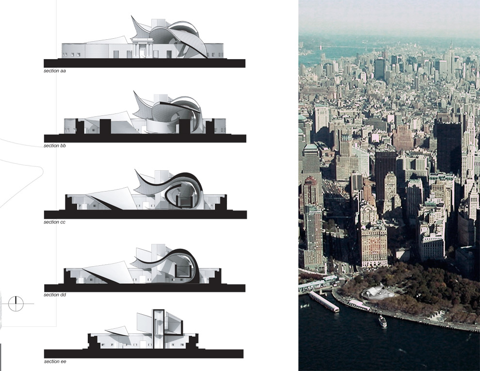
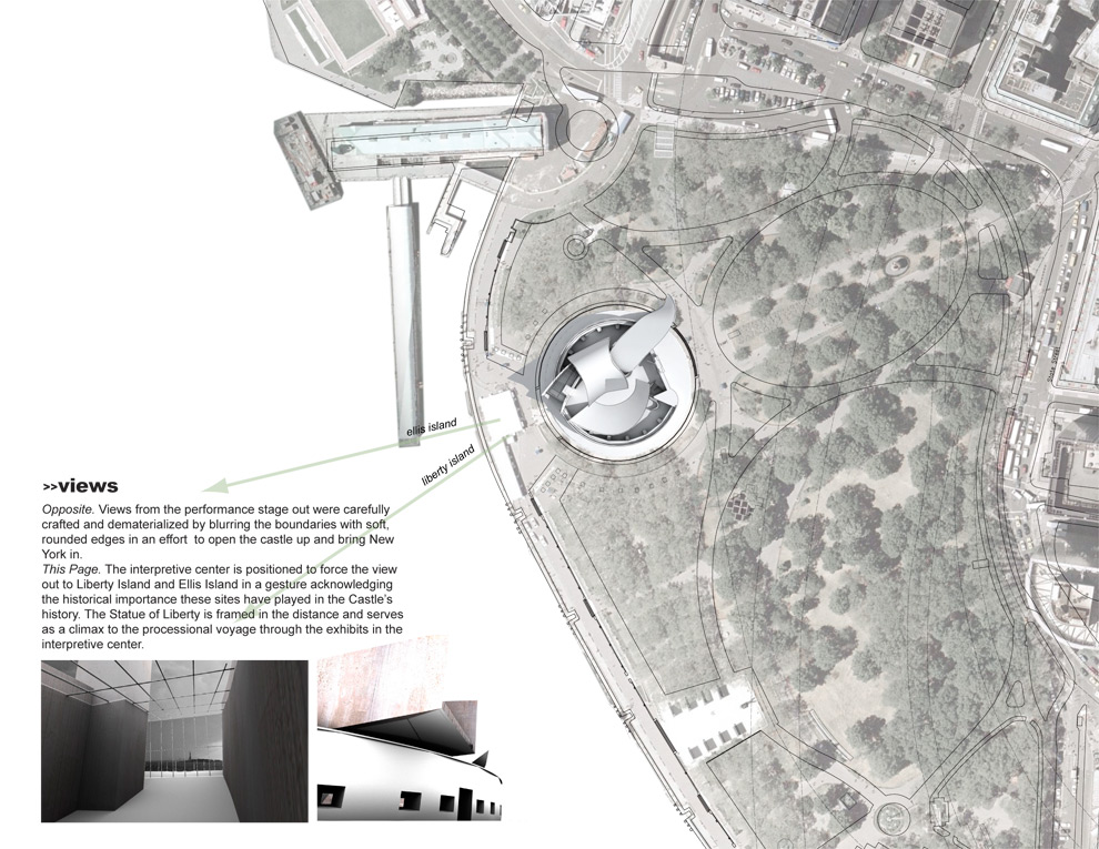
Since its creation as a defensive fortification during the war of 1812, Castle Clinton has undergone a series of reinventions. While the inner activities have changed, the solid masonry walls have withstood, providing a blank slate – or bowl – for new programmatic activities, from an immigration processing station to an aquarium to its latest iteration as a performance space for lower Manhattan and the centerpiece of a renovated Battery Park.
The challenge became how to maintain the ring shaped exterior walls, while creating a welcoming and inviting space for artistic expression. To both emphasize the existing historic walls and the new intervention, the differences between the two were played for maximum effect – avoiding any attempts at a formal or historic similarly. In stark contrast, each could maintain their individual sense of integrity: new vs. old, light vs. heavy, closed vs. open, solid construction vs. modern building techniques all became overriding principles. In addition, because the intervention is without enclosed volume, the relationship between sharp-inside and curved-outside corners were emphasized. Thomas Phifer was the studio critic for this project.
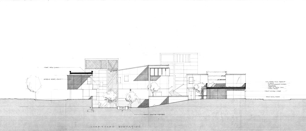
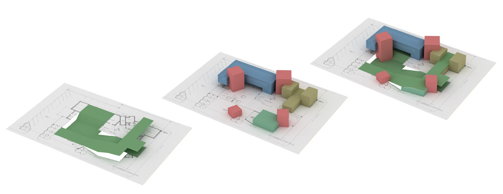
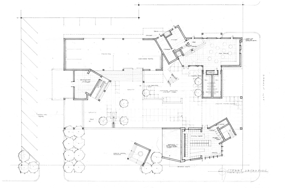
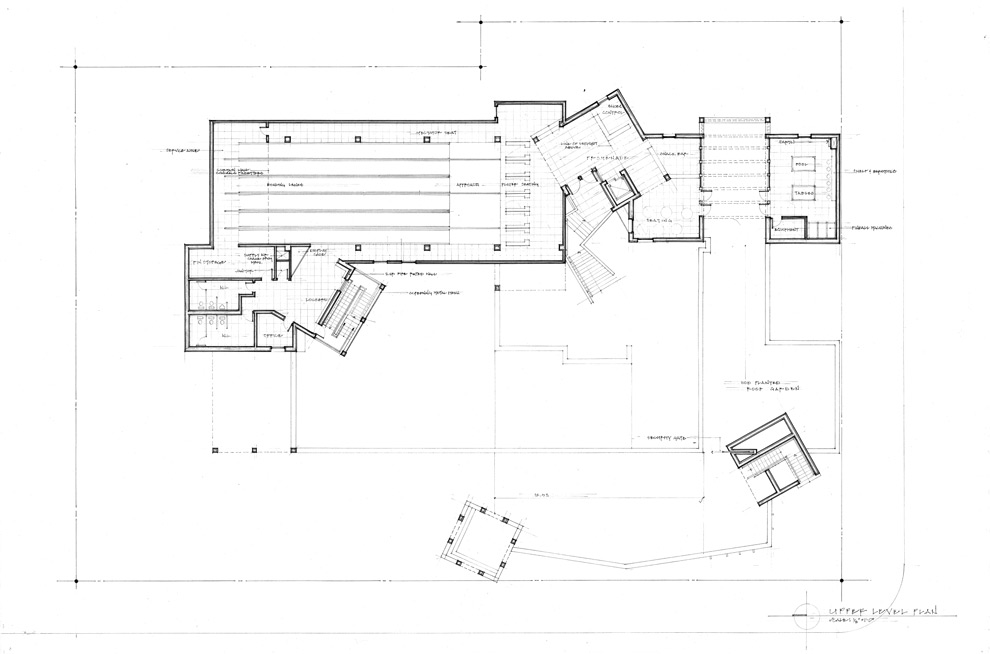
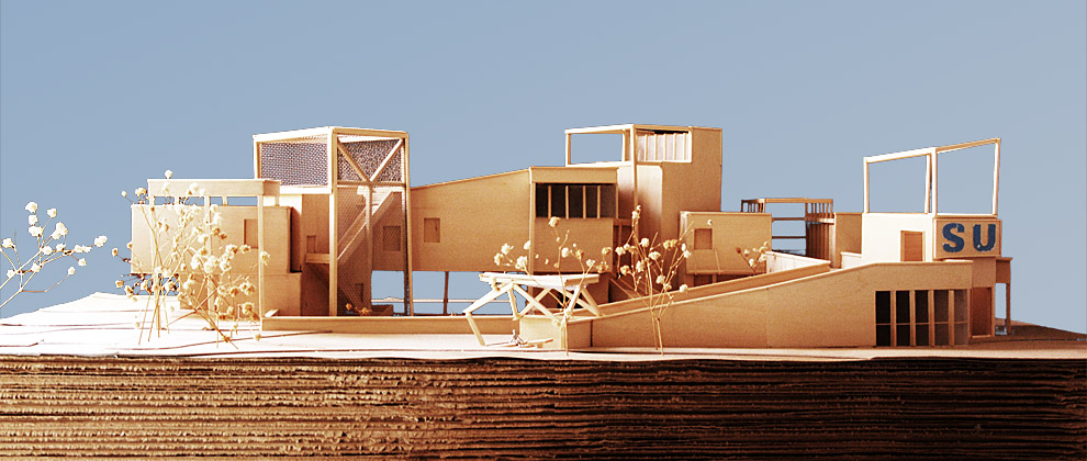
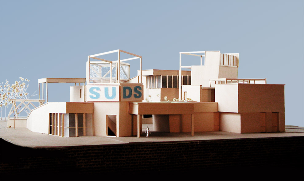
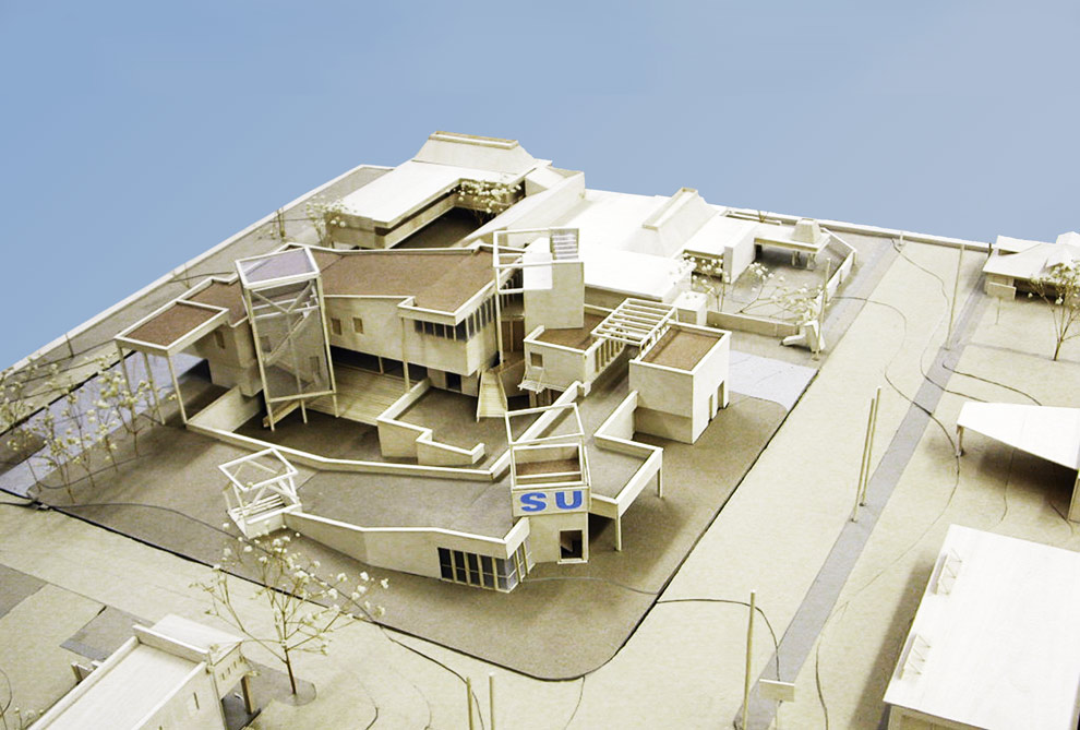
The program called for a combination of leisure activities that any college student is well acquainted with: bowling, drinking and washing laundry. The design reflects some of these playful qualities while also creating a ground, a city within a city. The building is meant to provide a strong presence in an area where the inhabitants are recycled every four years – perpetually created anew.
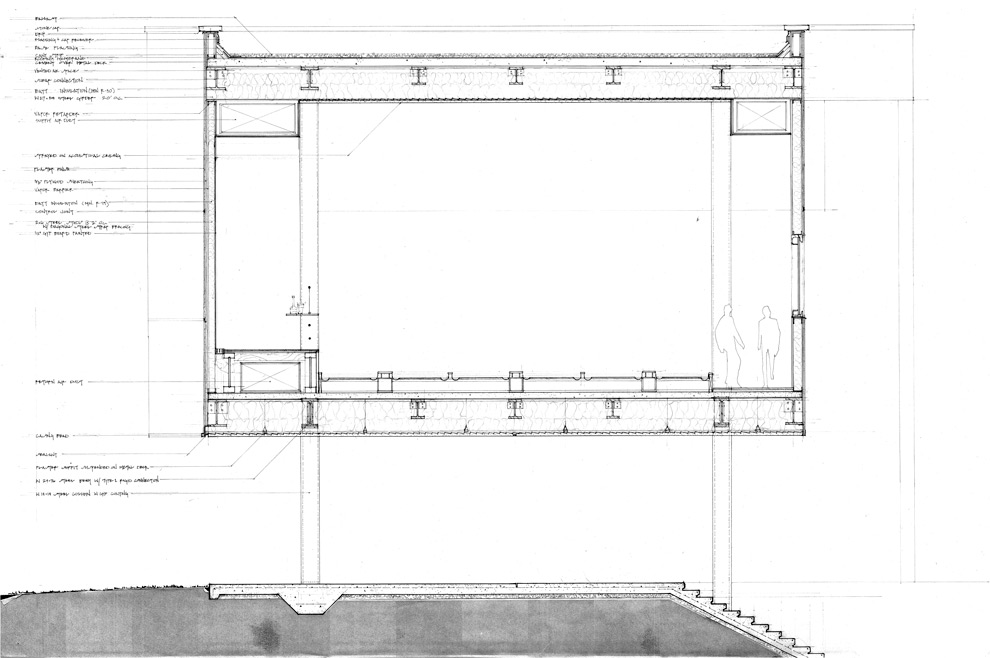
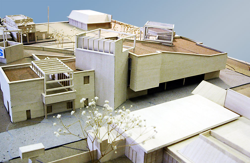
The design is separated along program and wraps itself protectively around a central sunken courtyard that provides shade and solace. The line between inside and outside is blurred through the use of roof gardens, cantilevered overhang spaces and the absence of a traditional central front door to the business. As opposed to one central building, the programmatic elements are separated into a collection of buildings, meant to evoke the layout of a college campus. Inhabitable outside void spaces were key and provide open areas for outside cafes and meeting spaces. Also, each program is expressed separately to accommodate differing hours of operation. The space is unified by a consistent structural grid of 20 x 45 feet.
The mechanical and support areas are articulated in a grouping of vertical towers. The towers reference both the separate programs as well as reinforce the idea of a place in and of itself. The building’s service areas contain vertical circulation, and the roof-packaged air conditioning units are localized in these towers. The collision of the service towers and program areas creates areas of complexity and spatial interest, while referencing the transient nature of the patrons and the interstitial urban gridwork of the University corridor.
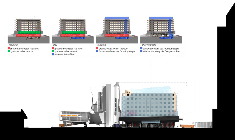
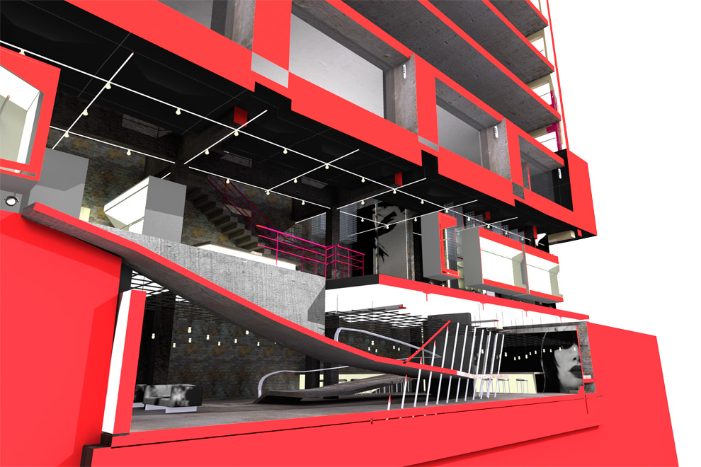
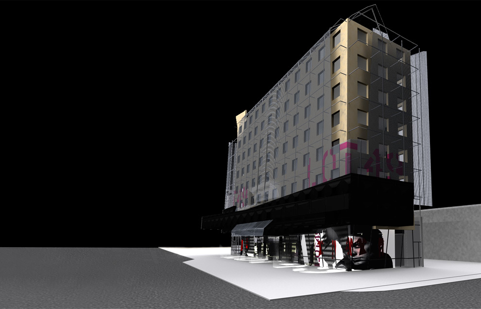
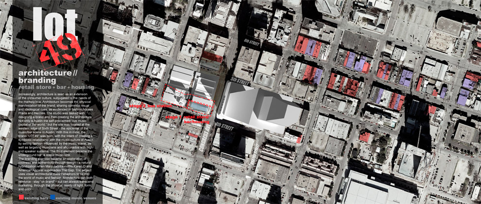 Increasingly, architecture is seen as an extension of the consumer culture, subjugated to the needs of the marketplace. Architecture becomes the physical manifestation of the brand, sharing common visual and ideological cues, as evidenced in fashion houses Prada and Hermes. The studio was tasked with designing a brand and then creating the architecture.
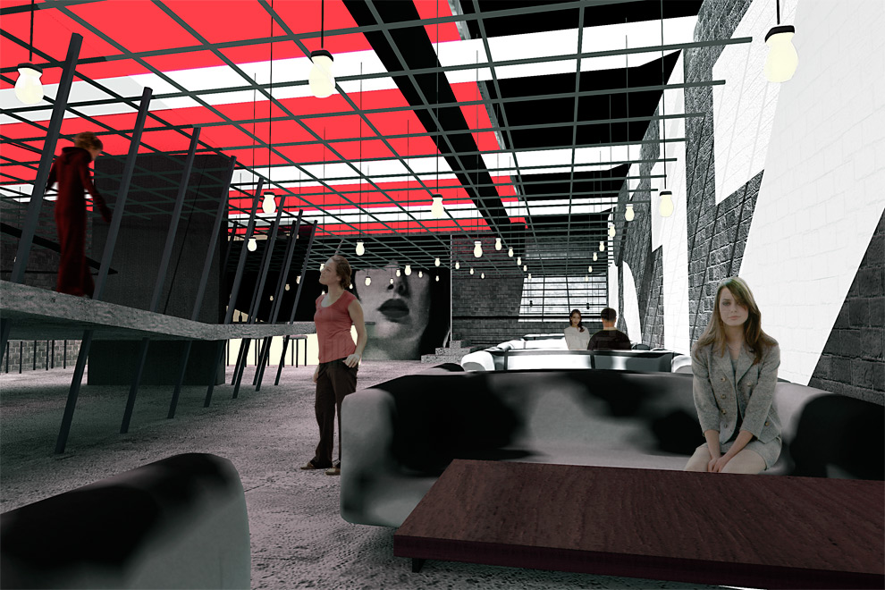
Not only is Austin the self-proclaimed “live music capital of the world,” but the site was located at the western edge of Sixth Street – the epicenter of the music/bar scene in Austin. With this in mind, the brand “LOT49” was born, with the intent of creating a symbiotic relationship with the music culture of Austin by selling fashion influenced by the music scene, as well as targeting musicians and aficionados with high-end speaker systems. The third element became the underground bar, a staple music lore.
The branding exercise became an exploration of coolness and authenticity through design – a natural hybridization when Marc Jacobs outfits Karen O and American Apparel supercedes The Gap. The project uses visual architectural cues/metaphors to tie into the world of music and fashion. Architecture can both reinforce – stay “on brand” – but can always transcend marketing, through the physical, reality of light, form and color.
This was also the first paperless studio project I worked on. I was fumbling around with lightwave 6.0 all semester. It’s incredible how far technology has come in four years. ]]>
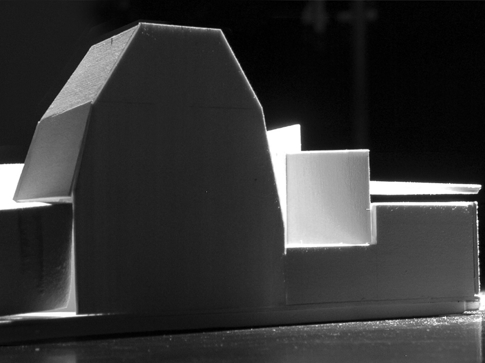
Architecture is a game of limits. Some studios work within the confines of context, program and site, here we explored limits that were more intangible. The studio worked directly with a strong emphasis on space, shape, color, light, shade and shadow. We searched for limits, letting function simmer while heating up the form. We explored limits in three shape studies in a variety of form and media: 1) Two dimensional shape black and white paintings 2) Three dimensional car/truck bondo shape studies and 3) Building design studies: proposals for an automotive body shop and paint shop.
An early limit arose from light illuminating a distant plane, while backlit shapes filled the foreground, creating space and hope, and drawing the worker into his business. I also advocated the use of a strong void space. The black and white paintings evolved from logocentric gestures, yielding overlapping spaces where smaller elements could be brighter than the whole. Contrast functioned as a powerful space-making tool within the project, as well as with the neighboring context. The play between soft, near edges; and farther, harder planes influenced much of the car/truck shape-making, as well as issues of silhouette, color and perceived mass.
Learning about the site: As part of our analysis of the site, we moved beyond standard topographic information. Frequent visits to the site, meeting people, and making sketches, paintings and photographs led to a fuller understanding of the area and yielded a building intervention that had a deeper relationship to the intangibles of the area.
Learing about the culture: Residents of the neighborhood live in the same house they were born in, the same house their grandparents were born in. It became necessary to meet with people and hear their stories and opinions. Local institutions and neighborhood history became additional site considerations. From this extemporaneous, improvised neigborhood, the studio work took on a messy quality that reinforced the sense of immediacy.
See the second part of the studio here, shape and color.
See the first part of the studio here, black and white shape paintings.
]]>
