car/truck shape study model 14.5”x7”x5.5”
layers of bondo molded over a rectangular metal base
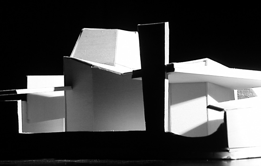
The perception of color is relative. The interaction of multiple colors creates a new relationship that alters the nature of the individual shades. The light quality in the project is important to the reading of the building shape, therefore, stable colors were chosen that are also dull, cool and light. The value of the red/blue colors were the same, creating an underlying unity while also influencing the perception of the forms reflecting in sunlight – and hidden in shadow. The colors reinforce the overall formal gesture while maintaining the indivual integrity of the facets. This was the third component of the Shape Studio, the first component can be viewed here.
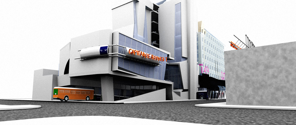
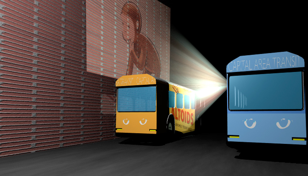
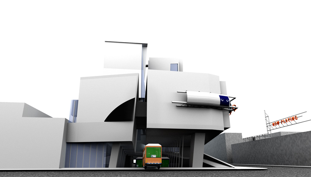
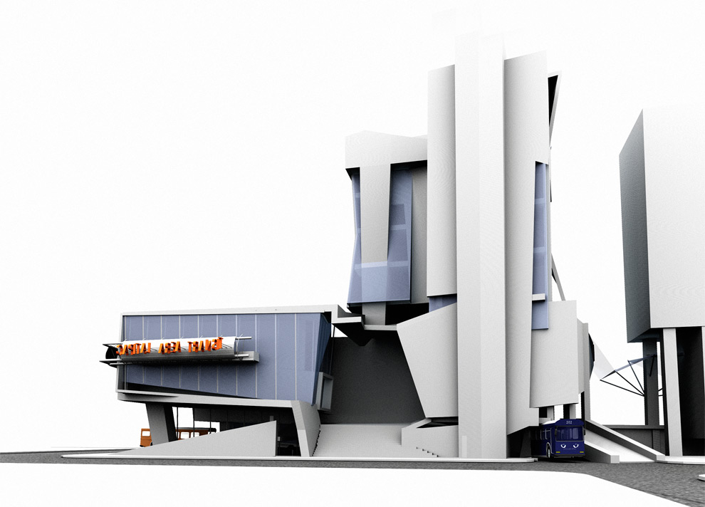
Far too often the ones advocating increased public transportation are absent when it came to riding public buses. The capital metro brand has become too associated with a misrepresentation of resources and nondescript buses. We proposed to do away with the old name and replace it with ‘Capital Area Transit.’ Much of the imagery for the logo and design of the bus stop came from ‘CAT,’ the idea of nimbleness and sharp vision. This also created something inclusive, bringing more people together by a shared name that allowed the riders to give the transit system their own slang term, not an official nickname.
I wanted to simplify the contradictory organization method, and replace it with a more universal color-coding system: each route will be color-coded and each bus stop will correspond with the color of the bus. With television screens commonplace in automobiles and advertising becoming increasingly obtrusive, we sought to take this one step further: starting with the idea of the eye, I proposed fitting the buses with image protectors. Passing cars, buildings and people all become part of the image. Changing projection and led screens on the bus help target specific audiences. They can be programmed to display different images to specifically target economic and ethnic parts of the city. Also, the coveted rush hour times could bring in increased revenue.
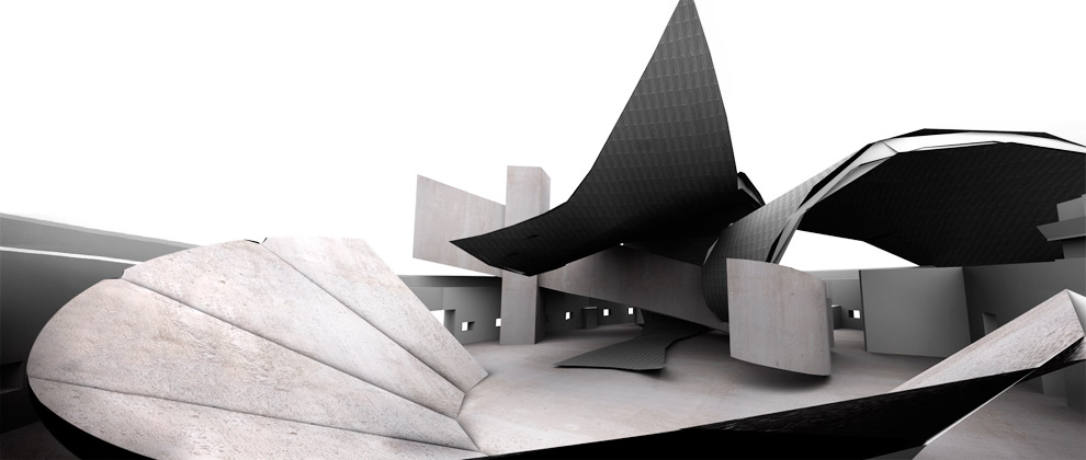
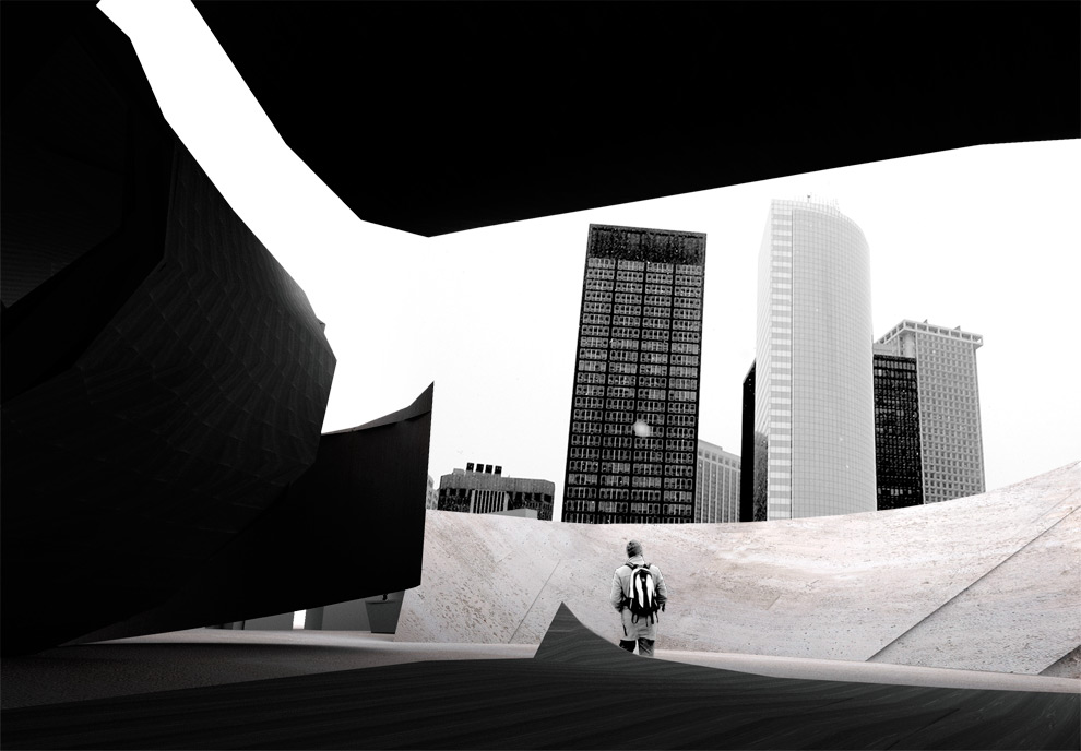
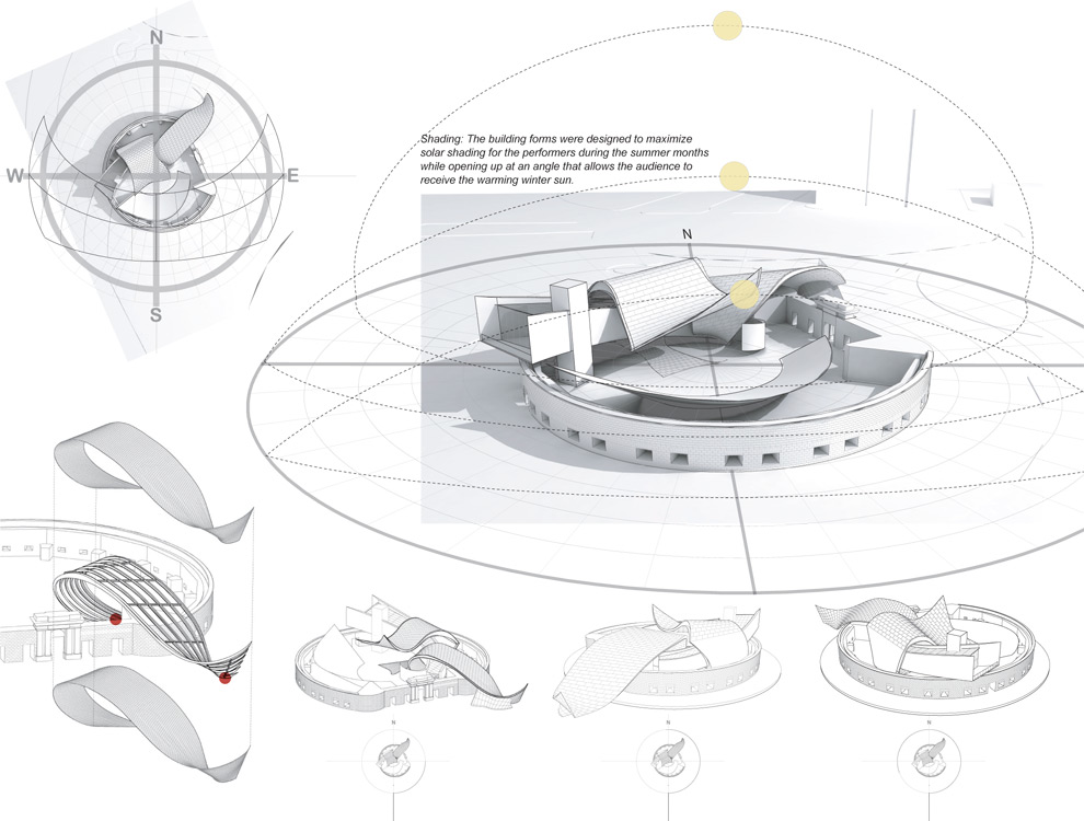
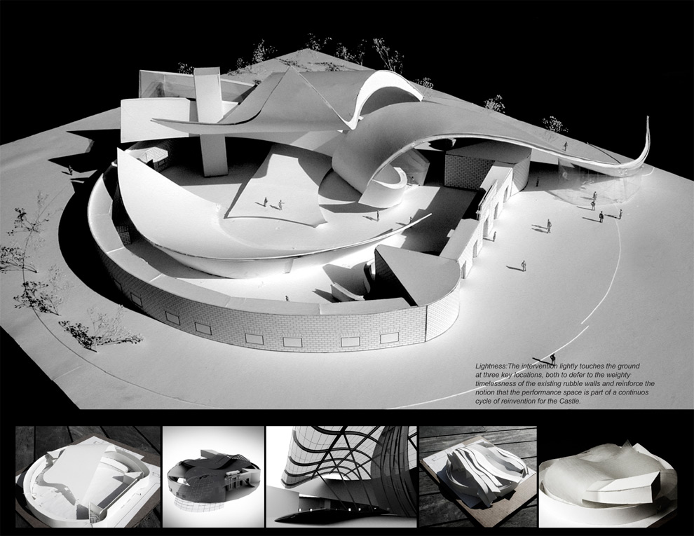
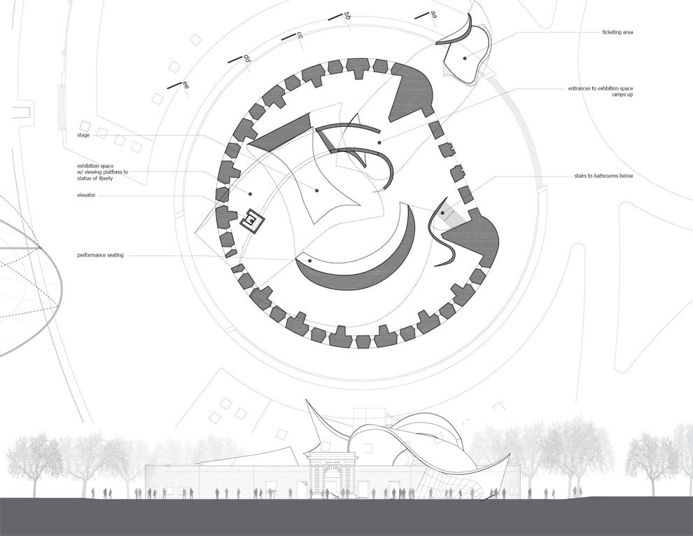
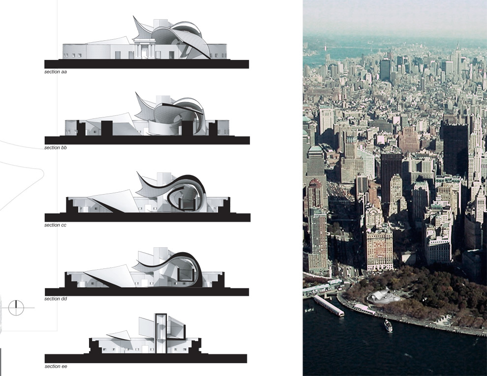
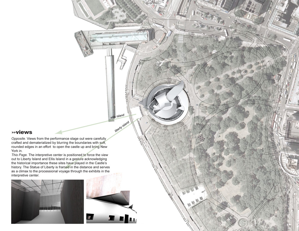
Since its creation as a defensive fortification during the war of 1812, Castle Clinton has undergone a series of reinventions. While the inner activities have changed, the solid masonry walls have withstood, providing a blank slate – or bowl – for new programmatic activities, from an immigration processing station to an aquarium to its latest iteration as a performance space for lower Manhattan and the centerpiece of a renovated Battery Park.
The challenge became how to maintain the ring shaped exterior walls, while creating a welcoming and inviting space for artistic expression. To both emphasize the existing historic walls and the new intervention, the differences between the two were played for maximum effect – avoiding any attempts at a formal or historic similarly. In stark contrast, each could maintain their individual sense of integrity: new vs. old, light vs. heavy, closed vs. open, solid construction vs. modern building techniques all became overriding principles. In addition, because the intervention is without enclosed volume, the relationship between sharp-inside and curved-outside corners were emphasized. Thomas Phifer was the studio critic for this project.
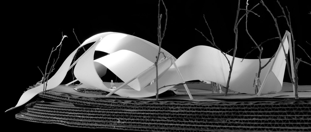
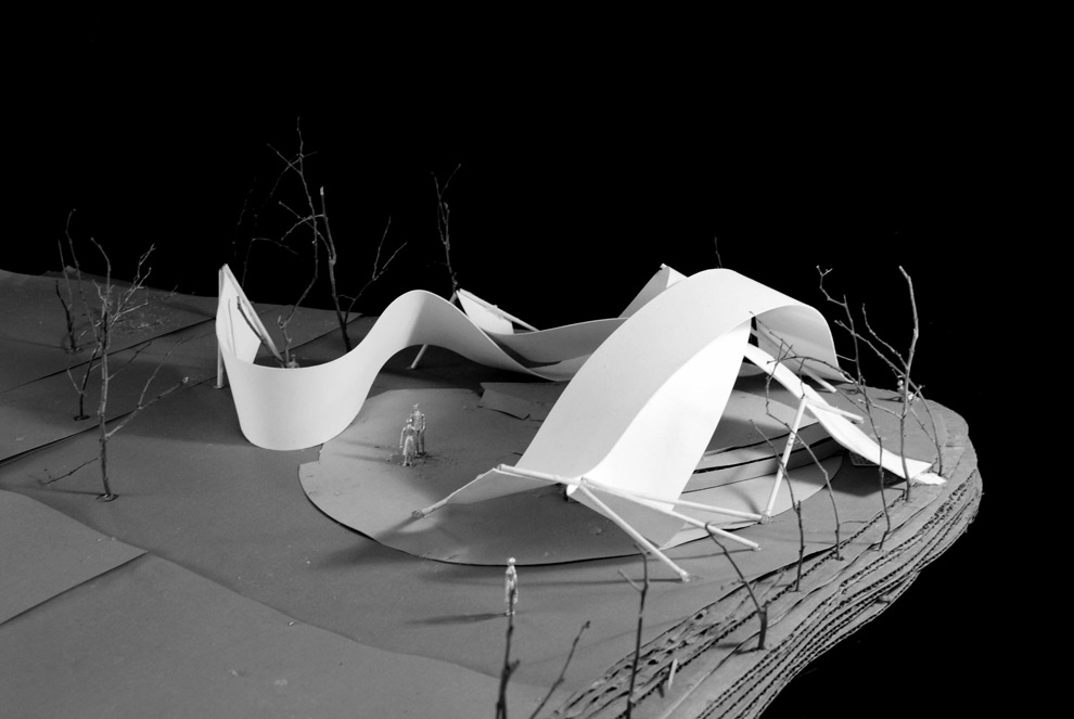
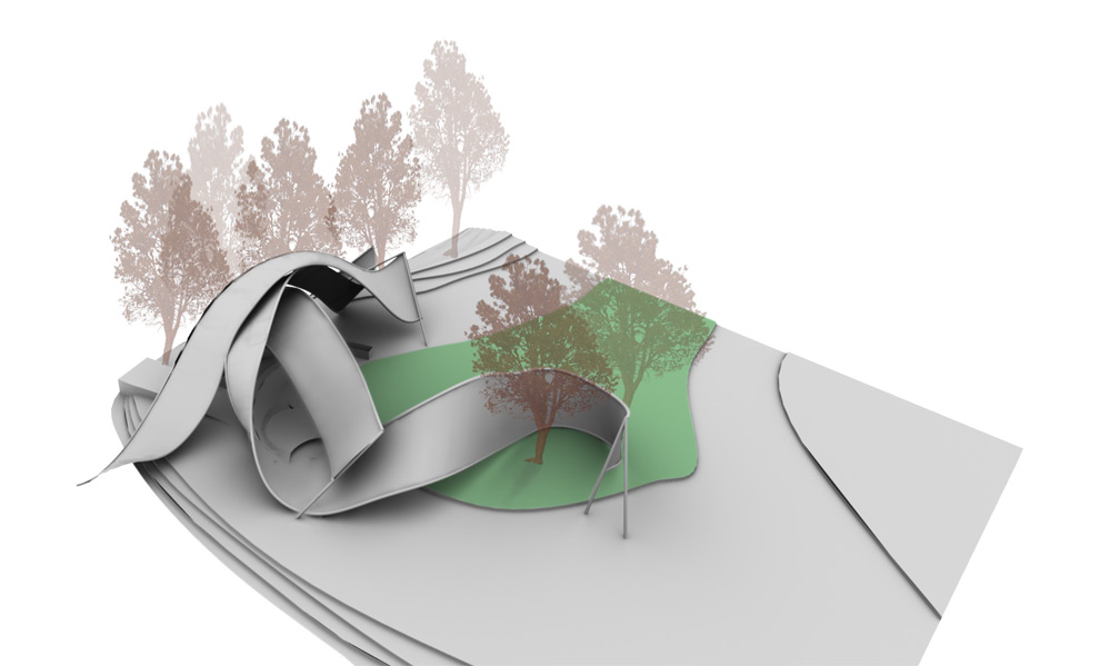
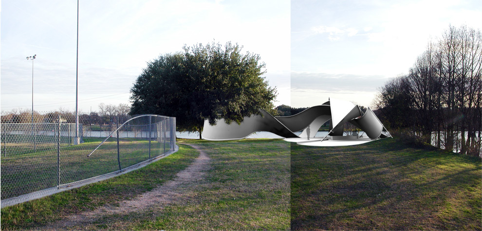
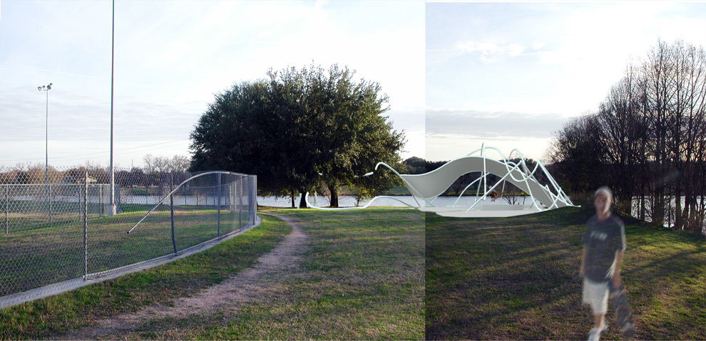
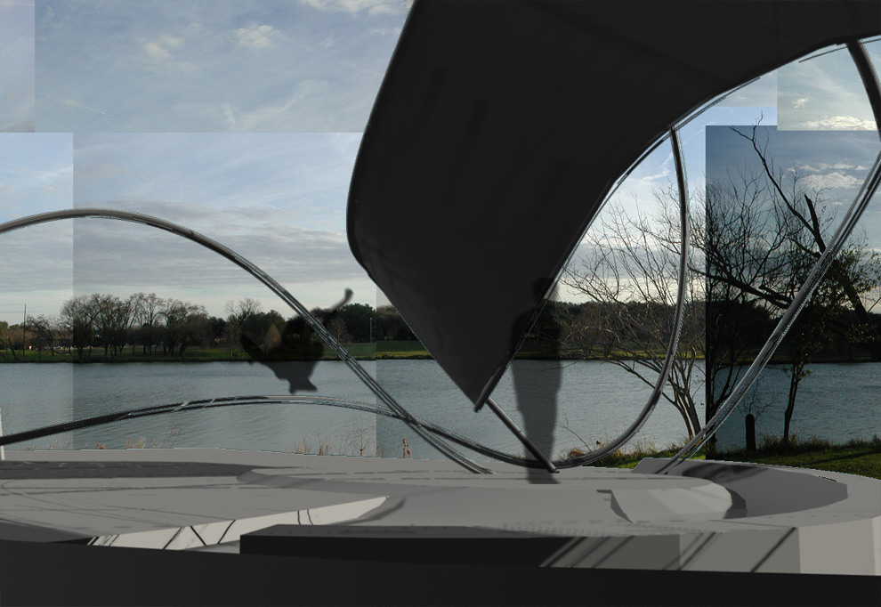
The Challenge: 1) Analyze and choose a site along the 10.1 mile stretch of park along the Colorado River, which winds through Austin, creating Town Lake. 2) Design a space for artistic performances that is movable, able to transform into an “on” and “off” position.
The Solution: 1) A site was chosen in East Austin, near a rundown park in a neighborhood struggling with a lack of facilities for local children. This is in sharp contrast to other parts of Town Lake that are primarily used as walking and jogging trails for more affluent visitors. The site is also geographically unique, having an insular quality – surrounded by water on three sides – making possible a significant, central entry point. 2) A design was chosen that would still provide a functional purpose when the container was in its “off” position. With the rapidly declining public opportunities for skateboarding, the Performance Container was designed to transform into a skate park, providing a recreation center for the neighborhood. This was accomplished by creating three ribbons that lightly touch the ground and actively engage with the natural landscape of the site to create space. Like a roll of paper, each ribbon could be retracted or unfurled based on necessity.
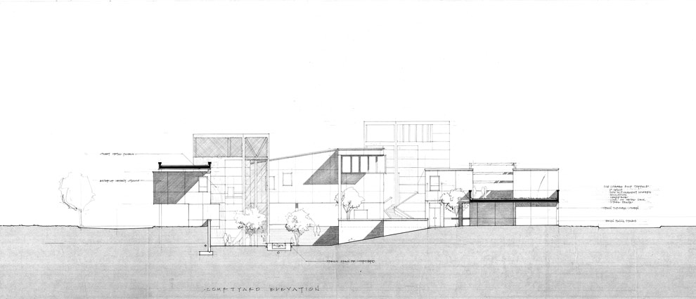
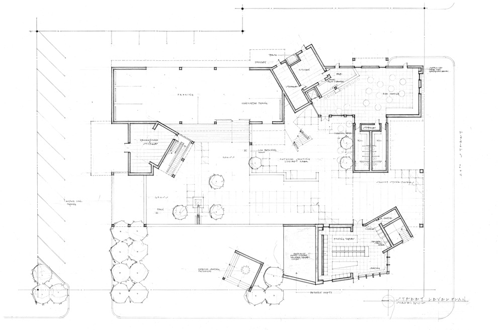
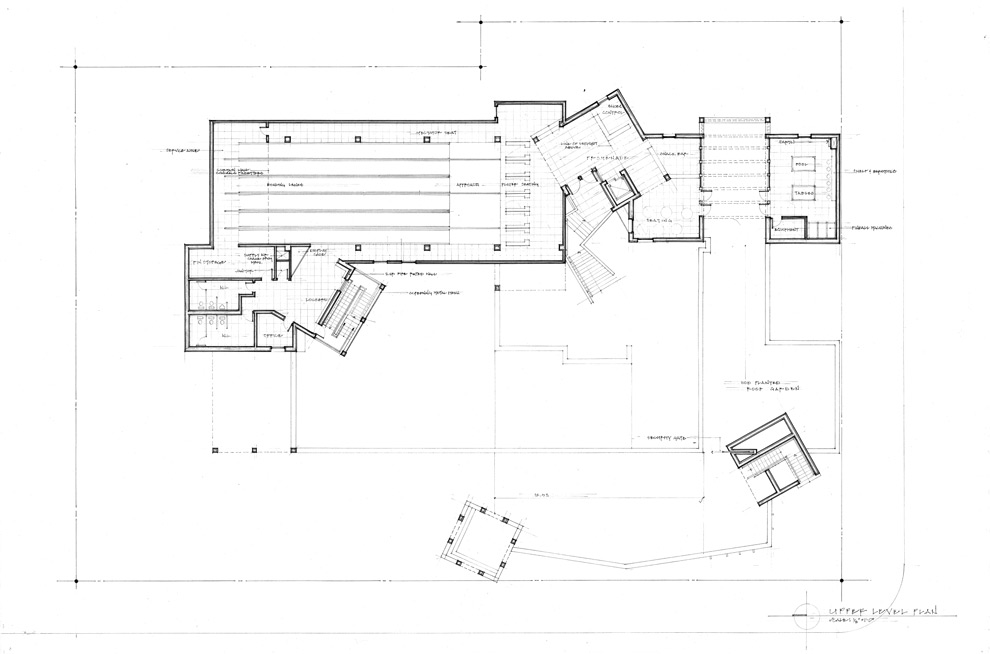
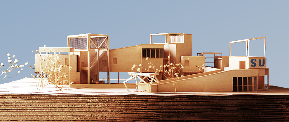
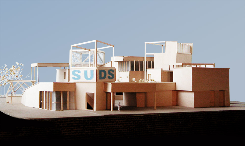
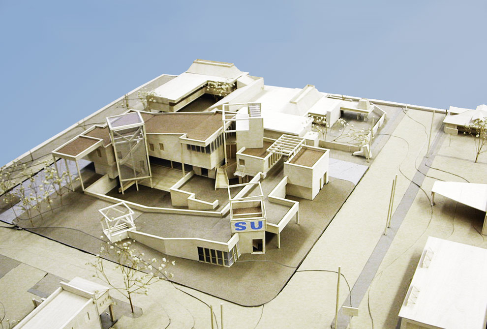
The program called for a combination of leisure activities that any college student is well acquainted with: bowling, drinking and washing laundry. The design reflects some of these playful qualities while also creating a ground, a city within a city. The building is meant to provide a strong presence in an area where the inhabitants are recycled every four years – perpetually created anew.
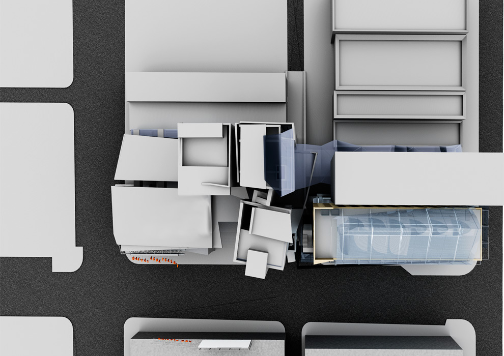
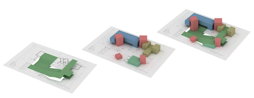
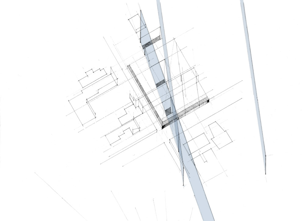
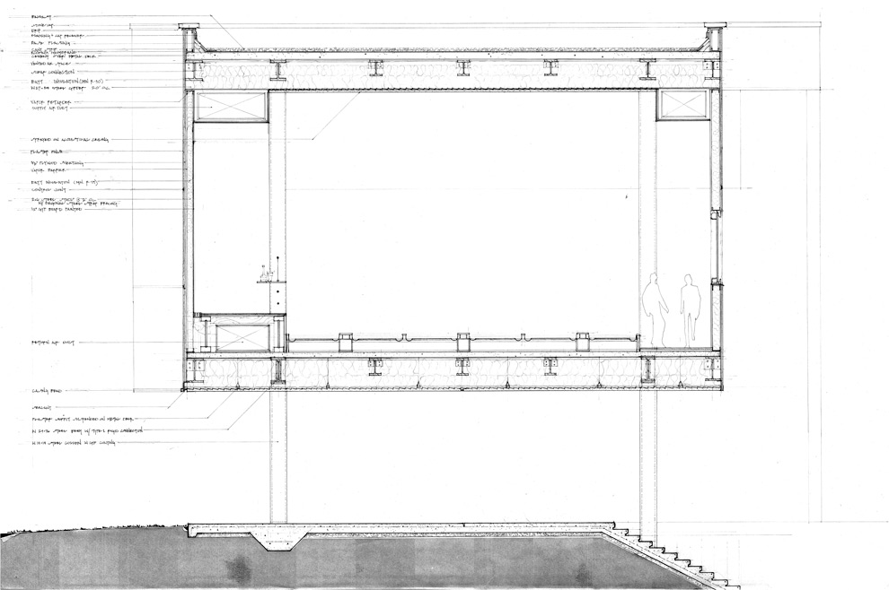
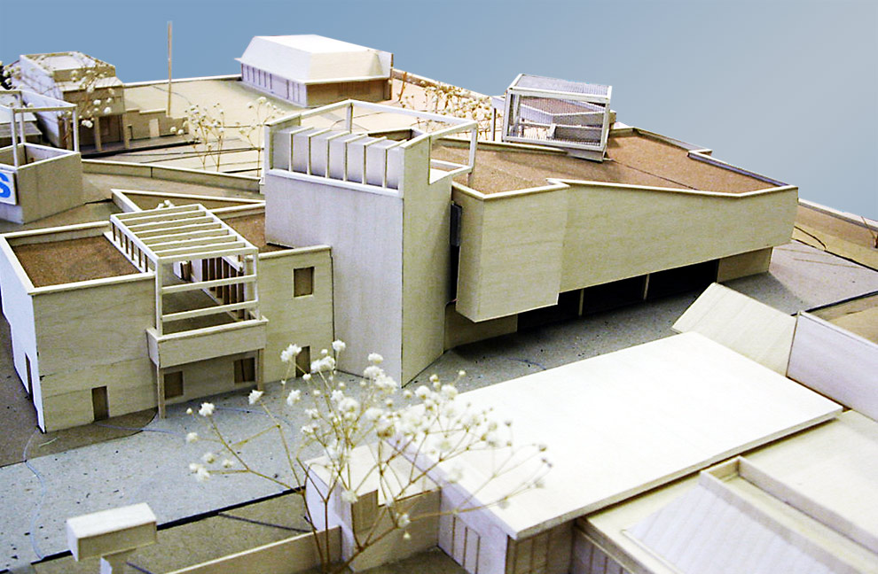
The design is separated along program and wraps itself protectively around a central sunken courtyard that provides shade and solace. The line between inside and outside is blurred through the use of roof gardens, cantilevered overhang spaces and the absence of a traditional central front door to the business. As opposed to one central building, the programmatic elements are separated into a collection of buildings, meant to evoke the layout of a college campus. Inhabitable outside void spaces were key and provide open areas for outside cafes and meeting spaces. Also, each program is expressed separately to accommodate differing hours of operation. The space is unified by a consistent structural grid of 20 x 45 feet.
The mechanical and support areas are articulated in a grouping of vertical towers. The towers reference both the separate programs as well as reinforce the idea of a place in and of itself. The building’s service areas contain vertical circulation, and the roof-packaged air conditioning units are localized in these towers. The collision of the service towers and program areas creates areas of complexity and spatial interest, while referencing the transient nature of the patrons and the interstitial urban gridwork of the University corridor.
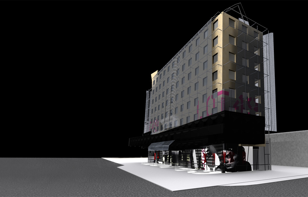
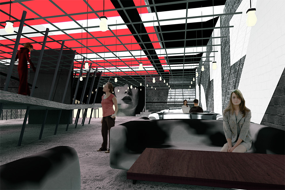
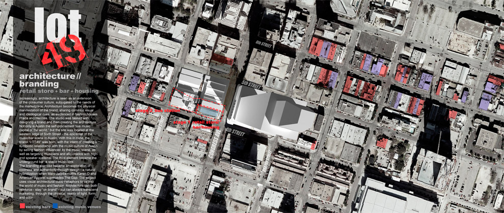 Increasingly, architecture is seen as an extension of the consumer culture, subjugated to the needs of the marketplace. Architecture becomes the physical manifestation of the brand, sharing common visual and ideological cues, as evidenced in fashion houses Prada and Hermes. The studio was tasked with designing a brand and then creating the architecture.
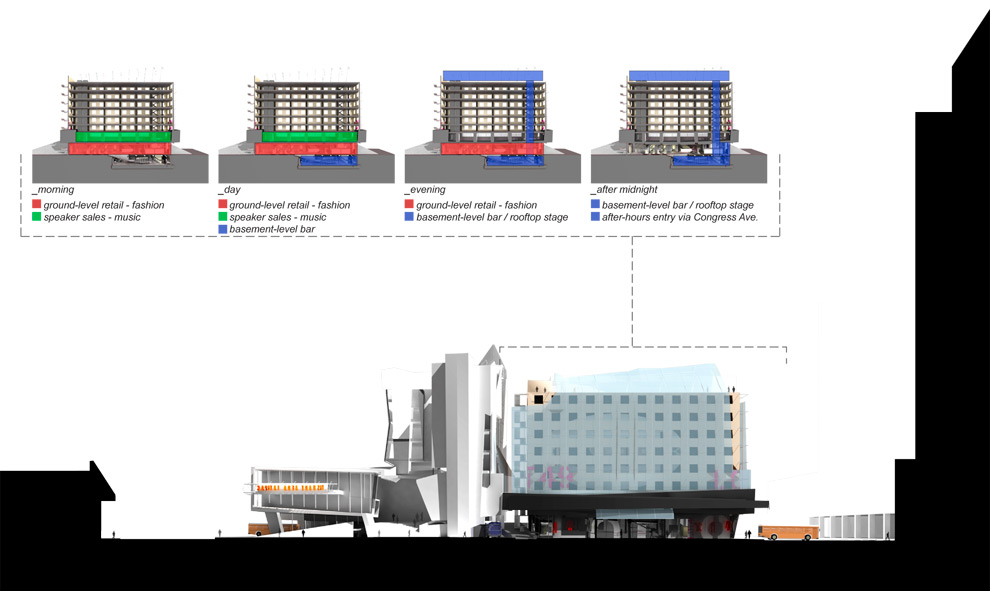
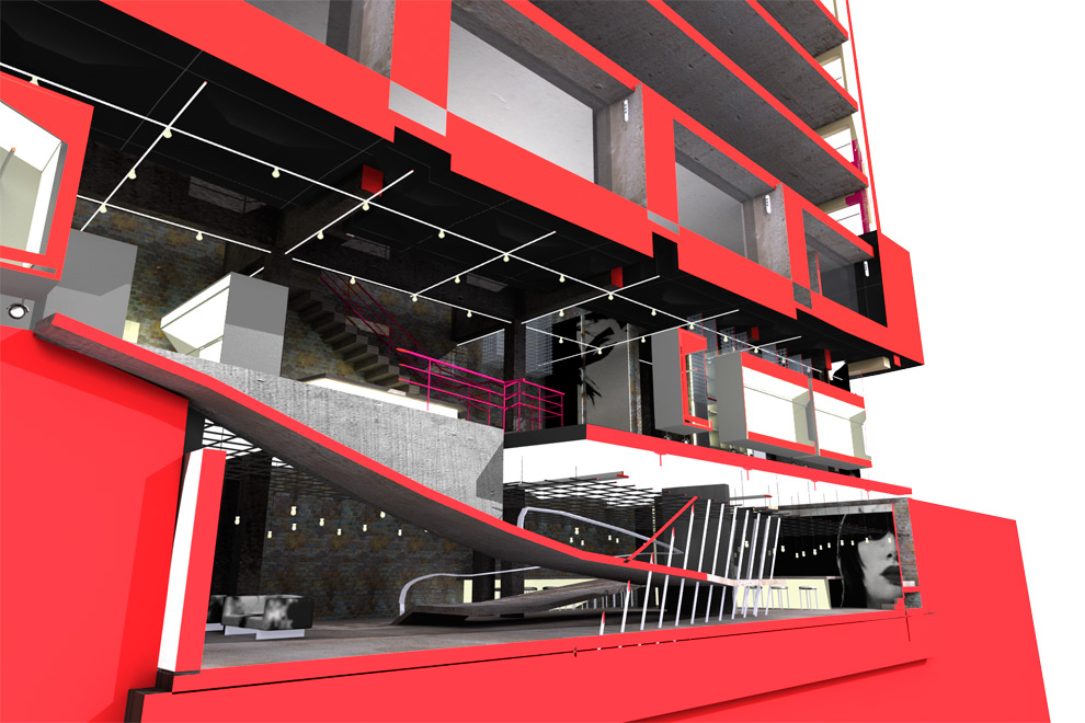
Not only is Austin the self-proclaimed “live music capital of the world,” but the site was located at the western edge of Sixth Street – the epicenter of the music/bar scene in Austin. With this in mind, the brand “LOT49” was born, with the intent of creating a symbiotic relationship with the music culture of Austin by selling fashion influenced by the music scene, as well as targeting musicians and aficionados with high-end speaker systems. The third element became the underground bar, a staple music lore.
The branding exercise became an exploration of coolness and authenticity through design – a natural hybridization when Marc Jacobs outfits Karen O and American Apparel supercedes The Gap. The project uses visual architectural cues/metaphors to tie into the world of music and fashion. Architecture can both reinforce – stay “on brand” – but can always transcend marketing, through the physical, reality of light, form and color.
This was also the first paperless studio project I worked on. I was fumbling around with lightwave 6.0 all semester. It’s incredible how far technology has come in four years. ]]>
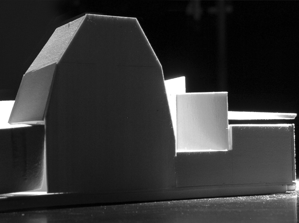
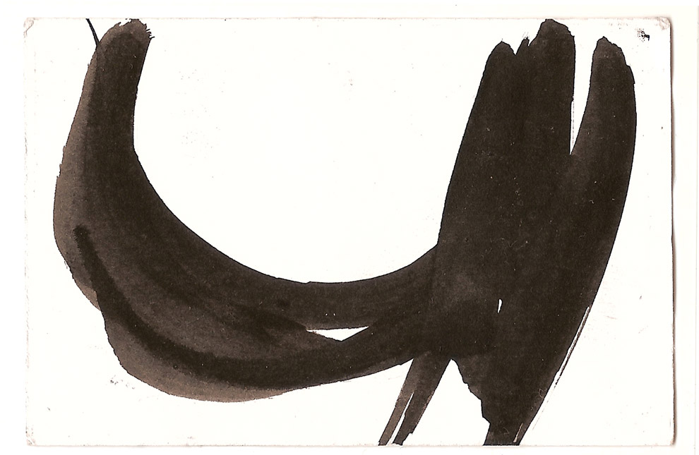
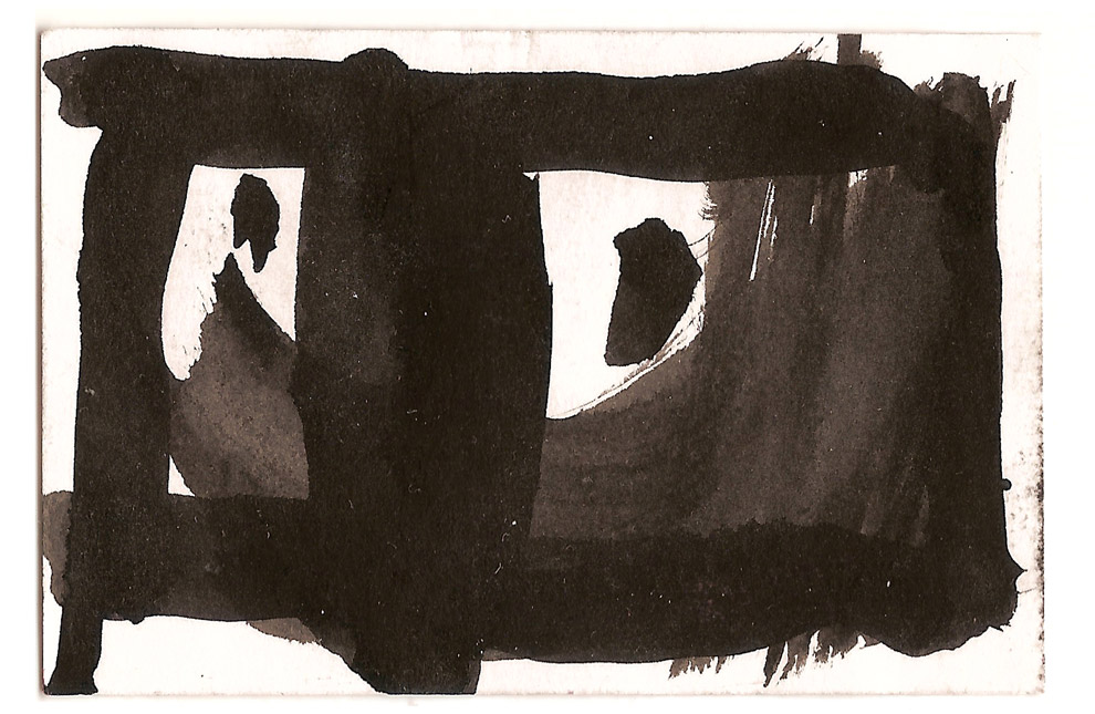
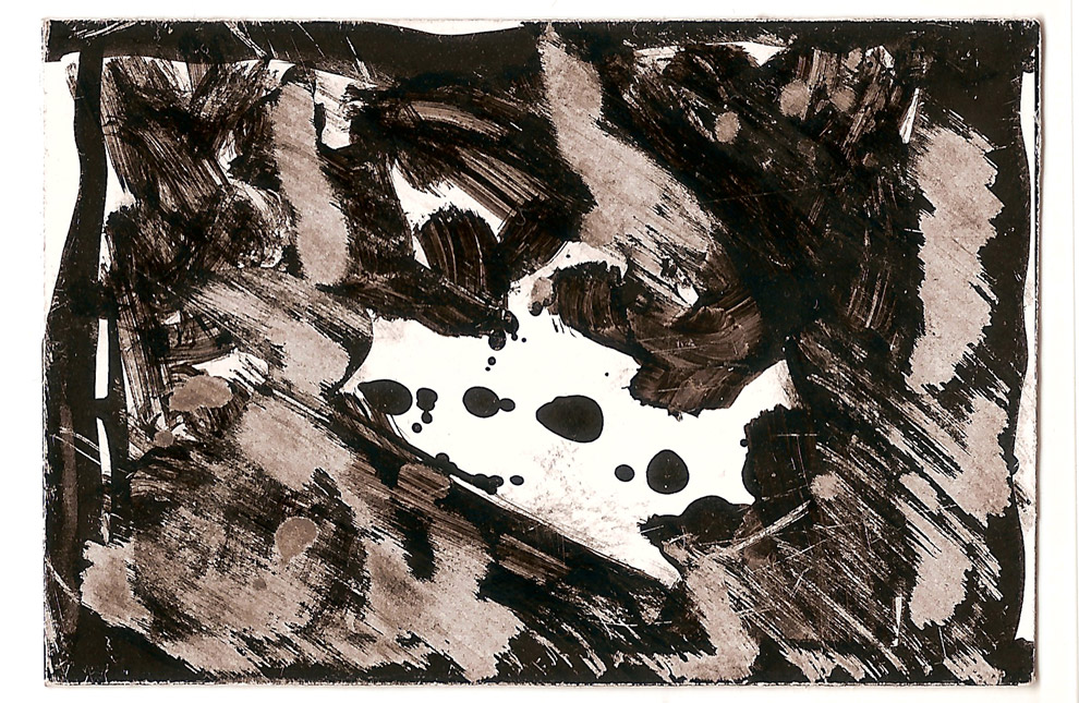
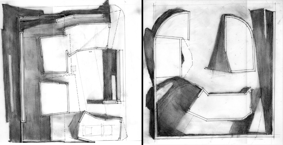
Architecture is a game of limits. Some studios work within the confines of context, program and site, here we explored limits that were more intangible. The studio worked directly with a strong emphasis on space, shape, color, light, shade and shadow. We searched for limits, letting function simmer while heating up the form. We explored limits in three shape studies in a variety of form and media: 1) Two dimensional shape black and white paintings 2) Three dimensional car/truck bondo shape studies and 3) Building design studies: proposals for an automotive body shop and paint shop.
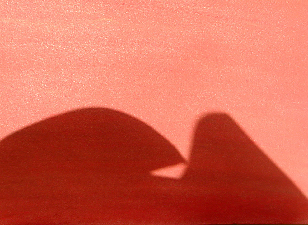
An early limit arose from light illuminating a distant plane, while backlit shapes filled the foreground, creating space and hope, and drawing the worker into his business. I also advocated the use of a strong void space. The black and white paintings evolved from logocentric gestures, yielding overlapping spaces where smaller elements could be brighter than the whole. Contrast functioned as a powerful space-making tool within the project, as well as with the neighboring context. The play between soft, near edges; and farther, harder planes influenced much of the car/truck shape-making, as well as issues of silhouette, color and perceived mass.
Learning about the site: As part of our analysis of the site, we moved beyond standard topographic information. Frequent visits to the site, meeting people, and making sketches, paintings and photographs led to a fuller understanding of the area and yielded a building intervention that had a deeper relationship to the intangibles of the area.
Learing about the culture: Residents of the neighborhood live in the same house they were born in, the same house their grandparents were born in. It became necessary to meet with people and hear their stories and opinions. Local institutions and neighborhood history became additional site considerations. From this extemporaneous, improvised neigborhood, the studio work took on a messy quality that reinforced the sense of immediacy.
See the second part of the studio here, shape and color.
See the first part of the studio here, black and white shape paintings.
]]>
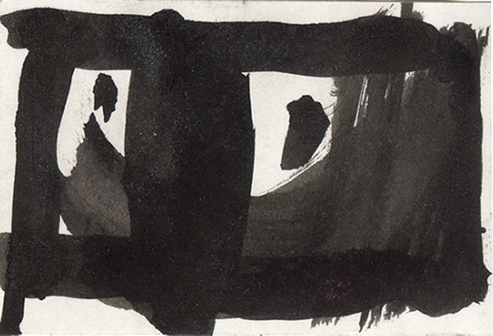
These were components of the Shape Studio I took at UT with critics Chris Risher and Mark Vaughn. The paintings began as expressive gestures that evolved to rigorously reflect a series of imposed limits. What began as logo-centric forms took on qualities including the use of void spaces as well as a depth and primacy of smaller pieces within an overall composition.
