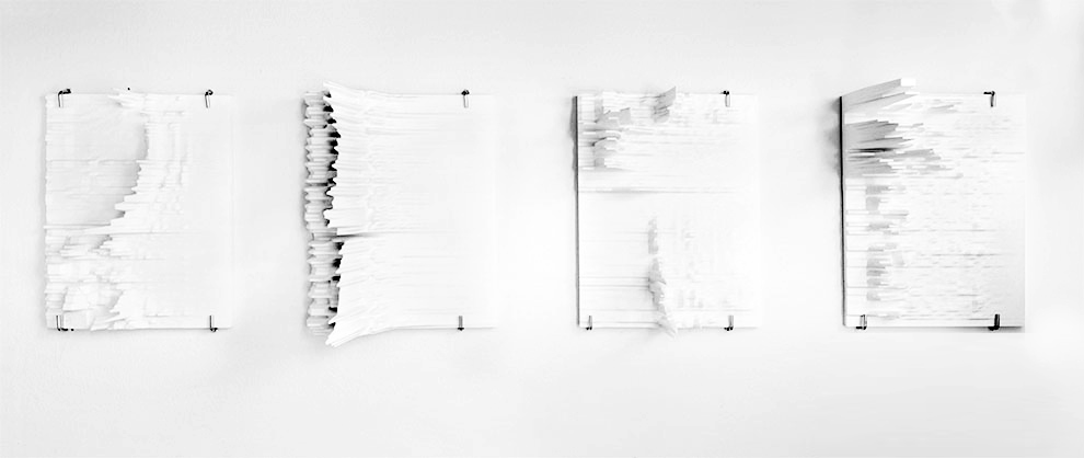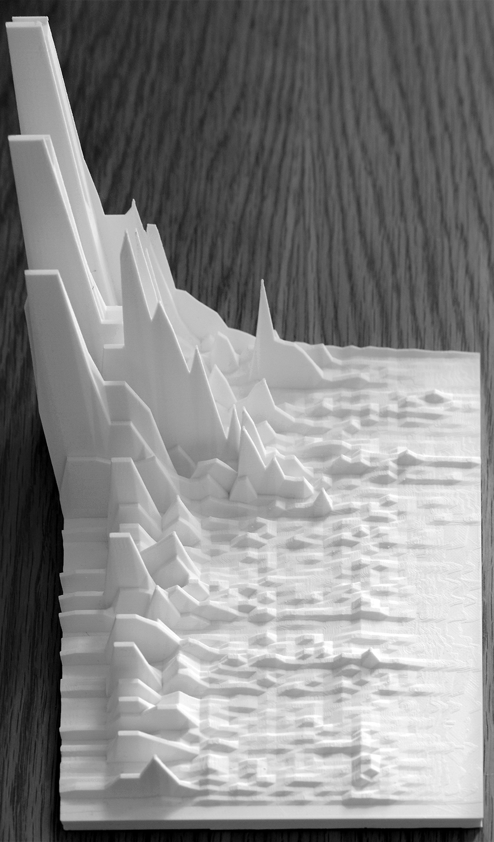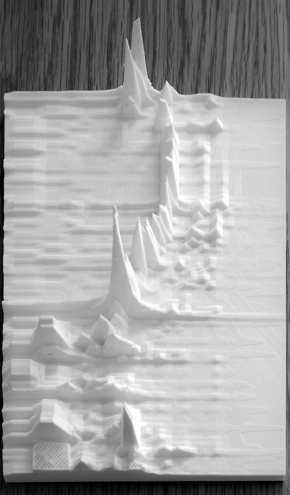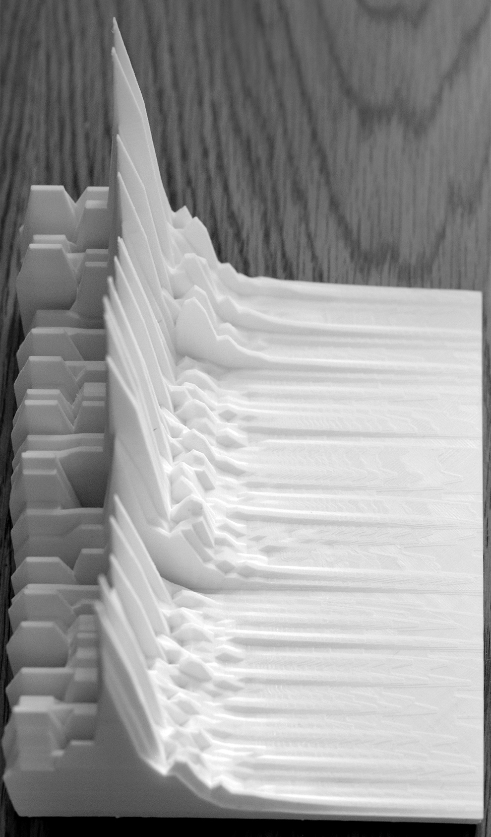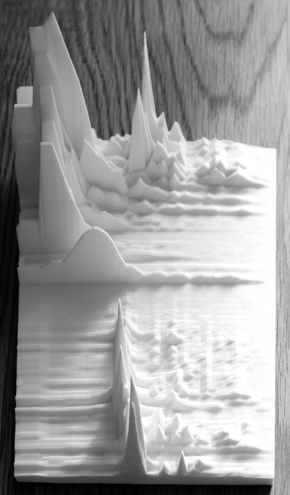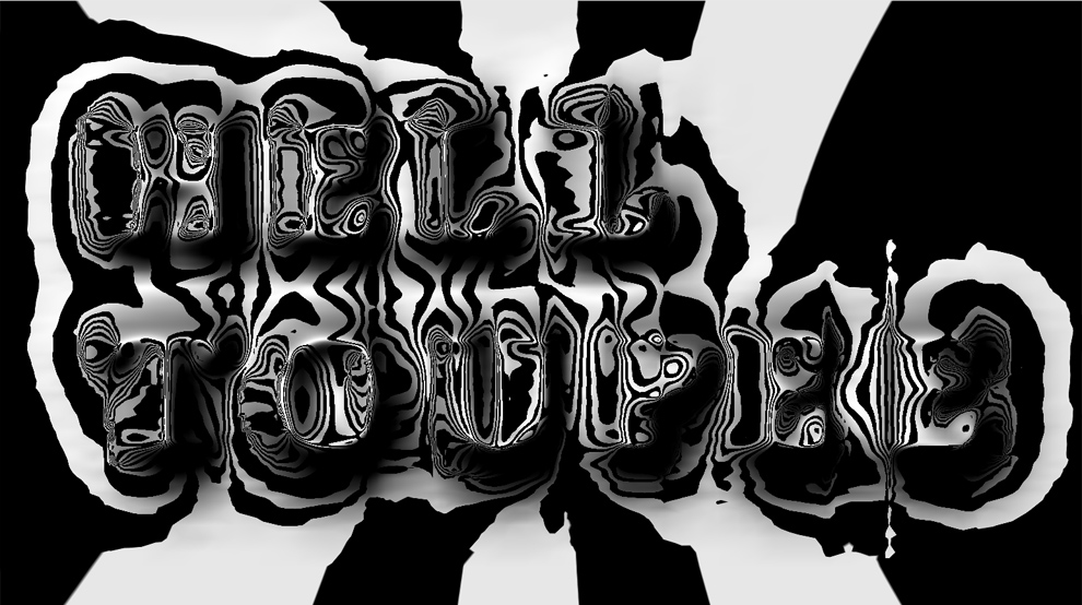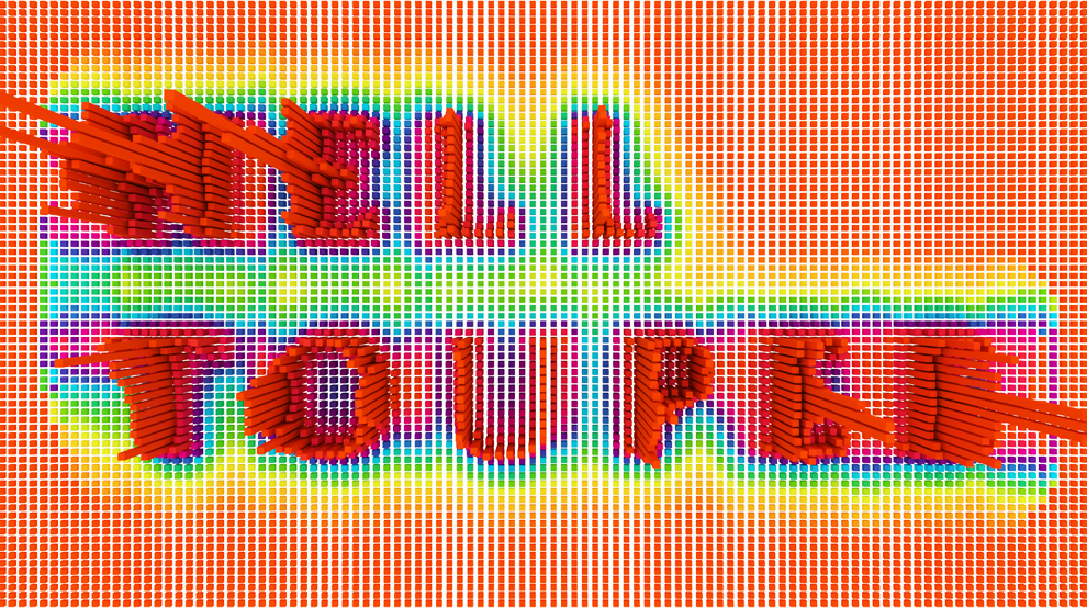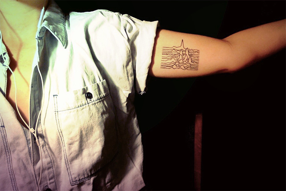
I was asked to design a soundwave tattoo that references a specific part of a single song. It turned out pretty cool. Buildings are often designed for a 50-year lifespan. Female life expectancy in New York is pegged at 83 years, so as a design problem the time scale on this exceeds architecture.
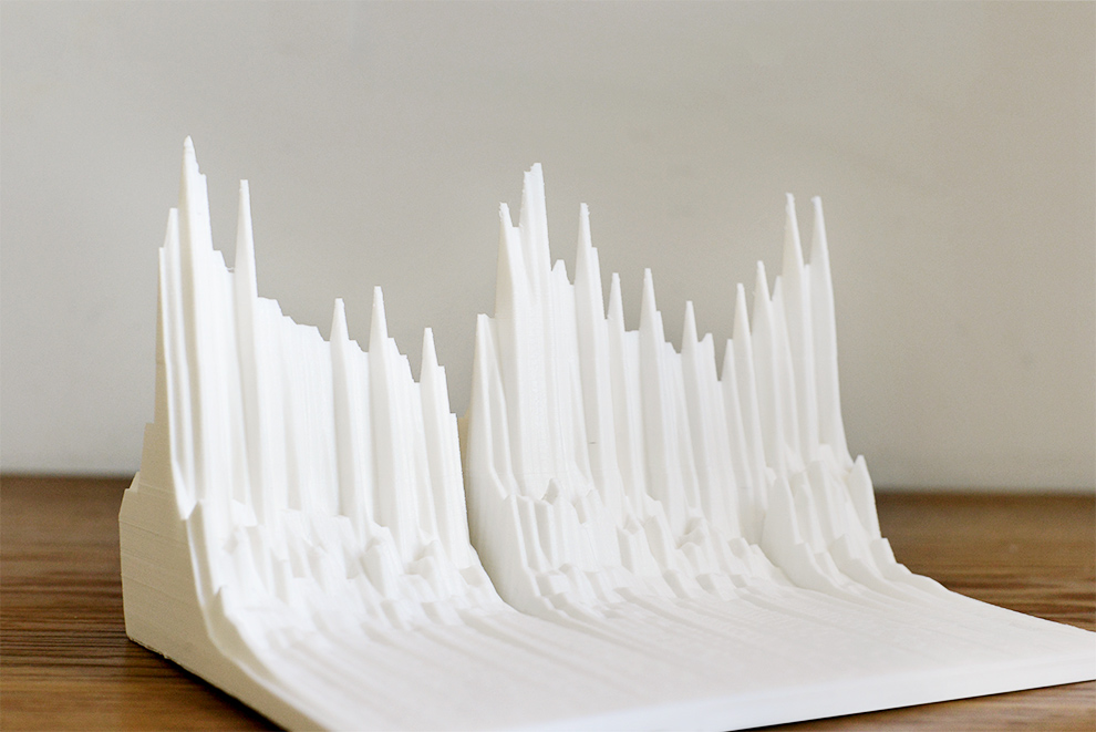
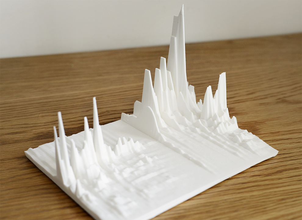
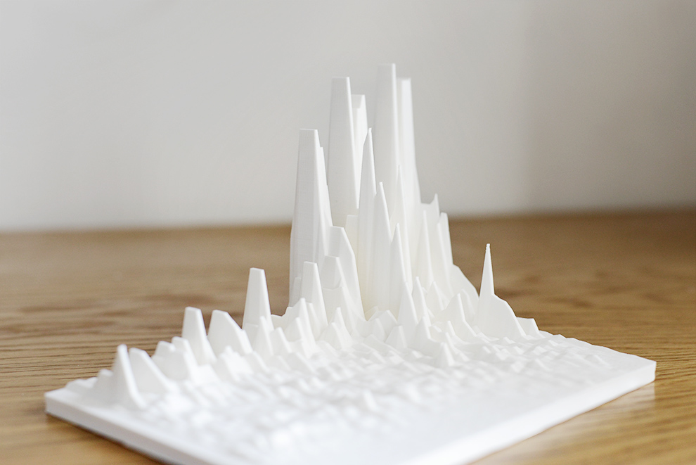
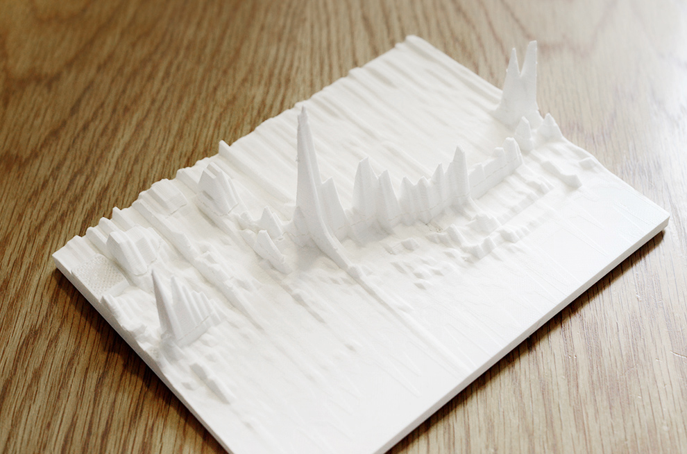
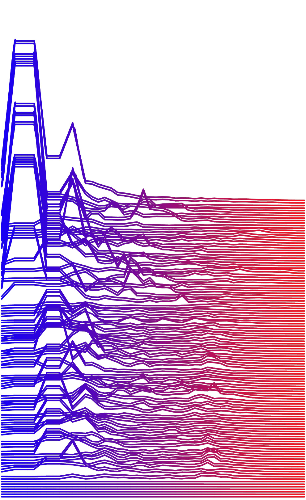
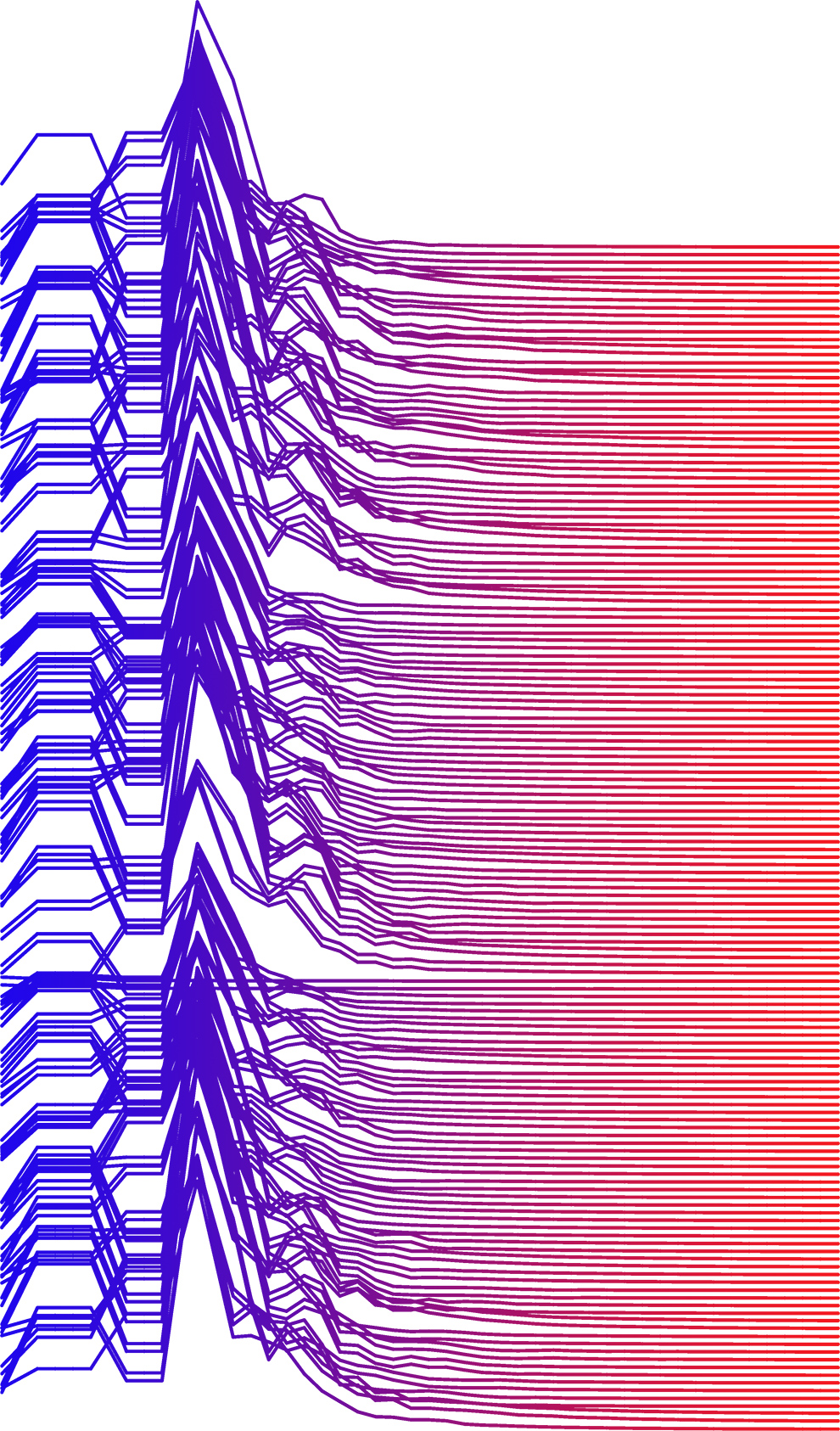
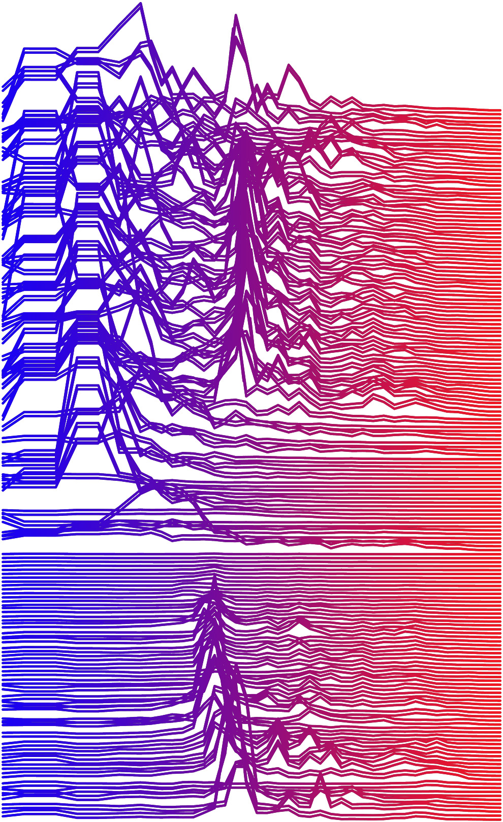
Building off of previous work that looked at real-time sound visualization, the intention of this exercise was to create a series of physical objects that legibly conveyed the transformation of sound into a landscape. Four specific indicative moments of recorded sound were rendered as a topographic form in Processing, then 3d printed. Any piece of real-time or recorded sound would work, however, these prototypes were chosen because they highlight special snippets or short moments during signature songs that could warrant further observation of the ordered or chaotic underlying sound structure. Once printed, each piece creates a striking object that allows for ease of visual comparison.
The four selections shown here include:
1) “Young Americans” – David Bowie. The brief pause at 4:19. (youtube link) Also, per Jennifer Egan in A Visit to the Goon Squad: “This is a lost opportunity. Hell, it would’ve been so easy to draw out the pause after ‘…break down and cry…’ to a full second, or 2, or 3, but Bowie must’ve chickened out for some reason.”
2) “Ride of the Valkyries” – Richard Wagner. The introduction of the main theme including the arrival of the brass instruments. (youtube link)
3) “Mood Indigo” – Duke Ellington. Jimmy Hamilton’s introduction on the clarinet. (youtube link)
4) “Sonified Starlight” – NASA. Translation of light waves emanating from star KIC 7671081B into an audible pattern via NASA’s Kepler Input Catalog. (soundcloud link)
Lastly, drop me a line if you’d be interested in your own 3D printed soundwave.
“Sonified Starlight” – NASA. Translation of light waves emanating from star KIC 7671081B into an audible pattern via NASA’s Kepler Input Catalog. (soundcloud link)
“Young Americans” – David Bowie. The brief pause at 4:19. (youtube link)
“Ride of the Valkyries” – Richard Wagner. The introduction of the main theme including the arrival of the brass instruments. (youtube link)
“Mood Indigo” – Duke Ellington. Jimmy Hamilton’s introduction on the clarinet. (youtube link)

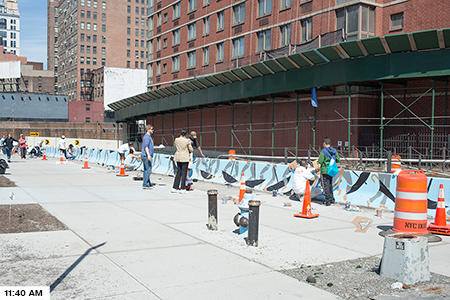
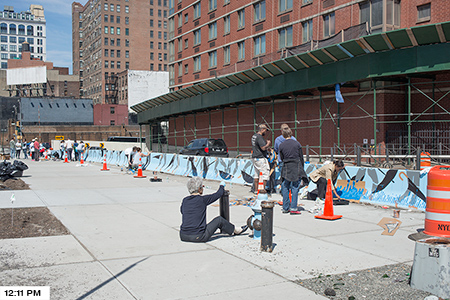
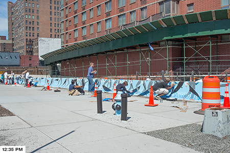
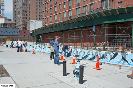
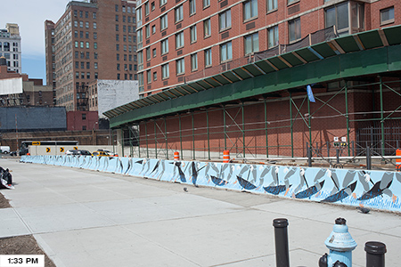
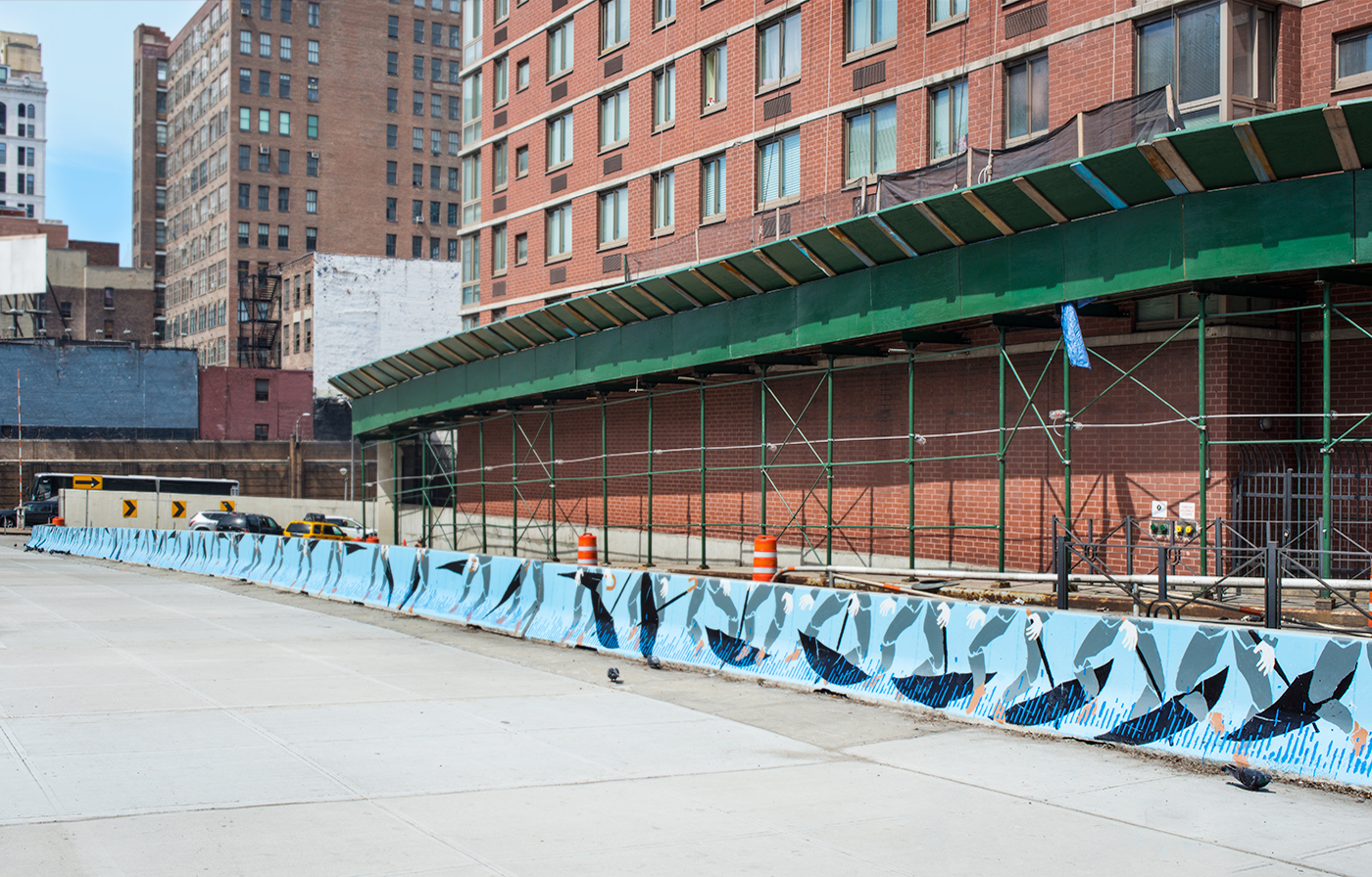
Final painted barrier
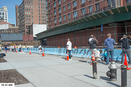
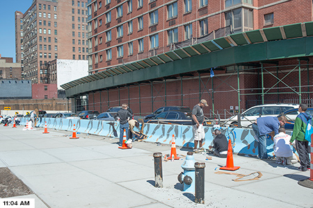
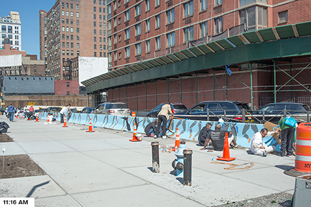
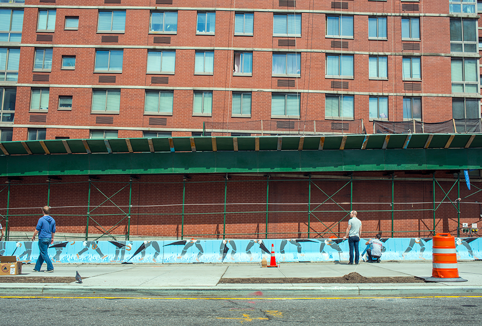
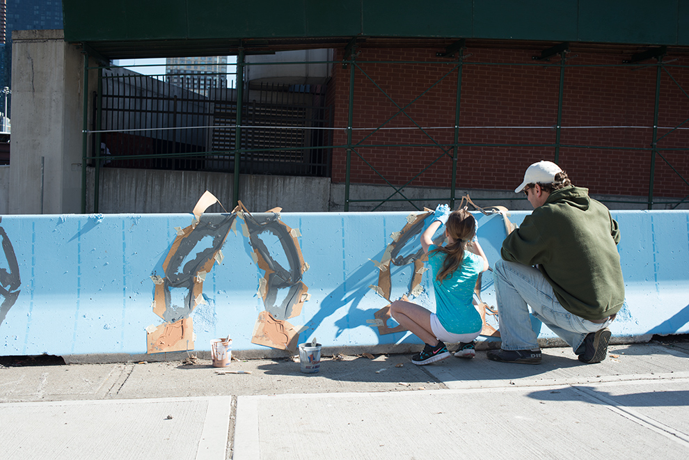
NYCares Volunteers paint the barrier
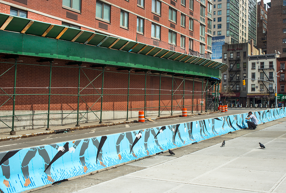
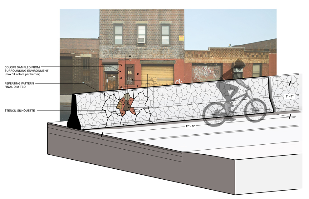
Barrier made of (10) 20′ long modules

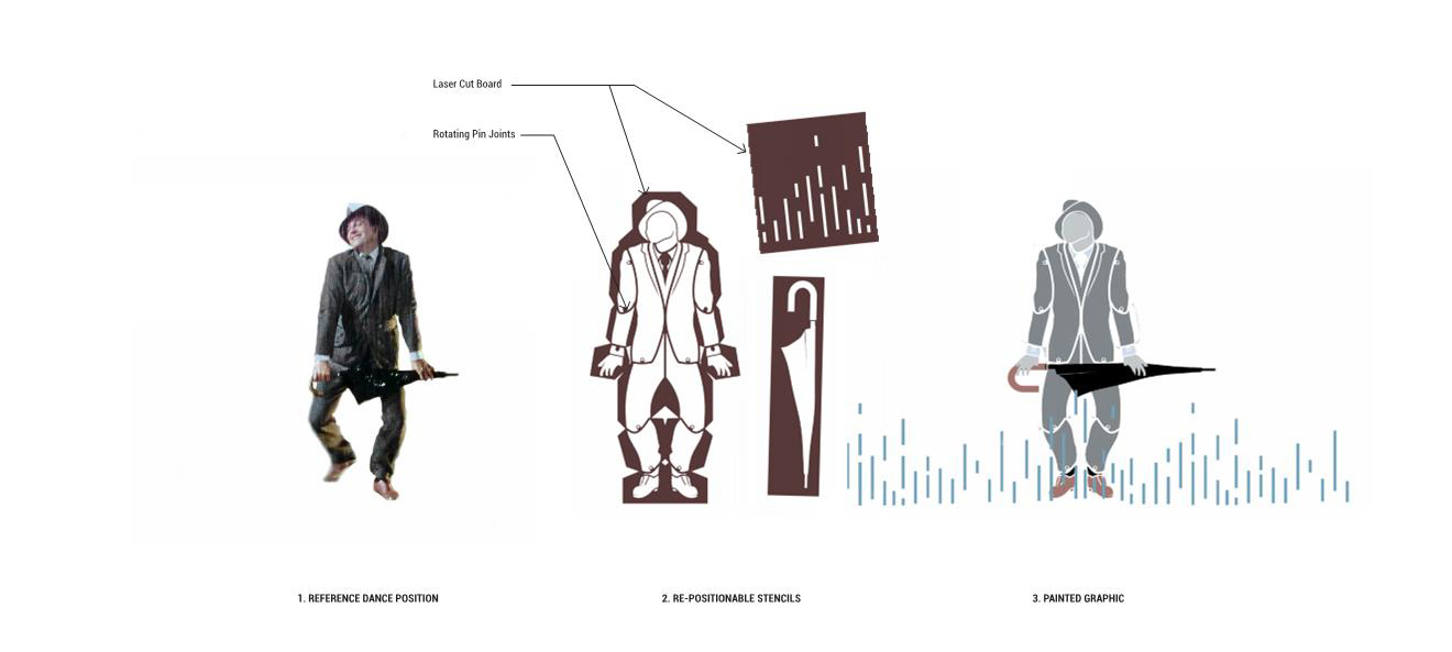
Stencils laser cut out of oil board with rotating brass pin joints
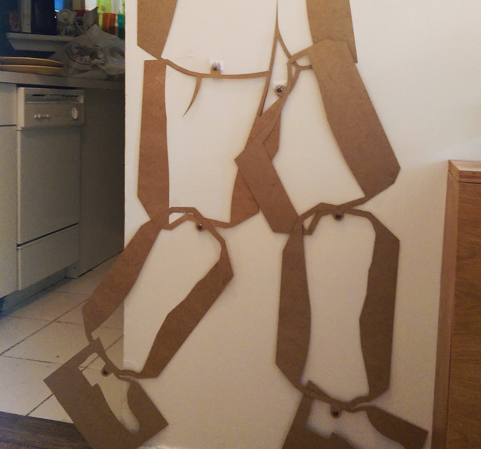
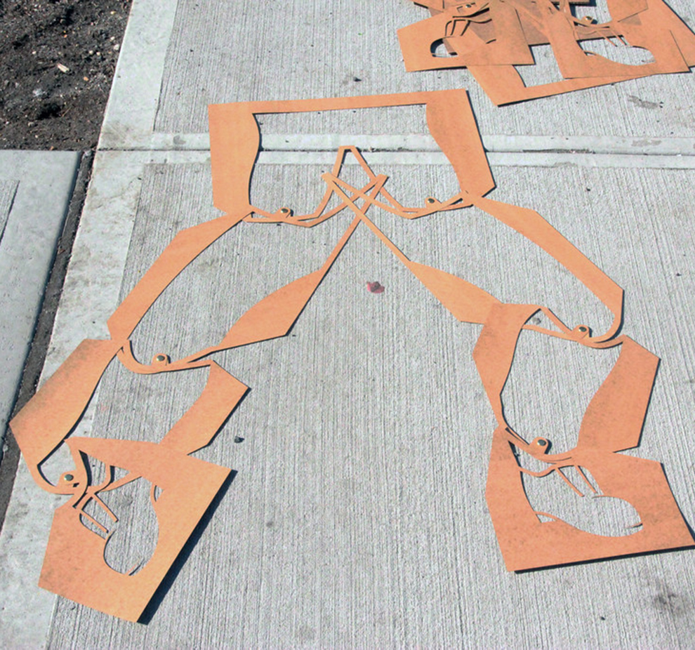
200′ of barrier painted in 4 hours
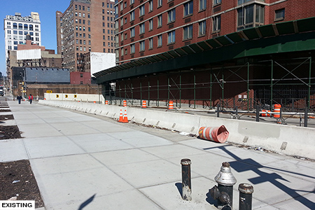
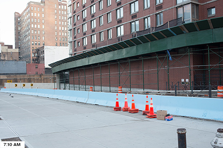
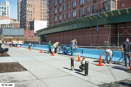
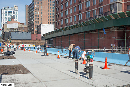
NYCares volunteers painted barrier number 10
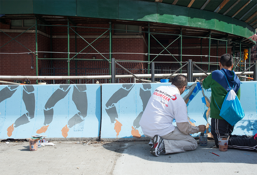
Final painted barrier images
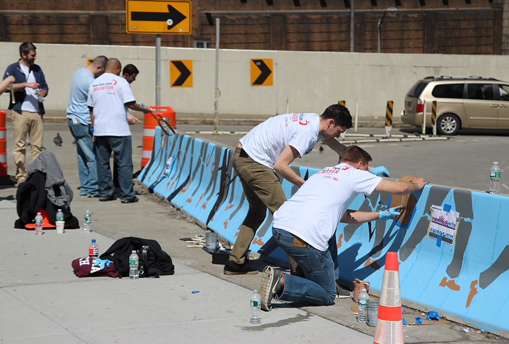
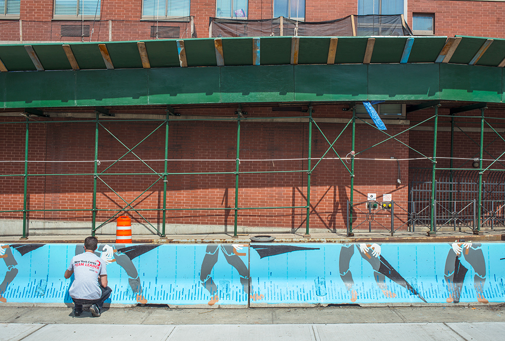
My design for “Singing in the Rain” was commissioned by the NYC DOT as part of the Urban Art program to Beautify Barriers throughout the city. The site is located just South of the theater district and Times Square at 36th St and 9th Ave in Manhattan, and references musicals – especially one in particular – as well as motion, animation and street rhythm. The piece will be up for 1 year and made use of a series of movable stencils of figures with articulated joints to allow for variation in the 200′ barrier length. 20 awesome volunteers of all ages participating in the NYC Cares program (many who had never picked up a paintbrush before) were able to arrange the stencils and finish painting the design in 4 hours based off of a series of detailed instruction sheets.
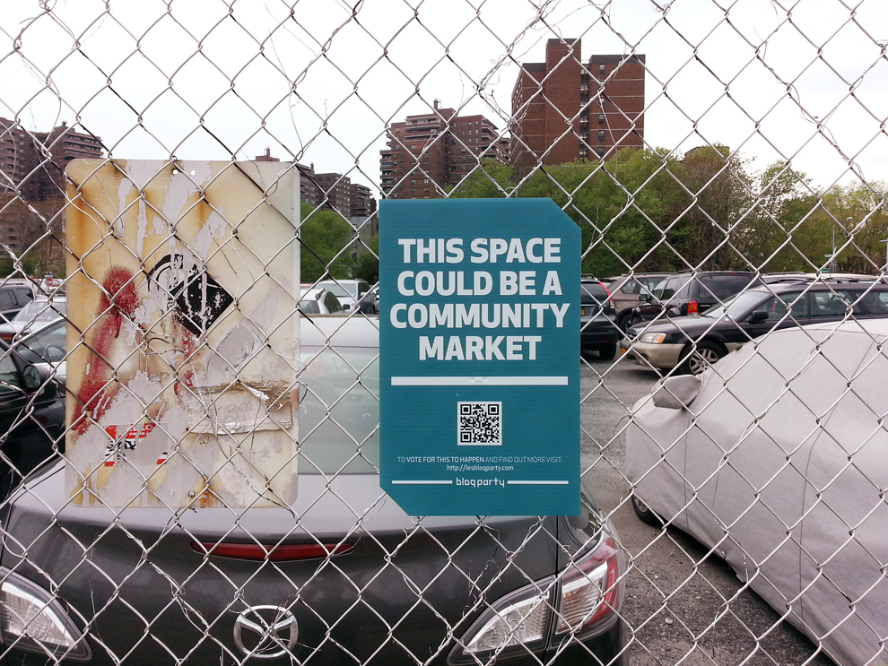
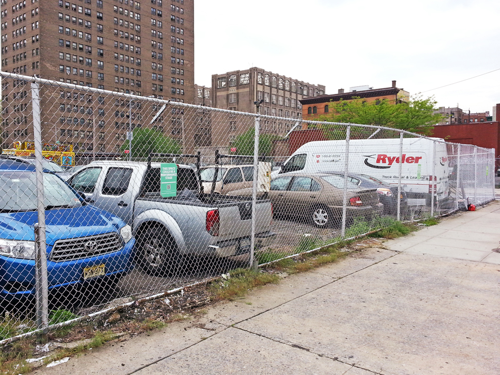
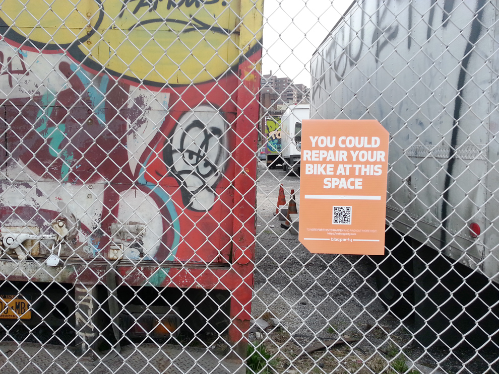
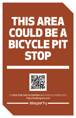
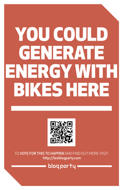
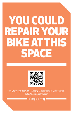
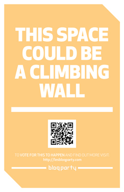
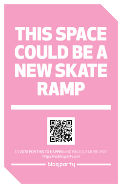
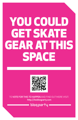
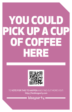
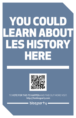
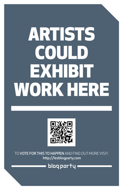
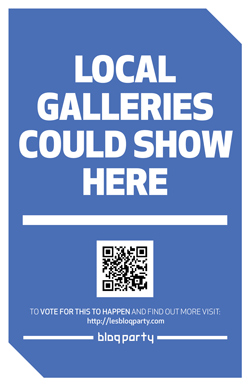
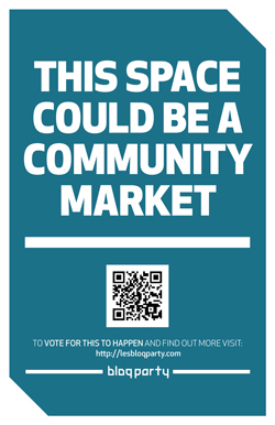
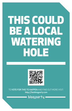
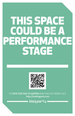
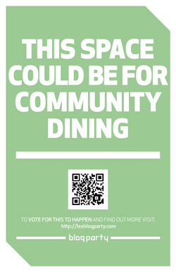
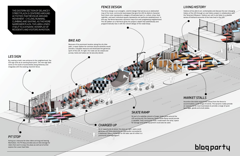
]]>To generate interest and excitement for our BLOQ PARTY proposal, we wanted to start a conversation by showing how the program elements we produced could potentially activate the competition site. Competitions, design proposals and urban space planning oftentimes fall under the radar of the actual users of the site who are both unaware that a competition is taking place and then have no voice in the process or outcome. The plastic signs are intended to link the digital proposal to an actual physical space – less obscure websites and more public posters. It also helped to see how our space division laid out on the actual site, we had treated the eastern, narrower plaza area as space for movement and dynamic interaction – biking, running, skating. The western, more generous plaza was designed for slower, more spontaneous meeting areas. We hope the signs can begin to create a diaglogue for the best use of the space including potentially new and different program ideas that can eventually bring the space to life in a vibrant manner for all.
]]>
Designed with Mark Bearak and Yuval Borochov
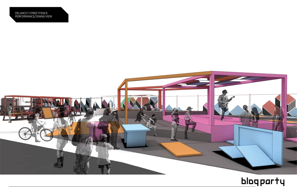
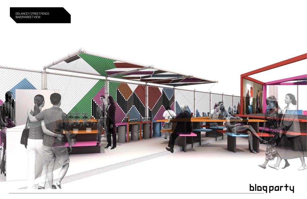
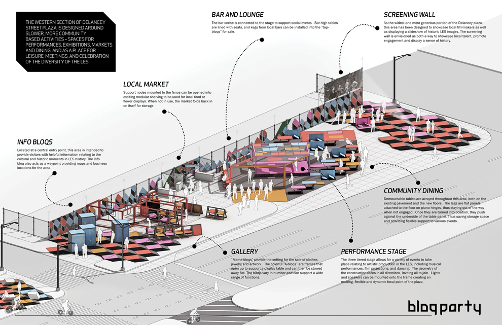
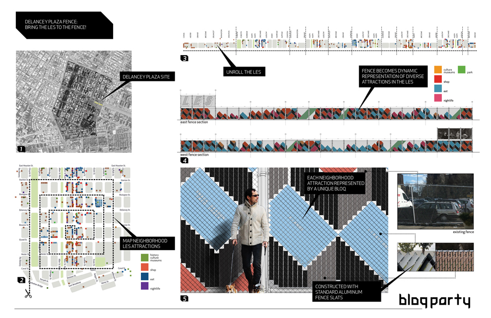
What began as a competition for a temporary rehabilitation of an existing chain link fence along two blocks – adjacent to a pair of parking lots – quickly became a more encompassing proposal as we realized the latent potential of the two narrow, un-programmed plazas bordering the modest chain link fence. Located at the Delancey Street connection to the Williamsburg Bridge, the site acts as the symbolic gateway to the Lower East Side for those leaving and entering Manhattan, and as such, displays a great wealth of untapped design opportunity. As a temporary proposal of less than 5 years duration, we identified a variation of possible plug-in nodes that could be used to test ideas for the site and generate community engagement by bringing the scattered, diverse collection of LES attractions together at the fence, displaying the street-level density and multiple, overlapping functions that have historically characterized the LES. Budget and business plans were also developed to illustrate the feasibility of a more ambitious program at the site through a variety of funding and sponsorship options.
PROJECT DESCRIPTION:
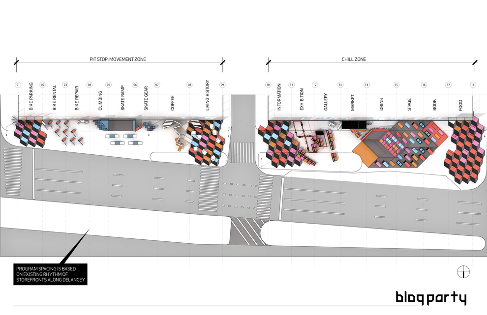
The possibilities of programming a BLOQ are endless, ranging from a bike repair station, to a satellite location of a Lower East Side business, to a concert venue stage. Each block will have its’ own identity, but share geometric cues from its neighbors. In our proposal we will aggregate 16 BLOQS that will serve as a gateway to the LES while also providing an oasis of attractions within the neighborhood.
The site will consist of two city blocks and each section will have its own identity. We call the Eastern section the PIT-STOP based on its adjacency to the Williamsburg Bridge and its planned programmatic functions. The BLOQS located in this section will serve as a way station for pedestrians heading to Brooklyn or entering the LES. This section will have BLOQS with services such as bike repair, coffee and skate gear.
We call the Western section the CHILL space and we will treat it as more of a destination. The width of the site allows for larger gatherings of people who can congregate into the farmers market or catch a drink at the pop-up bar. Our proposal represents a handful of potential BLOQS; over the life of the project there are endless possibilities for temporary and permanent installations.
Further exploring the actual BLOQS, each zone will be defined by a fence which will act as a billboard for the community and patterns placed along the ground. Each section of fence will be a billboard representing an actual block of the LES. The design of each section of the fence will be a series of parallelograms that advertise local businesses within the represented blocks of the LES. The parallelograms will be colored based on following four categories: Shop, Eat, Explore & Nightlife. The adjacent ground will be a continuation of this theme containing patterns unique to each BLOQ.
The most liberating feature of the BLOQS will be created when the fence is used as a jumping off point to an architectural installation. We will bend, fold, cut, extend and warp the fence to accommodate the unique functions of each BLOQ. In some cases the drama of the gesture will be relatively modest; in the case of the market the fence will simply be extended horizontally to create a canopy to protect the produce. In more complex situations, structure and furniture will be built off of the fence to create a space suitable to host large groups of visitors. One of the largest BLOQS will be composed of a bar, stage and viewing area built within the distinct vocabulary of the installation.
The main purpose of the BLOQ installation is to activate the space. The BLOQ will not only serve as a gateway to the LES, it will serve as a destination for all New Yorkers. The project will never be static and its potential can be tested over time as the project evolves to suit the changing needs of the community. Eventually the project will not only be a representation of the vitality of the neighborhood, it will also serve as a benchmark for the evolution of the Lower East Side.
http://newyorkcity.arthere.org/art/bloq-party-2/
http://lesbloqparty.com
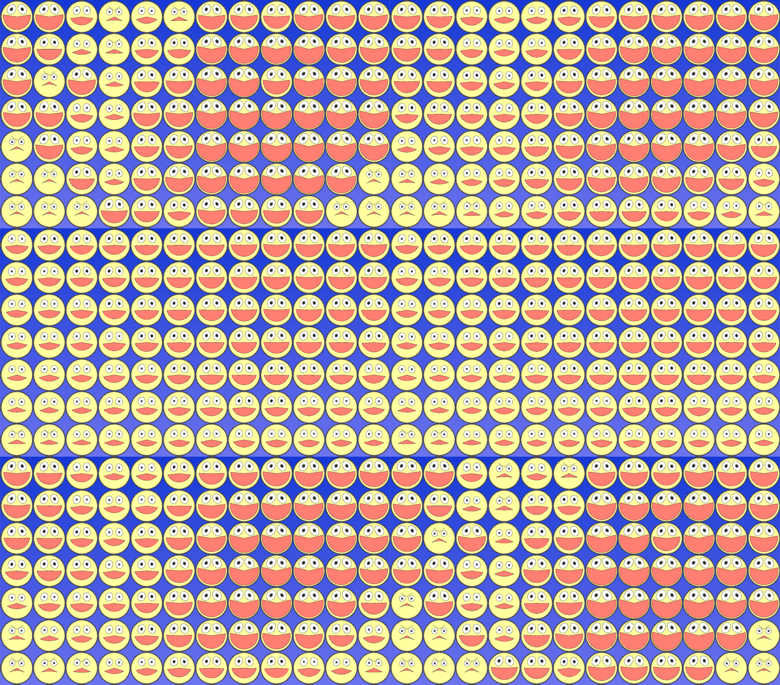
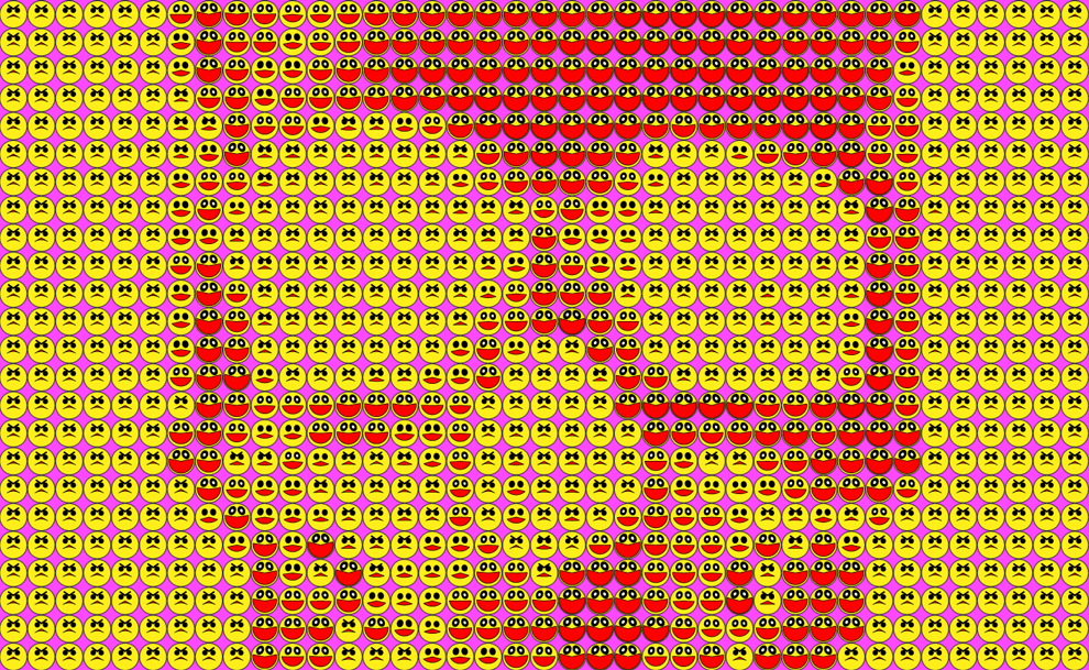
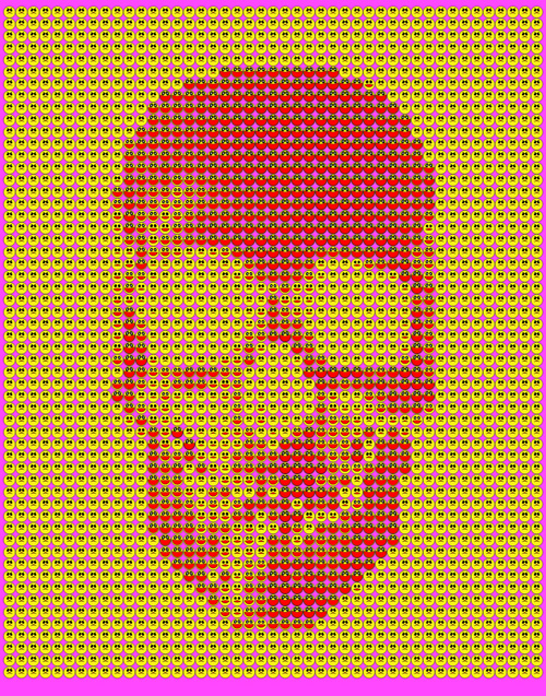
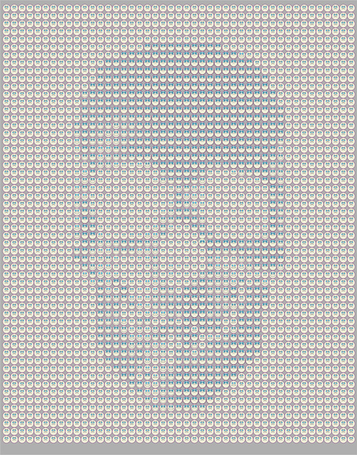
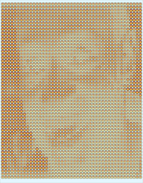
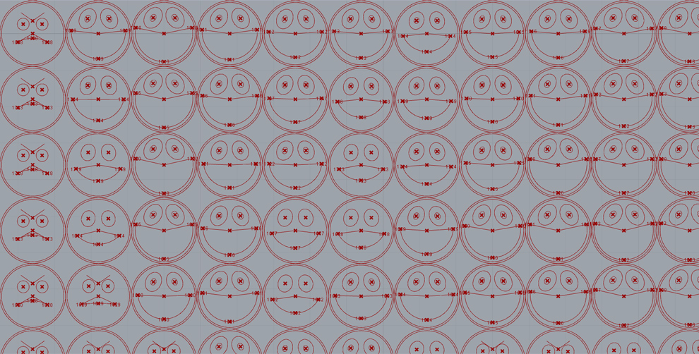
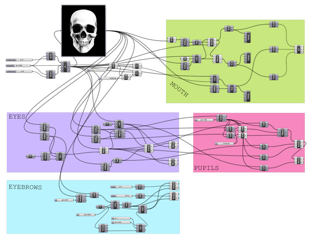
Parametric facade apertures on swooping surfaces are out, parametric emoticons are in. A quick experiment using the image sampler node in Grasshopper to parametrically control the relative ecstatic to furious expression of an emoticon. A sampled pure white pixel on the original background image produces full-mouthed, googly-eyed happiness, while a sampled black pixel will unleash furrowed-brow, pursed-mouth rage. Grayscale pixels produce the range of conflicted emotions in between. Grasshopper definition can be downloaded here, works with any image, but simpler images with fewer colors tend to produce more legible results.
]]>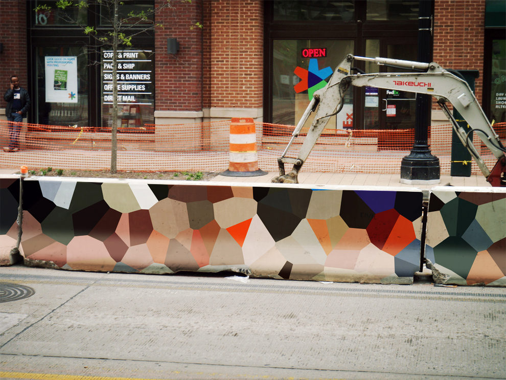

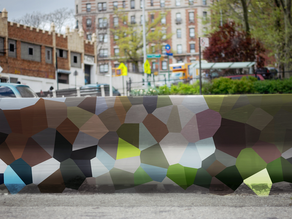
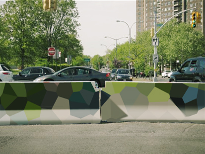
Continuing my love of camouflage and painting jersey barriers in a way that is probably too heavy on the new aesthetic vibe, but sill enjoyable nonetheless.
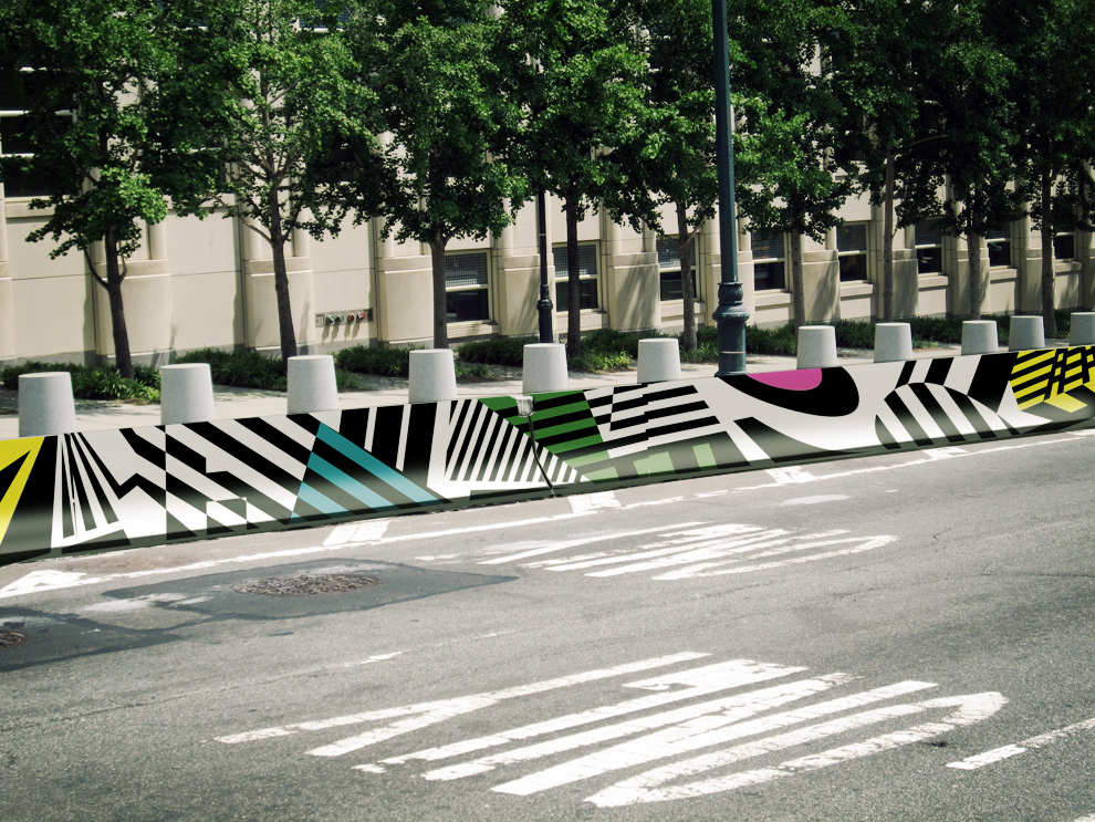
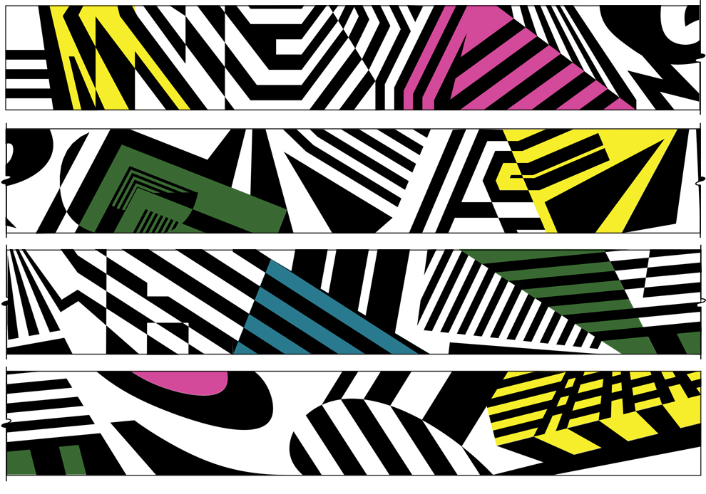
Inspired by both razzle dazzle camouflage and my middle school trapper keeper, this barrier entry presents a strong graphic face to the street. While the concept of camouflage may certainly seem like a contradictory tact for a protective barrier whose sole purpose is to remain unhidden, by using bold, angular geometric forms to blur the barrier’s edges, this in fact increases its perceived range. The illusory effect of the forms induce nearby traffic to slow down, producing a safer, more bike and pedestrian friendly thruway.
In a remarkable piece from New York magazine regarding the liberal world’s MVP, Paul Krugman, the author described the genesis of Krugman’s 2006 book:
When he was writing The Conscience of a Liberal, Krugman found himself searching for a way to describe his own political Eden, his vision of America before the Fall. He knew the moment that he wanted to describe: the fifties and early sixties, when prosperity was not only broad but broadly shared. Wells, looking over a draft, thought his account was too numerical, too cold. She suggested that he describe his own childhood, in the middle-class suburb of Merrick, Long Island. And so Krugman began writing with an almost choking nostalgia, the sort of feeling that he usually despises: “The political and economic environment of my youth stands revealed as a paradise lost, an exceptional moment in our nation’s history …”
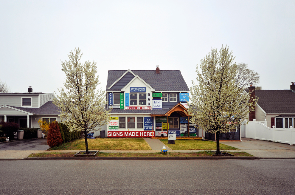
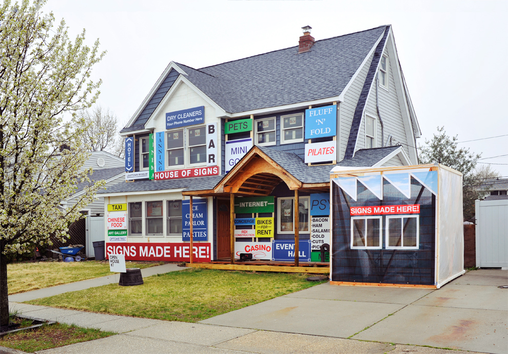
Krugman’s own vision of a lost utopia on Long Island, during that bright post-war bloom of middle class prosperity, which must have had seemed so full of limitless potential and opportunity but somehow lurched toward our current state of contraction, pulled apart and forgotten by the twin poles of unimaginable wealth disparity, was at the front of my mind when I had the awesome opportunity to manage this project from David Benjamin and the Living. This was House #7 of nine theoretical projects that comprised part of a one-day only open house installation on the future of suburbia, a what-if, hyper-fictional reality showing design’s potential to provoke and elucidate a hypothetical path forward hosted by Droog and DS&R.
Conceived with the ingenuity of hybrid housing/service industry residences seen in Tijuana and rendered with the graphic intensity of Chinatown, David’s concept called for a home that is both a store and factory for making and selling signs. The factory is an inhabitable sign in and of itself, and the facade of the house is taken over by examples of constructed signs. As more and more Levittown residences convert to self-sustaining home businesses the House of Signs positions itself as an integral piece of future suburban infrastructure. We went from concept sketch to exhibition in less than 10 days.
]]>